HOME | DD
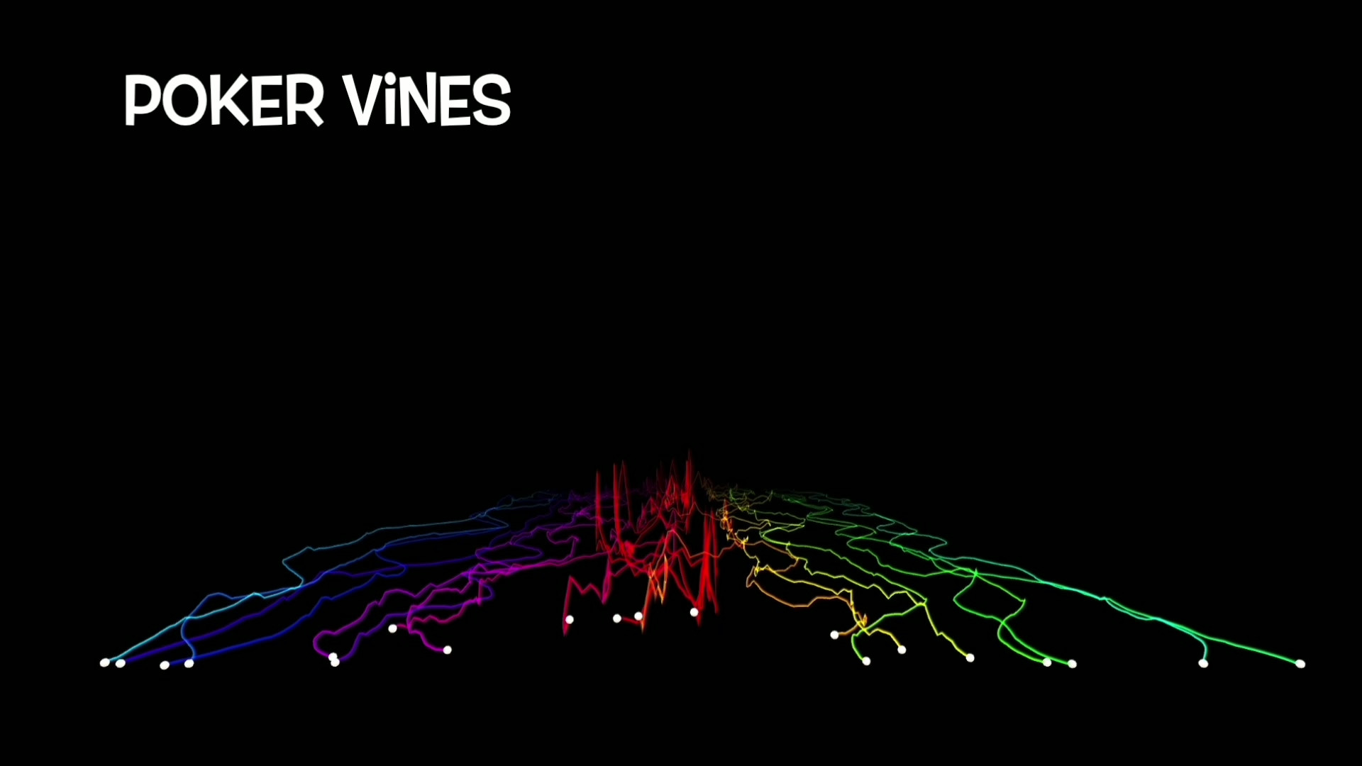
 4thPersonView — Fictive

Published: 2006-02-17 02:49:29 +0000 UTC; Views: 4047; Favourites: 67; Downloads: 814
Redirect to original
Description
fic·tive - adj.Of, relating to, or able to engage in imaginative invention.
Of, relating to, or being fiction; fictional.
Not genuine; sham.
---------------------------------
1st wallpaper i had made at the current time.
Related content


Comments: 161


excellent choice of colours, very complex must have taken a very long time to make

👍: 0 ⏩: 0

")

I really love this golden brown color, BUT it seems a little blurry, I think it would look better if it was really sharp.
👍: 0 ⏩: 0

Very chaotic and sharp looking. I like it none the less. The colour choices work well together.
👍: 0 ⏩: 0


Really nice.  (Smile)")
")
👍: 0 ⏩: 1


 (Wink)")


this is really cool, it has great colors great contrast and great movement, and i love the gold touch of it!
👍: 0 ⏩: 0

So original! i like the colours complement eachother quite nicely
👍: 0 ⏩: 0

nice job this is really cool and the colours go really well together
👍: 0 ⏩: 0
nice job this is really cool and the colours go really well together
👍: 0 ⏩: 0

Great piece! The luminousity of the those yellow stuff on the right is beautiful, but I think that the fictive wording and box didn't blend well enough into the picture.
👍: 0 ⏩: 0


i rarely think there is much to complain about when it comes to this type of art, but ofcourse there are some that are more interesting then others.
and i think you made quite interesting by putting in those different pictures, of words. graphs etc.

👍: 0 ⏩: 0

I love abstract, and particularly that kind of aggressive style.
That's awesome...
👍: 0 ⏩: 0

I like the minoclour theme!! The effects are sweet!!
👍: 0 ⏩: 0

I love this. Thesse types of wallpapers are what I'm looking for
👍: 0 ⏩: 1


It's a great wallpaper! The way things over lap is very nice and the way the light hits the objects?....makes it look great. Good job!
👍: 0 ⏩: 0


Very cool! Love the gold tones! It looks like you busted up some a gold mine! great job!
👍: 0 ⏩: 0

Excellent use of texture, lighting and color. Not much more to say.
👍: 0 ⏩: 0


NEW WORD. PWNAGE 2 TH MAXIMUM.
WOULD MAKE A GOOD WALLPAPER FOR A SCRAPYARD COMPUTER.
VERY NICELY DONE. ASYMMETRICAL AND EYEGRABBING.
👍: 0 ⏩: 0

Very nicely done for your first wallpaper
👍: 0 ⏩: 0

That's awesome! I love the variation of tone throughout this!
👍: 0 ⏩: 1

Wow, this is something I've never seen before. Very space fiction like with the metal pieces growing out from the middle. Well done ^^
👍: 0 ⏩: 1

Very neat and amazingly original; really beautiful, especially I think as a background. I love the contrast of the random and the predictable(?), I don't quite know how to explain, but the design is a really neat effect. The writing and numbers really give it something else; arg, you've got me all confused but it's great
👍: 0 ⏩: 0

Not bad looks a bit mashed together though. i like the colours, but i have seen so many of these pieces, its hard to be overly impressed by them.
👍: 0 ⏩: 0

can tell that your male from this, dunno why just has a v male feeling towards it lol. its gd looks v complicated to make. was it v difficult?
👍: 0 ⏩: 0


Photoshop 7.... the old classic version.
👍: 0 ⏩: 1

I love the concept. The color works really well for me, as does the design. Very intricate... very sharp. Great job.
👍: 0 ⏩: 0
| Next =>