HOME | DD
 5nak3 — Nion Redux Compact Start Menu
by-nc-sa
5nak3 — Nion Redux Compact Start Menu
by-nc-sa

Published: 2007-11-30 12:57:02 +0000 UTC; Views: 18646; Favourites: 20; Downloads: 3406
Redirect to original
Description
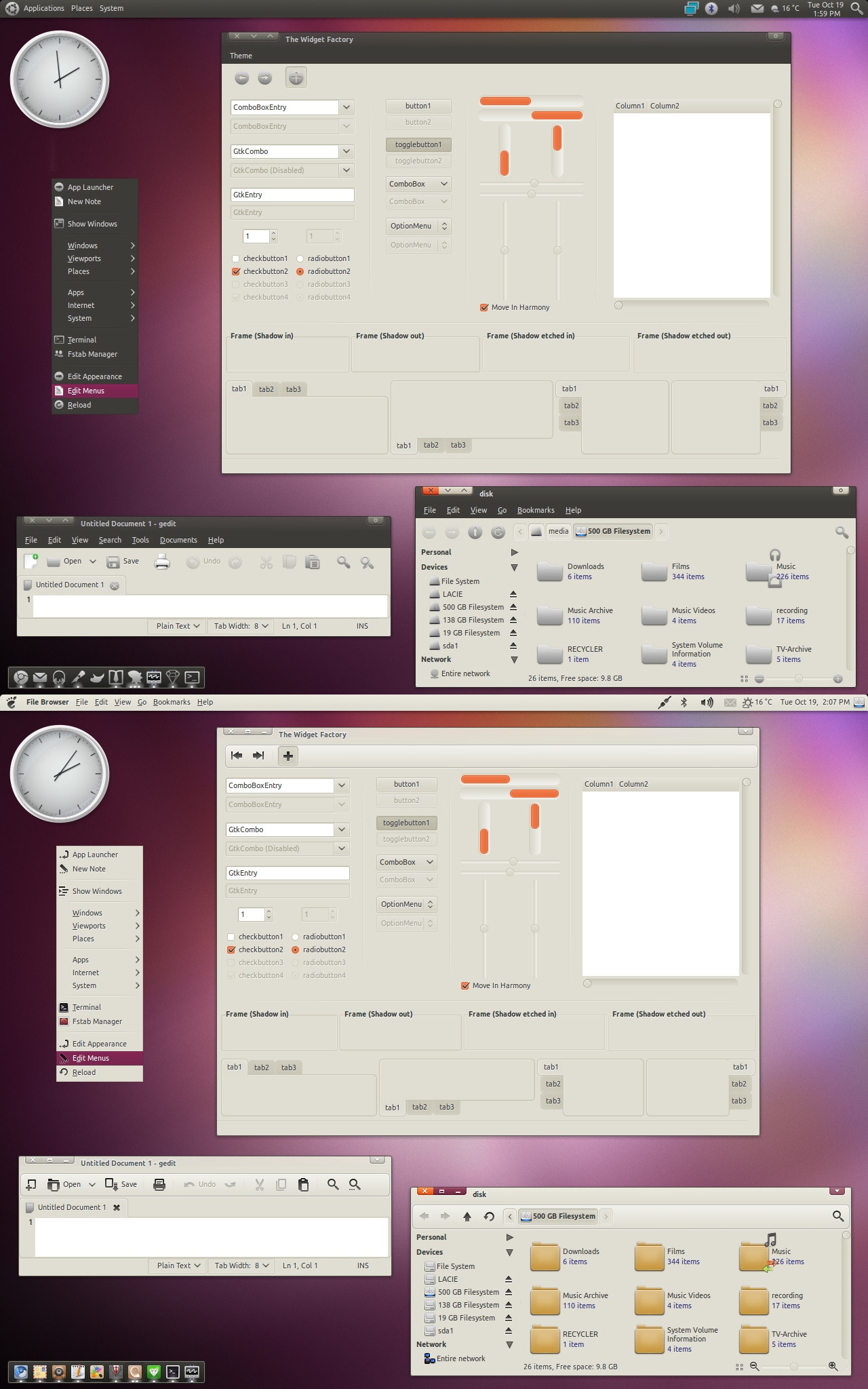
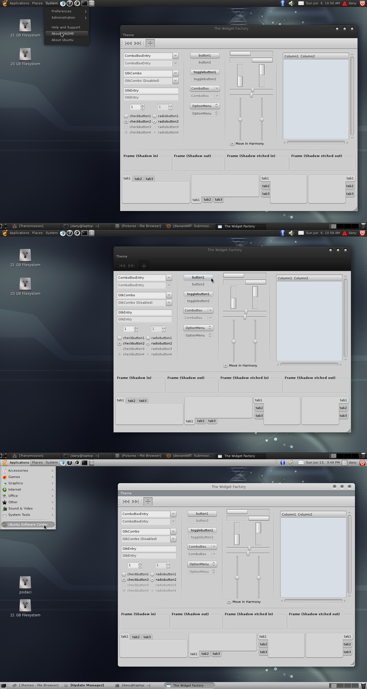
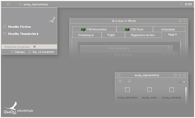
Ok this is not a new visual style; this is simply a mod of Nion Redux to include a compact start menu.Lassekongon 83 and Sakurakira designed Nion and Nion Redux respectively and all I have done is take a very nice minimal style and add a compact start menu.
Fonts include:
Tahoma, Calibri and Segoe UI and as seen in the preview graphite and black are the only colour options. I have tried to eliminate all bugs so hopefully none should be present if anyone finds any let me know and I’ll try and fix them
Related content


Comments: 25


Just a little glitch: the close button in small caption windows misses a few pixels on the right. For instance, can be seen in Miranda.
👍: 0 ⏩: 1
The above can simply be fixed by replacing the following in all the INI-files:
[Window.SmallCloseButton]
ContentMargins = -2, -2, -4, -4
with
[Window.SmallCloseButton]
ContentMargins = -4, -4, -4, -4
👍: 0 ⏩: 0
Nice style! Could you please make the active tab stand out more clearly, for instance by including a horizontal blue line on top of the active tab? In most tabbed browsers, it's not clear at all which tab is activated.
👍: 0 ⏩: 1

Hi there, thanks for the comment.
As i said in the comments above i did not create this style but rather just modified it.
In any case given my workload at the moment i have very little time to myself so any alterations will have to wait until i get some time.
If you could post a picture showing what you mean that would be great as i currently am not quite sure what you mean. If it is a quick fix i will gladly look into it. Otherwise it'll have to wait behind my real life workload
")
👍: 0 ⏩: 1
Hey, thanks for your reply!
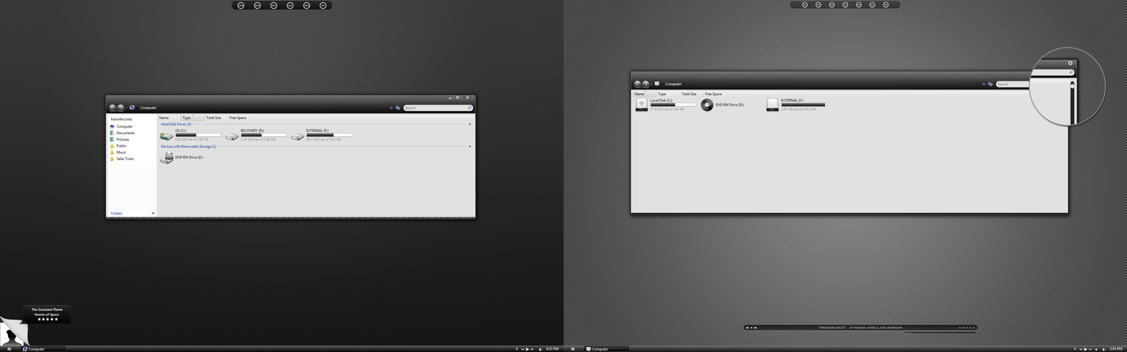
Here's a screenshot of part of my Opera installation with another theme (Nion 2 Green). As you can see, the green bar makes it very obvious which is the currently active tab.
[link]
In contrast, it's far less clear to see which tab is active in Nion Redux:
[link]
Get my point?
Thanks in advance!
Greetz!
👍: 0 ⏩: 1
Right, yeah i see the problem. I'm assuming you are using an opera theme? Because my opera actually has a blue background on my tabs and a nice red cross in the corner of the active tab.
I'll have a look into the problem see if i can find anything and if i can i'll tweak it for you, but you may have to wait until the weekend the earliest as I'm working all through the week
")
👍: 0 ⏩: 1
Well, I'm using the Windows Native "skin" in Opera...
👍: 0 ⏩: 1
Already fixed it with the tabs from Nion 2 Grey
 (Smile)")
👍: 0 ⏩: 0

thank you for the comment and fave
👍: 0 ⏩: 0

please tell me where i can find the wallpaper.thanks
👍: 0 ⏩: 1
the wallpaper was included in the zip. All you have to do is set your computer to tile the wallpaper and then right click and set the royal flower_3 file and set as desktop background.
Hope that helps
👍: 0 ⏩: 1


I used stylebuilder, but a lot of the work was done by the two memebers listed in the comments section above. All i did was replace the start menu.
👍: 0 ⏩: 0


This is very soothing. No clutter. Just a comp. Just the way I like it.
👍: 0 ⏩: 1
Yeh i like the compact menus a lot as well, normally for me using a nice minimal skin and then having a big start menu pop up isn't something i like. Since i liked this style so much i thought it would be a great style to convert to a compact menu. And i think the menu itself fits a lot better with the style (although this is down to personal taste at the end of the day)
👍: 0 ⏩: 1

Very nice and minimalistic, i like it. It reminds me the work of Greyhouse
👍: 0 ⏩: 1
Thanks, i hope you enjoy it, and if you want more minimal styles i highly advise you to check out lassekongo he has some great styles in his gallery.
👍: 0 ⏩: 0