HOME | DD
 7shadows — AI EXPANSION V2

Published: 2002-04-09 22:50:14 +0000 UTC; Views: 65988; Favourites: 178; Downloads: 17205
Redirect to original
Description
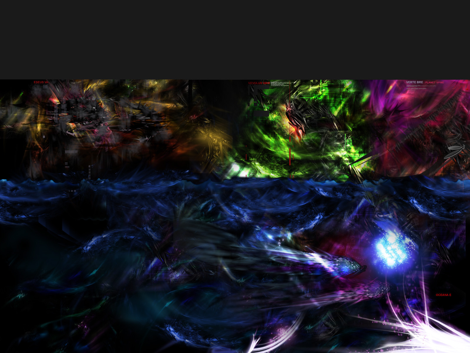
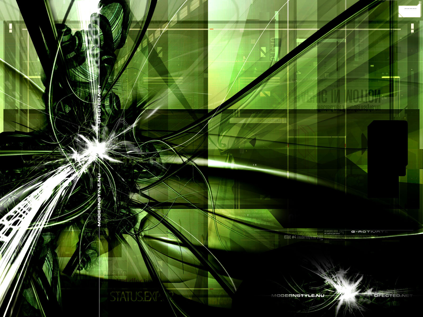
. reuploaded.// ALIEN-INDUSTRIES:EXPANSION V2 ::
This extended, reworked wallpaper version of my last submission embraces much more formally our desktop. By viewing the 1600x1200, you will find continuity to the hardcore artwork you have seen just previously.
++ Check out the first version: [link]
I would like to this opportunity to thank all for your warm welcome words.
Related content


Comments: 166

I don't like it, cuz you're whores and use your website to refer people to DA so you can inflate your view count and impress everyone, byotch!
God dang it... I wanna make this stuff, but I dont have the resources.
👍: 0 ⏩: 0


Only thing I can do is *once again* pick up my jaw...
👍: 0 ⏩: 0


awesome freakin' colors...everything flows nicely.
-----
~spectracide
https://spectracide.deviantart.com
👍: 0 ⏩: 0

wow... just wow!
that red sky is amazing! whole piece bursts of energy and comotion.... and those vivid colors make it look so post-armagedonysh
amazing!!!
-----
°°°Two people are needed to make a good piece of art: the artist and someone else to hit him on the head with a hammer when the piece is finished.°°°
👍: 0 ⏩: 0

Mad. Totally Mad. Reminds me of a technological Garden of delights. Twisted and torn into shape. Beautiful.
👍: 0 ⏩: 0

hmm, how come theres no DD on this yet?
i love this one, will add to favs now...
-----
-Falcon-
👍: 0 ⏩: 0

bzzzzzzzzzzzzz beam me up scotty!
HOLY SHIT!!!!!!!!!!!!!!!!!!!!!!!
THIS KICKS AAAAAAAAAASSSSSSSSS!!!!!!!!!!!!!
👍: 0 ⏩: 0

great !
the colors r so beauty
so cool ..
so mechanical and biologic ..
great !
DD for u man !!
-----
__________________________________
Brazil gFx power
__________________________________
www.zaphp.cjb.net
👍: 0 ⏩: 0

I have been a fan of your work for some time. I have even done a study of your website to learn how you fit it together so well. This is comparable to your other works.
The only thing bothering me about this one, is there is no distinct object of focus. This is only a personal preference, because the skill is amazing.
In your other works, there seems to be a figure entwined in the mechanics or some distinct object. Not complaining, just a personal preference.
-----
--Would you believe me if I told you I was a liar--
👍: 0 ⏩: 0

never cease to amaze me.. all your work is incredible keep it up man im always anxious to see something new from you
👍: 0 ⏩: 0

Whoa momma, that's one awesome looking WP! Looks all *Starcraft-y..okay, so i just made up that word. ~~!* Glad to see a WP that defies the norm, and something that doesn't have *trendwhore* written all over it...lol! XD~~! Thanks for sharing!
-----
---
I hope to hell that there isnt a :Sex for Dummies: book out....the last thing we need is to be teaching idiots how to reproduce...:
http://www.xquisite.net/~empyrean/ - Colorless//Sky
👍: 0 ⏩: 0


I like it a lot, the best point if the fact that you can see the horizon, makes itm uch better, adds more depth. I dont like the little text tho, in fact, I hate it....but you'd only care for the trendwhoreism anyways can you do one without little text?
they should make a plugin for ps, that automatically makes the lil text
saves you a lot of work!!!
now back to the comment...mm yeh I like the colors, esp the green it makes it looks really fresh. the purple sky is good alien=ish.
-----
----------------------------------
- - - - - - K I P T O N - - - - - -
👍: 0 ⏩: 0

great, look what you made me do now I gotta clean the lick marks off my monitor
bad ass awesome job
my new wallpaper
-----
art has a habit of turning bad
👍: 0 ⏩: 0


outstanding job once agin. Amazing. Favs
-----
:::::::Todd Cook::::::::
Hardcore Junglism...
👍: 0 ⏩: 0


This is much better...
The other one doesn't look like a wallpaper...
Both are amazing show of skills tho..
-----
Axis000
-http://www.axistrizero.i-p.com
👍: 0 ⏩: 0

whow - that is really gooood stuff
-----
~TigAEr https://tigaer.deviantart.com/gallery/
~.:see-to-feel:.~
👍: 0 ⏩: 0

Wow shadow, you jsut keep coming back with this amazing work. I have no idea how you can do it, i mean you need to be hella creative to pull these colors off, and its perfect, definately a favorite, and devpack. A++.
-----
Check out my work - https://gawd.deviantart.com
👍: 0 ⏩: 0

this is purely incredible. Not many people could pull off a design with those colors and still make it look as nice as that. Your shadowness.com is one of the most elite websites I have ever seen. You and your collegues are an inspiration to all of us fledging web designers. Keep up the great work.
~Nuformz
👍: 0 ⏩: 0


oh my god, this one's insane, so much better than v1! One of my all time favorite wallpapers at this point, we'll see if it stands the test of time ::sets as wallpaper:: I have a feeling it'll be on my desktop a while
-----
I Are Ninja!
👍: 0 ⏩: 0

I like this even better than the DD. Great detail and nice colors.
-----
Support the :camera: emoticon - https://www.deviantart.com/deviation.php? id=176875
👍: 0 ⏩: 0

Thank you so much for making this high res!
-----
ALF IS GOD!!!!
.
http://www.Zeigual.com
👍: 0 ⏩: 0

hmmmmm, why is there always those 2d work?? it would be much better without this!!
Just only my opinion...
nos
👍: 0 ⏩: 0


great colors and technique. using this baby right now
👍: 0 ⏩: 0

oh my... this is amazing. you have played with really nice colors. the details are awsome. i must heve this. this is with my favorites now and i'm gonna use it
-----
> mikkeh
👍: 0 ⏩: 0


the colors flow which is a good thing
-----
Wo0T!
Dont Mock Me https://Mock.deviantart.com/
👍: 0 ⏩: 0

It would be completely TOO cluttered if it were not for the letterbox format...good work for the trend, but ...
-----
Fortune favors the Bold...
👍: 0 ⏩: 0

i shouldnt even comment because the comment would not do the work justice. simply amazing. the color choice is brilliant as well as the abstract work. great work. would love to see even more of this type of stuff.
[click here] https://-lk2183.deviantart.com
👍: 0 ⏩: 0

Great WP! I love it! Awesome detailing. Also the colors are very original, great composition. Very trendy, but I love this style. Great work! This is going straight to my favorites.
-----
If hypothetical questions make you nervous, what would you say?
👍: 0 ⏩: 0


This is one of the best things I've seen in last few days!
Congrats to u, it's great, nice purple clouds..
..d..
👍: 0 ⏩: 0

Love the clouds, other than that well, yeah, I agree with the rest of everyone's comments.
-----
--
_Saige
_Zero
👍: 0 ⏩: 0

Whohohoaa ... genius colorwork, very much details, good typo ... aehmm ... okay I dont wait ---> Favs !!!
👍: 0 ⏩: 0

i uh....wow. not sure what to say...wOW. you've outdone yourself here.
Wow.
what jark said.
and
wow.
👍: 0 ⏩: 0


ooohhhhhhhhhhhhhh yessssssssssssssssssss
just about says it for me..
Whens the next ????
👍: 0 ⏩: 0

Nice... it's cool that you used more than one colour, and I especially like how you took something that's normally considered abstract and created a landscape out of it. Very well done!
👍: 0 ⏩: 0

i'd say their kinda good and still fucked up boring i used the other one for a wallpaper but it made me yawn after 4 hours :\
-----
[nec]
👍: 0 ⏩: 0

I can`t tell you how much i admire your work! .....just cool!!!
👍: 0 ⏩: 0

can't decide which version is better, but i love both of them!!!
👍: 0 ⏩: 0

wow..mad tight dude... amazing... and the name makes sense... i can see what you mean...
peace
-----
»Waledawg http://waledawg.forsaken-youth.com
👍: 0 ⏩: 0
| Next =>