HOME | DD
 8088 — 12

Published: 2005-06-28 05:28:54 +0000 UTC; Views: 1650; Favourites: 32; Downloads: 150
Redirect to original
Description
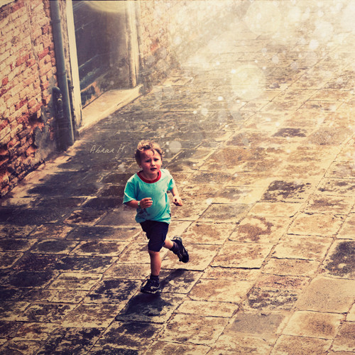
Hope you like it. (Smile)")
Related content


Comments: 13


oo i really like this. love the oldness that it has, the colors and the texture.
great shot.
---cameradude---
[link]

👍: 0 ⏩: 0

when the number go down...
good photo man, good flog
saludos!
👍: 0 ⏩: 0

12 sayısındaki eğiklik çok şey katıyor fotoğrafa.
çok farklı yerlerde çok farklı şeyler hissettirecek türden bir çalışma olmuş.
çok beğendim. tebrik ederim.
👍: 0 ⏩: 1

Yaşadıkları hayatın küçük bir özeti aslında o eğik 12 sayısı. Güzel yorumun için tekrar teşekkürler Doruk. Görüşmek üzere.
👍: 0 ⏩: 0

Far out.
I LOVE it. That green, the composition, the numbers.... such punch!
👍: 0 ⏩: 0


züper olmus. renkler süper. ayrica herkese farkli duygular yasatabilcek bi fotograf
👍: 0 ⏩: 0

I like it alot.
The contrast works really well. I like even though its run down the colours aer still bold and stand out
👍: 0 ⏩: 0

yes very much like it.. the color and the placment.. very nice
👍: 0 ⏩: 0

Just when I was starting to think it was impossible to find good new art on the frontpage...
Very cool shot, great textures (obviously) but an even better composition. My glance at the thumbnail had me saying "wow" and after opening it I wondered if you should have given the 12 more room on its corners. On second thought, nah, leave it as it is, it gives the composition a slighty unsettling feeling and keeps the scene from becoming too static. It's amazing how much that little yellow flake on the bottom right adds to the composition. I like.
👍: 0 ⏩: 0