HOME | DD
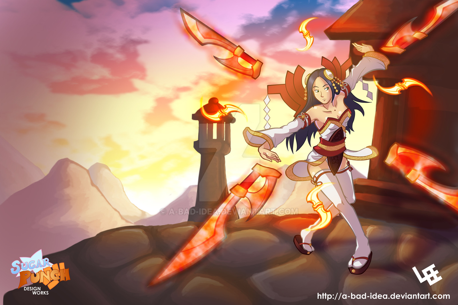
 a-bad-idea — Kida Color Practice
by-nc-nd
a-bad-idea — Kida Color Practice
by-nc-nd

Published: 2013-04-03 21:49:05 +0000 UTC; Views: 2240; Favourites: 90; Downloads: 49
Redirect to original
Description
More color practice, featuring the protagonist of Path of Twelve, Kida Maraviss. I don't seem to draw Kida often, which confuses and shames me, because I really like her.Related content


Comments: 10

is this "Path of Twelve" a television show or is this a creation of your own?
👍: 0 ⏩: 1

It's my own creation. I haven't decided what I want it to be. Tentatively it's going to be an animated web series, but I haven't made any set plans yet.
👍: 0 ⏩: 1
looks awesome so far, great technique and all.
👍: 0 ⏩: 0


Wait a minute, a female without an overly curvy figure AND isn't a Loli?! Good sir, I think you just defied the laws of the Internet Artist! D=
Okay okay, all joking aside, this is a very nicely done drawing. The design in solid enough, although the "neck collar" design always bugs me on female characters for some reason >-> The hands might be a tad big as well, at least relative to the rest of the body .o. The pattern on her wings should also be less "strait and smooth" looking, especially if the wings are composed with feathers. A more "ruff and sharp" style will defiantly make it blend better, since in it's current state it feels very "layered" on. (although I do appreciate the attempt of the Sharp&Ruff style, as it is clearly evident) The cleavage window with her top seems a taaaaad unnecessary as well, but then again what do I know? -3-
I like the more sketchy-line style with this, I find it really appealing for badass or action pictures. Like, as if the lineart itself if going "Oh crap guys, stuff is going down HARD D=". The coloring is nice as well, although a bit washed-out looking, but that could just be the character's design. Which, in itself, is pretty nice. Defiantly a rougher, warrior female vibe going on. Similar to a huntress or "glass canon" warrior. Shading is pretty nice too, lots of smaller details in it (like the gradual solid shading and a few bright shades of highlighting). You got a pretty darn distinct style going on =3 If I saw it in a pile of other drawings, i'd be like "Well, that's obviously ABadIdea's work o3o". Overall, it's a solid drawing. A few tweaks here and there would make it really good in my eyes, but hey. I'm just your amateur, lonely artist at the back corner of DA and Tumblr, so what do I know? XD
👍: 0 ⏩: 1
Thanks ")
👍: 0 ⏩: 0

Nice action pose.  (Smile)")
👍: 0 ⏩: 1

Thanks
👍: 0 ⏩: 0