HOME | DD
 Aaron-R-Morse — Down the rabbit hole
by-nc-nd
Aaron-R-Morse — Down the rabbit hole
by-nc-nd
Published: 2013-09-02 06:01:54 +0000 UTC; Views: 1833; Favourites: 92; Downloads: 0
Redirect to original
Description
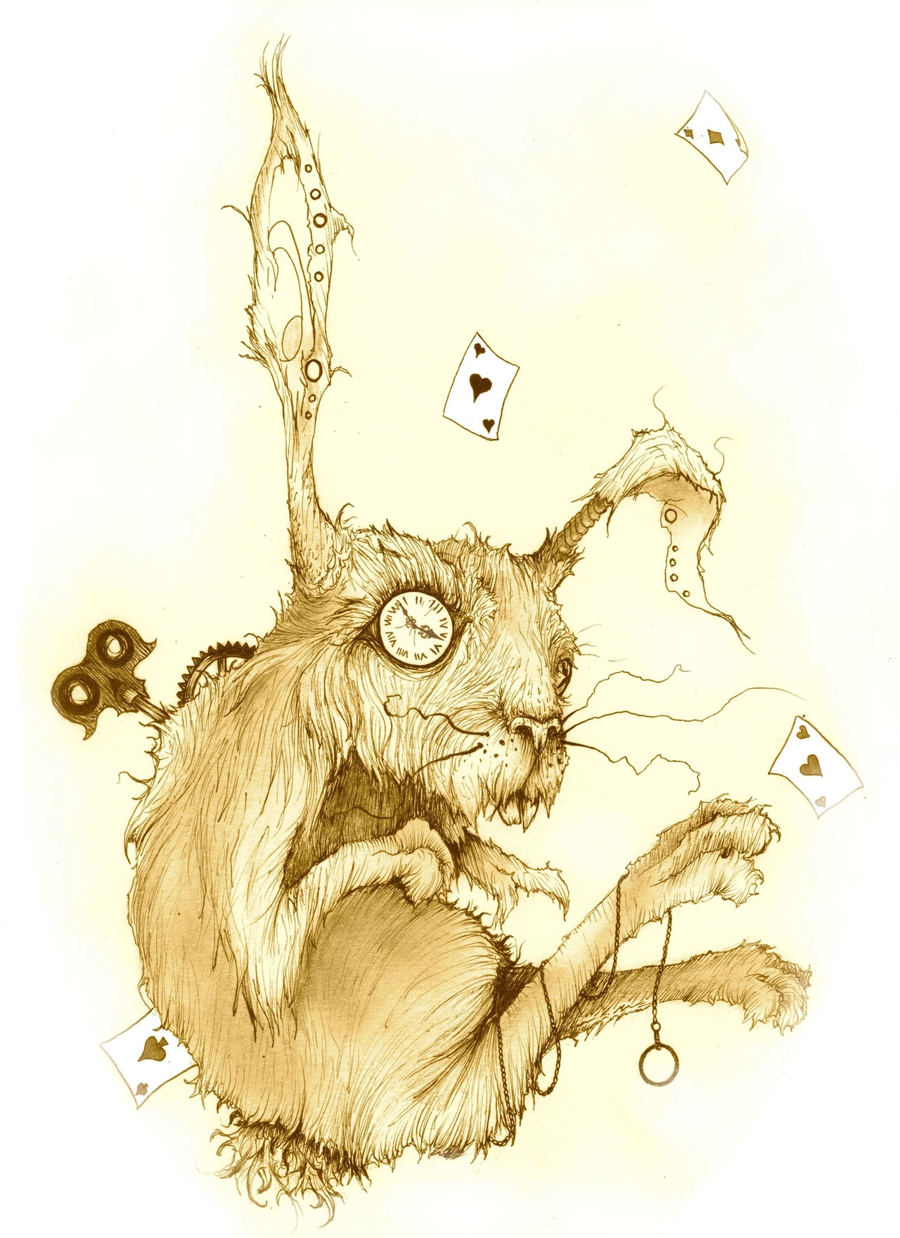
One of my personal twists for Alice in wonderland. for the wonderland theme I seem to enjoy keeping it rough and sketchy. Brown and gold watercolor pencils were able to achieve a light gold sepia, with a little enhancement to keep it nice and clean on the computer. Mostly just playing with High contrast.Related content


Comments: 11

If you do not mention is watercolor I admit it was hard to guess... still I know that looking at a watercolor paint in reality is very different when you transmit it to digital ( scanned), the colors are so light that you must enhance them. Still I really like this and I bet it can be a wonderful experience to see it in reality (not in the computer). 

👍: 0 ⏩: 2
Thanks for such a deep response... It seems you really enjoy art as me. Please take a few minutes to watch my gallery and maybe comment what capture your interest, have a great day!
👍: 0 ⏩: 0

the great thing about watercolor pencils that i love is I can get a smooth color without any watery look, or make it look like normal water color paint, all based off how much water is used. Yes, obviously, for digital purposes it was enhanced just to give it back the boost it lost in its scanning, and by habbit, I clean it up a bit. Tends to look pretty digital, original is a little less gold and more brownish, yet that doesnt matter to me. I dont usually pay much attention to what all I use, I just try to capture what I originally visioned. I still like to keep things as real as possible, but without a bit of smoothing, the tint faded in just the wrong places.
For some, yes MUCH better experience in person, for this one, I particularly like the edited scan more.
thank you.
👍: 0 ⏩: 0


Awesome interpretation - looks adorable and disturbing all at once, love it!
👍: 0 ⏩: 0


This is so cool. I love the sepia colors. And once again I immediately knew this was a work done by you, you've got a great style. ^^
👍: 0 ⏩: 1
thank you yet again. this will be my last of the sepias for a little bit, I have a few more pen & ink And watercolors to push out.
👍: 0 ⏩: 0


wow! Love this! Definitely agree with you on keeping it sketchy...It's an old book, like seeing it look vintage. The key on the back, and the watch face are impeccable!

👍: 0 ⏩: 1
thank you. I worried a bit about how I left the style. Was a little afraid it look rushed or incomplete. and solid white was too simple.
👍: 0 ⏩: 0