HOME | DD
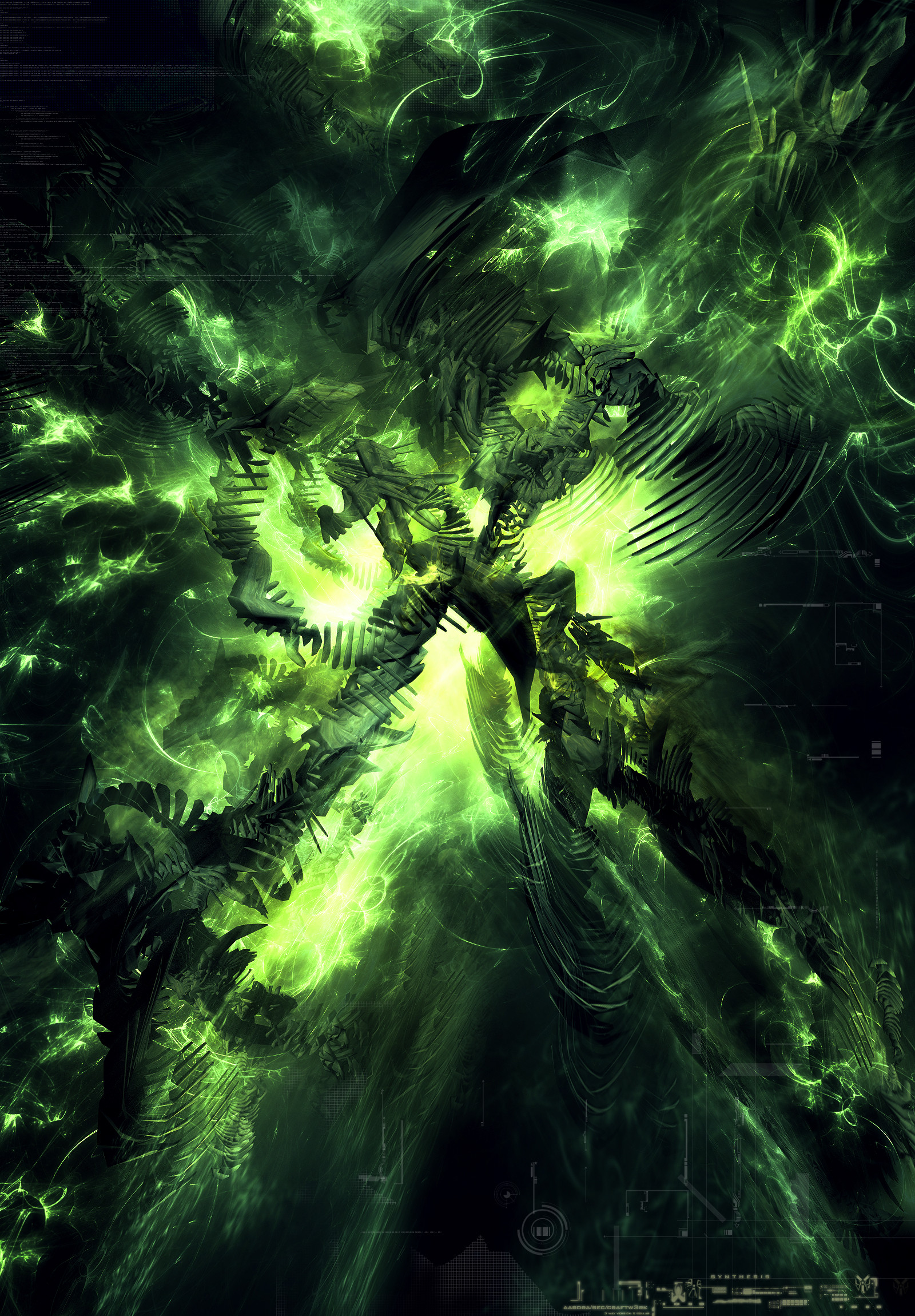
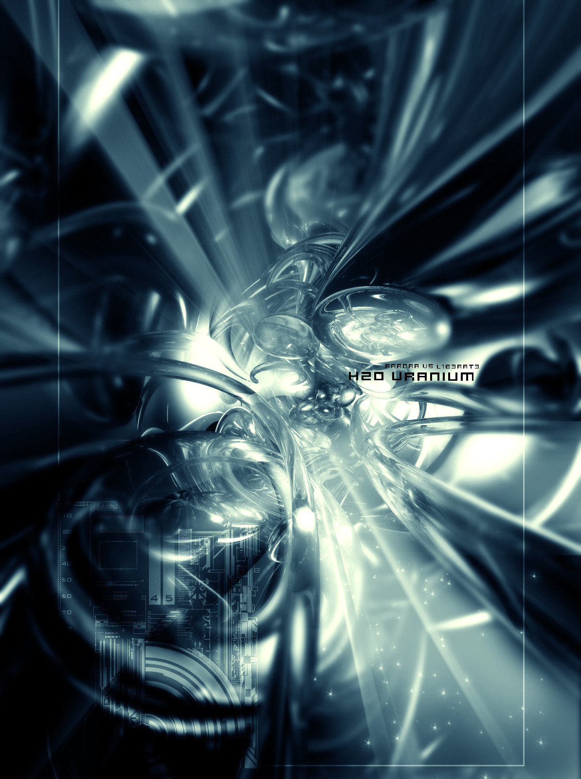
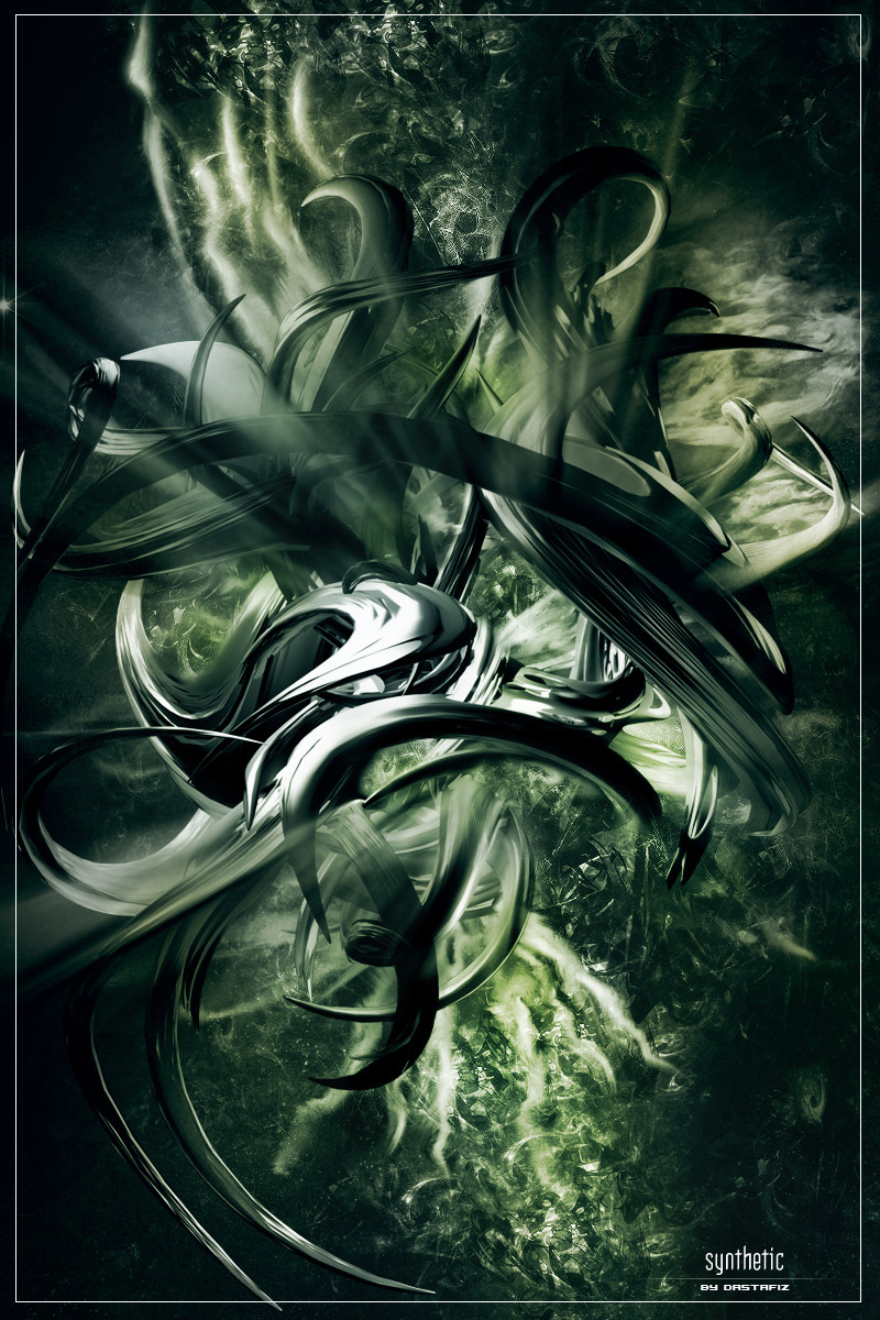
 aarora — s y n t h e s i s
Published: 2003-11-11 19:36:39 +0000 UTC; Views: 1601; Favourites: 45; Downloads: 802
Redirect to original
Description
vs vsWell this was really suppose to be a collab with me and craftw3rk, but it was kind of plain so i gave it to sec, so it became like a 3 way collab. It was funning doing this and it was great working with these guys.
Please full view this one
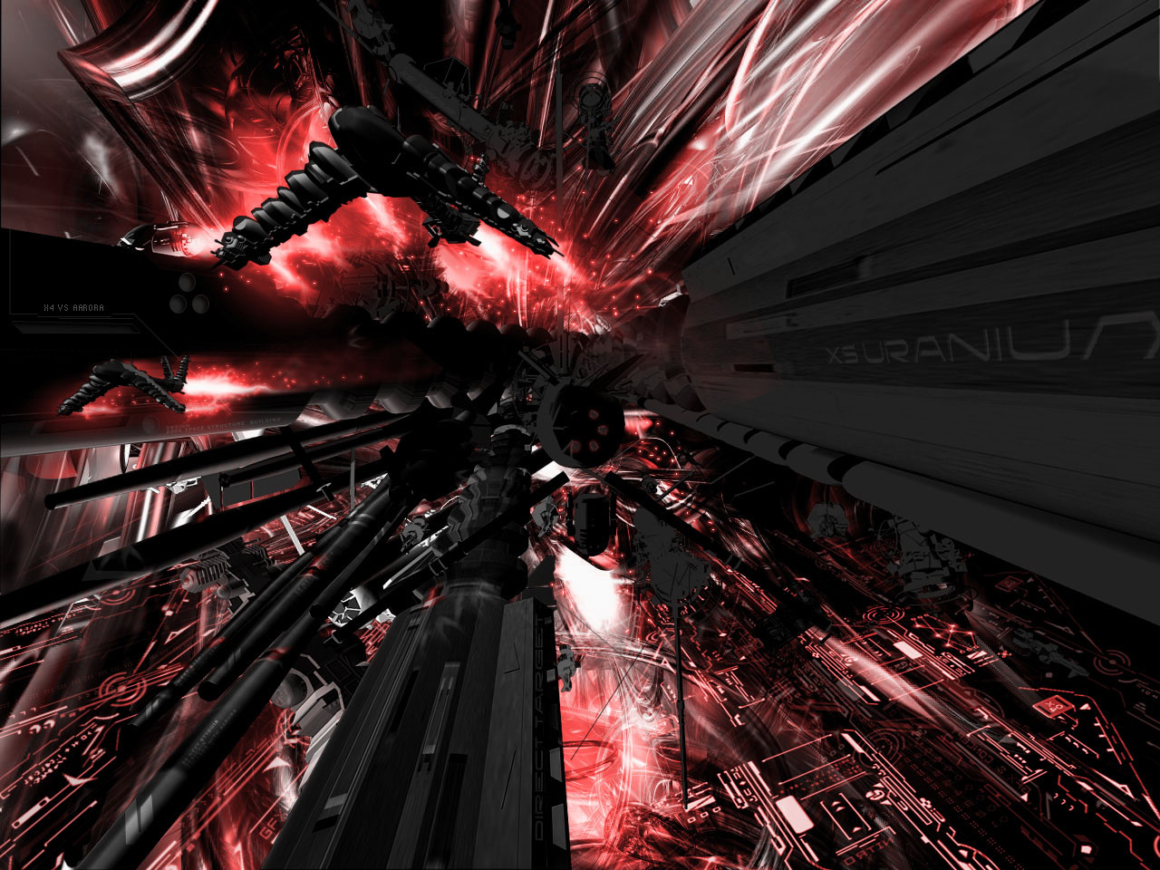
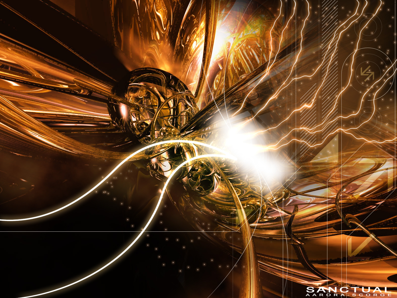
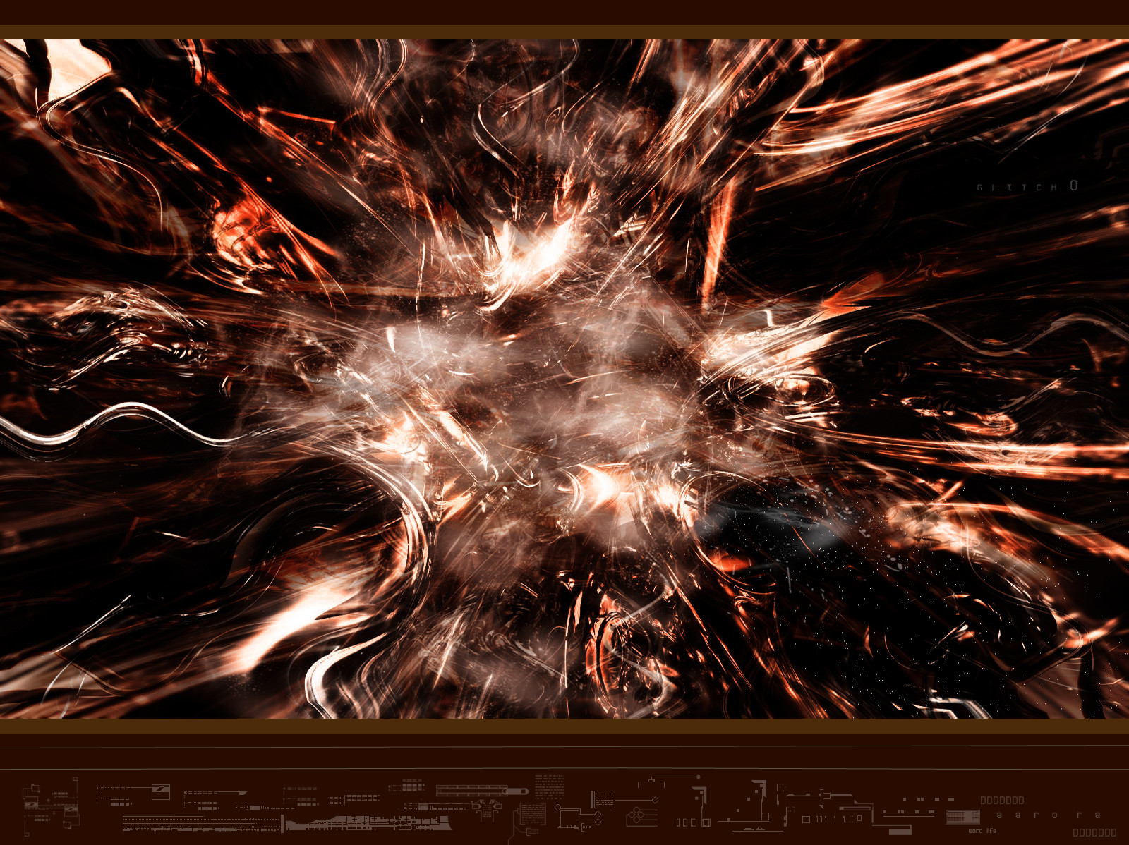
Related content


Comments: 59


Very nice render.. Is that Apop brushing in there? I hope not..... As has been said.. leave out the 2d next time.. and the whole piece needs a focal point.. For 3 such talented artists I think this piece could have came out much better...
👍: 0 ⏩: 0


why do the 3d artists like this always do a vs. thing
👍: 0 ⏩: 0


i love the curvey 2d brush work looks awesome. nice colours
👍: 0 ⏩: 0


Whoa.. this is very nice. The colours.. I love them. Green is so fresh and makes me feel the spirit of this work.. ^^
👍: 0 ⏩: 0

crazy amazing renders some nice APOPH! burhsing lol
keep it up+FAV
👍: 0 ⏩: 0

Nice job.. I like the green and those light brushes.. This kinda reminds me of halo
👍: 0 ⏩: 0

so much detail.. ")
i don't like the text and the grids all that much tho..
👍: 0 ⏩: 0


wow sexy green brushwork.. and i hate green... its sick. in any event, the renders could use some more texture to give them a sense of life, being that they are in this environment of swirling energy. the composition, sense of depth, and the actual 3d forms are all top notch work, great stuff you guys.
👍: 0 ⏩: 0

Wow. I mean--just...WOW! This really blows me away. Yeah, its not perfect, but the initial impact for the viewer is priceless. I'd like to see this piece printed on like 8'x8' glossy photo paper or something.
Anyways, I think the 2d elements are well done and are incorporated well. The green lighting swirls and flashes are really pretty astounding. The rendering is well done in places but does indeed feel a little lazy in others (center right, down a little). I wish that the "objects" werent as opaque...they need to be more solid to really pump up the feeling and depth in this piece. I think that's the largest problem--there seems to be a "haze" that interferes with the objects here--it really flattens out that space. I like the commitment that happened with the green here. Its a strong piece overall.
Kudos to you three!
👍: 0 ⏩: 0

wow this looks amazing i have always wanted to do something in with the color green and u guys pulled it off nicely
keep it up
👍: 0 ⏩: 0

yes great renders only some other colors just much contrast
👍: 0 ⏩: 0

")


This just feeds my green addiction all too well.
Amazing to all of you.
The main structures and choice of layout for them, I feel, is so choice. I looks like electric current charging through all of these conduits.
I agree that the 2D could be less random, but the dot grid is a nice effect.
Overall -- Gorgeous GreenZ!!!!!
👍: 0 ⏩: 0


awesome work guys!!!!! really like the lighting here.......well done...
 (Wink)")
👍: 0 ⏩: 0


Superb lighting, tho I would have liked to see some better 2d, perhaps different color 2d and lower opacity in some area's. Overall great work you 3, keep at it.
👍: 0 ⏩: 0

great piece bro, cool collab 
👍: 0 ⏩: 0


not bad at all guys... great colors and focal point... maybe just a bit to green though.... and the 2d couldve been far better... other then that good work
👍: 0 ⏩: 0

I like the 3d the most in the this piece. I think so solid critques have already been said. The 2d doesnt seem to fit too well for some reason. Dreamwa1ker makes the most valid points though. Not saying it sucks, It think it looks very cool.
👍: 0 ⏩: 0

will you just turn the stupid quality down though, theres no need for a 4meg file
👍: 0 ⏩: 0
holy crapness! thats awesome!!!
👍: 0 ⏩: 0


")

nice work guys...i really like the colors in this one..nice renders and 2d...thats a +fav for sure  (Smile)")
👍: 0 ⏩: 0

OMG!! you guys are awesome!! I think that's the coolest green i've ever seen... definately a
👍: 0 ⏩: 0

Hmmmmmmmmmm Big file .....I'm not sure how to comment here ........OK its a 3 way collab .so I dont want to offend ,But I can see some real genius in here and also some lazyness with post render cleaning up ( lottsa jaggies)..............Likes: great colour,nice bottom layer render ........thats where the post PS laziness creeps in tho . Lighting I like ............Most of all I like the top layer render centred around the middle of the image ......Dislikes: 2D ...........and basically a lack of focul point to the whole piece .........I wish I had the skills to produce the three renders that I think make up this piece (I suspect more) and have the oportunity to work on them ..Overall you are 3 real talented Guys (and I wish I had your skills), But I think this could have turned out a lot better ....................Thats the most Brutal crit I done to date ....But for Guys as good as you I push all the harder ....Thats what makes me work harder is good crit ........I got turned down by an art group that I know one of you is a member of...........and I take that on the chin and take it as excellent critique ..........I'm glad that happened .It just makes me feel that I have something to strive for and improve , in order to be accepted as a member ..and I thank that person for that ............Over all guys an excellent piece of work .........................
👍: 0 ⏩: 0

very nice, I love the renders, very nice brush work, and great colour choice, good job
👍: 0 ⏩: 0

the 2d isn't very inspiring, what is it, really? The only bit which grabs my attention is the 3d, because of the detail, but you should really concentrate on what the intentions of the image, what you where trying to make the viewer feel or think
👍: 0 ⏩: 0


Looking good, render and brushing are nice...
dot like the 2d though work on that

👍: 0 ⏩: 0

nice... i'm really like the green burts of light at the top.
👍: 0 ⏩: 0


holy shit the brushing on this peice is crazy sweet the 2d does ruin but this is still a great piece
👍: 0 ⏩: 0

the render and brushing, colours are nice...some 2d on the right is nice..
but the 2d top left spoils it.
overall good effort
👍: 0 ⏩: 0
| Next =>