HOME | DD
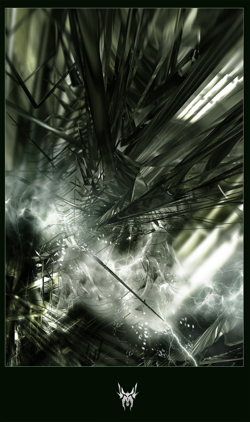
 aarora — co_existence
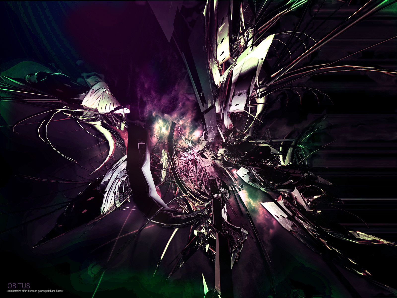

Published: 2005-01-05 19:48:58 +0000 UTC; Views: 859; Favourites: 13; Downloads: 259
Redirect to original
Description
First piece for 2005. I thought of making this a week ago but never got time till Monday when I started to render some stuff in cinema4d. I actlly liked the way the render turned out so went to photoshop to play with it and come out with these reults. Thanks to Xianex for helping me without the name.Please Full View
Related content


Comments: 20

pretty wicked render man..
looks like a ship or something made of thing "bars" or so...
very chaotic render in itself.
not sure about the blurred areas, but the colors in this are pretty kewl.
not one of ur best, m8, but still not bad
mP
")
👍: 0 ⏩: 0

First thought .. looks like a jail in space ...  (Smile)")
 (Wink)")
👍: 0 ⏩: 0

cool.. i like.. not a big fan of the blur.. but everything else looks slick
👍: 0 ⏩: 0

Wow. I was looking for dark. And I found my dark. Definitly a


👍: 0 ⏩: 0


nice work bud, liking the render and colour, looks good without brushing but maybe could have added some light work for extra effect
👍: 0 ⏩: 0

nice render and excelent colors but maybe some brushing
👍: 0 ⏩: 0

looks good to me...but maybe u could add some brushing/lighting.
👍: 0 ⏩: 0


I don't know, it's alright. It seems a typical abstract rendering. It just seems like that's done a lot. But it does look good for what you have.
👍: 0 ⏩: 0


great render m8!! it would looks even more good with some brushing just what i thought,
Great piece overall m8
👍: 0 ⏩: 0


very nice tone of colors, maybe too much 'long' objects for me, but that's just imho lol
good work bro
👍: 0 ⏩: 0

maybe some brushes? it's looking good
👍: 0 ⏩: 0
