HOME | DD
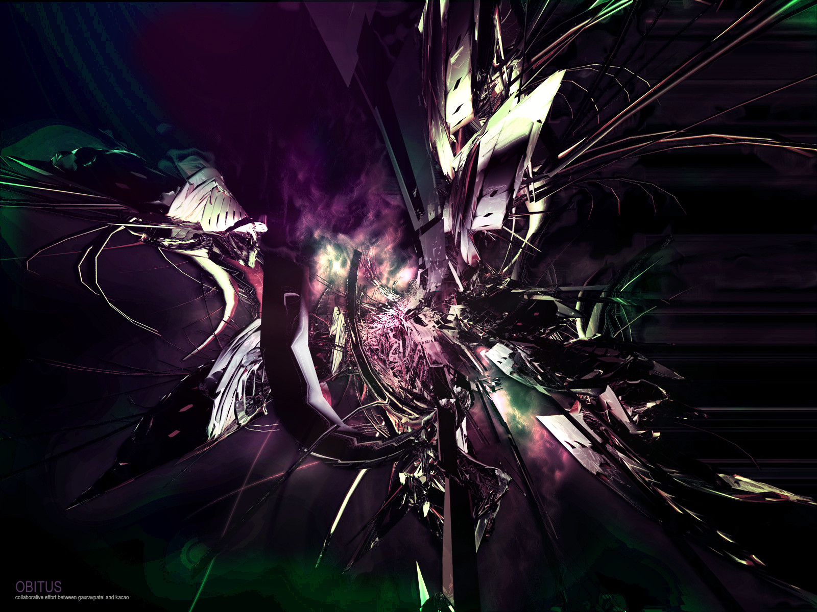
 gauravpatel — OBITUS
Published: 2004-07-06 19:30:53 +0000 UTC; Views: 419; Favourites: 4; Downloads: 345
Redirect to original
Description
Now go and watch this dude already.
Hit the download link to get a slightly different version.
Related content


Comments: 20

Are you in need of man-loving today? :*)

👍: 0 ⏩: 1

i ALWAYS need loads of that.
👍: 0 ⏩: 0

love the way it crunches in the middle and the color scheme you gave it. ^^ very cool ideas come from you.
👍: 0 ⏩: 0

This is awesome hun. I love the colors, i love the design, i love everything about this. I dont know why, but it amazes me when you do these things because i would never be able to do something like this.
It almost looks like its all coming from a distant peice in the middle of the artwork that you cant see. But its there somewhere. It makes me think too much.
Maybe i shouldnt rant about this because then i'll sound like a crazy person.
awesome job.
<3
👍: 0 ⏩: 0

all this stuff is happening!!!!!!
all this stuff...
okay, awesome. the colours = awesome. and there's a lobster at the left hand side. Eat it!

👍: 0 ⏩: 0


If I know you did this abstract stuff, I wouldn't have added you to my devwatch.
I like the colour scheme in this, it's a pretty unusual combination. Can't really comment on anything else.. Except that the thing on the left side looks like a fish.
")
👍: 0 ⏩: 0


i like the cold colour combinations going on there.. makes the whole piece feel supernatural, or machine-like? the render looks both a mixture of mechanical and organic. the misty/electromagnetic bit in the near center is the best part i feel. the detail in that area is great  (Smile)")
👍: 0 ⏩: 0


i'm loving the green and purples - they work so fantastically together.

👍: 0 ⏩: 0

I like it! and you know what? I like the colors..not very used but different and i like them . Good work you two
👍: 0 ⏩: 0

Talk about one cool piece. Just how cool is this?
It's now my background
👍: 0 ⏩: 0

Nice work with all the elements of the pic, they just don't flow together very well.
")
👍: 0 ⏩: 0


Hopefully the pixelation and noise of it was part of the original plan, colors could be better but still an overall good peice.
👍: 0 ⏩: 0


