HOME | DD
 aautio — Duel of Morgoth and Fingolfin
Published: 2005-10-27 21:24:36 +0000 UTC; Views: 11365; Favourites: 95; Downloads: 880
Redirect to original
Description
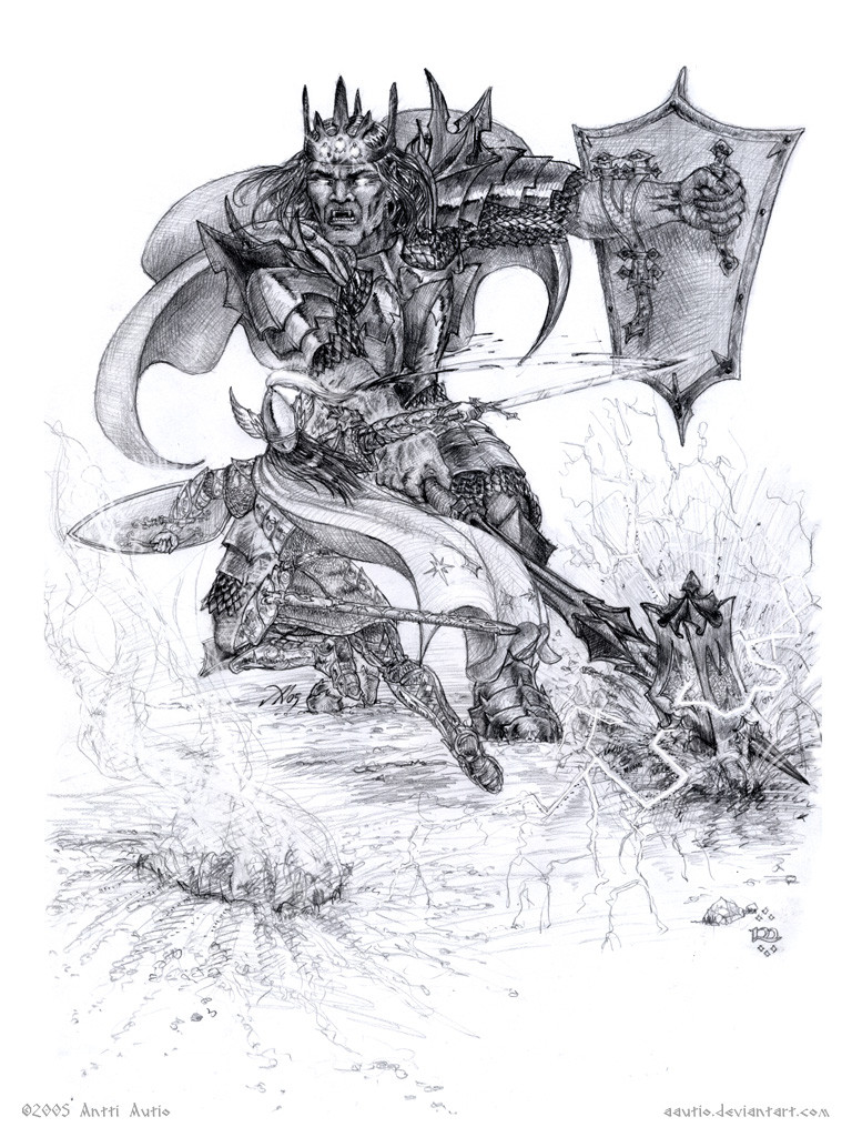
”Then Morgoth hurled aloft Grond, the Hammer of the Underworld, and swung it down like a bolt of thunder. But Fingolfin sprang aside, and Grond rent a mighty pit in the earth, whence smoke and fire darted. Many times Morgoth essayed to smite him, and each time Fingolfin leaped away, as a lightning shoots from under a dark cloud; and he wounded Morgoth with seven wounds, and seven times Morgoth gave a cry of anguish, whereat the hosts of Angband fell upon their faces in dismay, and the cries echoed in the Northlands.”- J. R. R. Tolkien: The Silmarillion, chapter 18: Of the Ruin of Beleriand and the Fall of Fingolfin
The Duel of Morgoth and Fingolfin (couldn't fit all this in the title field -- isn't it annoying the title has to be so short?)
Here's the last of the three Tolkien sketches i made last week (actually it’s the first, but I saved it for the last, because I knew it was going to be the most arduous..).
One of the most memorable moments from the Silmarillion and one of my favourites, even if reading it always makes me sad..
While making these Tolkien illustrations I don’t want to see any references but rather delve into my mind and try to find my own view.. still, it’s plain to see I’m heavily influenced by everything I’ve seen before.. In particular, I remember having a Tolkien calendar illustrated by Ted Naismith (or something like that) a long time ago (might’ve been the calendar of the centenary year of ’92, but can’t remberber for certain. There’s this image of Fingolfin’s challenge and Morgoth is wearing a shirt that’s made of something that lookes like black dragonscales. I haven’t seen the pic in years, and I didn’t want to look it up now.. but that’s something that my mind goes back to every time I think of this scene.
So I think my Morgoth owes a lot to that painting. I wanted to draw his face, because I think just a helmet or something would be too anonymous and could not really contain the true evil he characterises. I picture him as a kind of a giant vampire lord with both elven and orcish features. His equipment I wanted to make fitting for his self-proclaimed status as the King of the World – decorated but still looking kind of evil.. like I really wanted Grond to look like something that’s bound to hurt if you get in it’s path!

Fingolfin wears what I imagine elven armour looked like: light, intricate plate over a fine scale mail haubergon
This one’s definitely my favourite of the three.. though it should be too, since I worked on it a lot longer than the previous ones. I really wasn’t supposed to finish this yet since I should be busy writing my thesis, but still I put 6 hours into it today
 bringing the total spent on this close to 8. Uff.. too much for a pencil piece. I must say I’m really happy with it, though!
Sepia version here: [link]
EDIT: Better scan
Related content


Comments: 29

this too is one of my favorite just like the oath of Feänor son's and their fight for the Silmarils!!
👍: 0 ⏩: 0

Re-reading the Silmarillion for the first time in years, and I must say this is my favourite part in the entire LOTR series, I think.
👍: 0 ⏩: 0

I must say that is one of the best (if not the best ) drawing of the fight between figlolfin and morgoth bauglir.It is one of many moments in the book that is filled with tragedy and surrow.Nontheless you really made a good piece of art.Btw the sepia variant is very good too,it is somehow easier to distinguish (spl?) them from one another.
👍: 0 ⏩: 0

Amazing one you really have the pencil skills to draw a comic book 
btw. Great gallery
Dries

 (Wink)")
👍: 0 ⏩: 0

I think I like it the best of your works, sepia version is also beautiful. I love your Grond, somehow I always imagined it as a square-shaped ordinary hammer ")
oh, and you should send it to some Tolkien clubs on DA, if you haven't already! *tolkien ~Silmarillion-Club ~the-silmarillion
👍: 0 ⏩: 1

Thanks a lot! I never thought elven armour looked much like Medieval knights armour, but something more light.. I think i got the idea for the segmented structure partially from the LotR movies, even if the armour looks otherwise quite different. And I had never given Grond's looks much thought, but when i started drawing it i figured it deserves to be something else than just a big hammer..
 (Smile)")
👍: 0 ⏩: 1
"big hammer" - that was excactly what I imagined 
👍: 0 ⏩: 1


Beautiful pencil work, your hading technique is great, I love it
👍: 0 ⏩: 1

Holy sweet detail work o.o


👍: 0 ⏩: 1
Thanks!
👍: 0 ⏩: 0


ohhhh man... that weapon.. and the steaming hole it left... and the electricity coming off of it!!! Great job!! The poses are really awesome, and the attire, and everything about it... just awesome... Awesome work!!!
👍: 0 ⏩: 1

ohh wow! one of the most depict scene from Silmarillion ^^......well, your work is wonderfull as always...
You have drawed Morgoth very very very very well!**, the action is perfect!** and Fingolfin armor is amazing!!!!!!
I repeat...VERY GOOD WORK!!^^
well, I have to say you goodbye now.....
see you in the next week^^
👍: 0 ⏩: 1
Grazie mille!
One thing that bugs me now that i look at it, is that perhaps Fingolfin's cloak should go over the scabbard.. there's something off with the scale/perspective there. I might touch it later but not now..
ok, namárië!
👍: 0 ⏩: 1
uhm, I don't know...I didn't see something strange Oo
ehm, sorry for the short message....but I'm very tired...I destroyed myself in those days ahahahahah
namarie!
👍: 0 ⏩: 0

O_O Definitely my favourite of the bunch... just for the wicked Grond and armour!! I love the energy coming from this one; the amount of detail is profound, and it's giving me goosebumps.
👍: 0 ⏩: 1
Thanks! 
👍: 0 ⏩: 2
I agree! Fire and smoke... it's been done. But Electricity adds a little more life to it, I think.
👍: 0 ⏩: 1
Yeah, that's what i was thinking.. "Let's give the guy some REAL reason to dodge that hammer! ZZzzap!"
But alas, at the moment i don't have the tools, the time nor the skill to colour this the way i'd like.. but i'll get to it eventually!
👍: 0 ⏩: 0
Arrgh.. just how many typos did i manage to get on a single line..? 
👍: 0 ⏩: 1
