HOME | DD
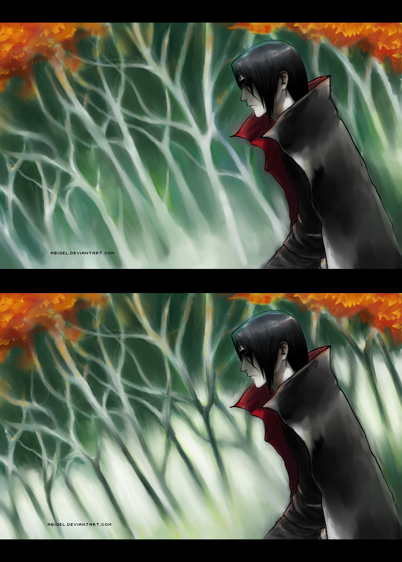
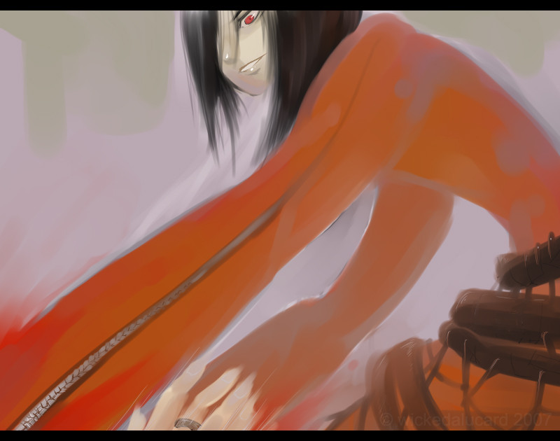
 Abigel — WIP: Which one is better
Published: 2008-09-08 08:35:49 +0000 UTC; Views: 581; Favourites: 25; Downloads: 0
Redirect to original
Description
Except that 'Jeeze, trees again, can't she draw some normal bg', I'd like you to tell me which version you like better. White trees are nice, but then light adds to depth. :/ I really can't decide and it's very important to me to decide quickly :S Please help! Thank you for your time
Done --> [link]
Related content


Comments: 56


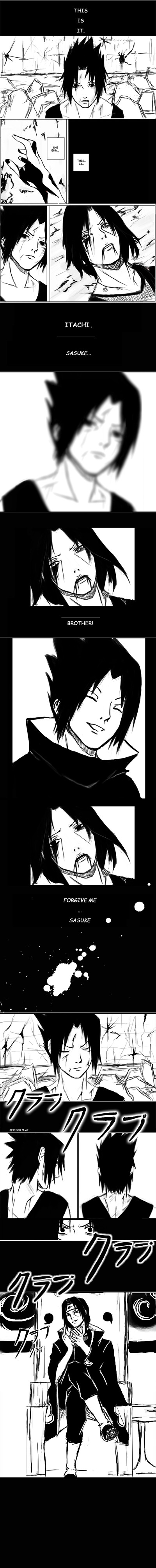
I like the top one best, but I think the bottom one works better because it shows more shades. The trees on the upper one seem to barely have any shadows, so it looks kind of funny. :]
👍: 0 ⏩: 0

oh, so hard!! >.< they both look awesome......
i think i like the bottom one more though
and as everyone says, it has more depth in it and it fits itachi more  (Smile)")
👍: 0 ⏩: 0

The BOTTOM one! cuz the trees on the top look more like bushes and the bottom looks more like a forest. But, of course, they both look great!
👍: 0 ⏩: 0

I love the botom one! Very pretty to both of them
👍: 0 ⏩: 0


 (Wink)")


Both are excellent. ")
👍: 0 ⏩: 0

Wow, this is quite hard; ^^
I like the depth of detail in the first one of the trees, but I have to say the fog / mist kind of look in the second panel much more fit's Itachi's figure, attitude, and basic idea; =]
👍: 0 ⏩: 1
But wait; The first one has mist too; e_e
Can I change my answer to the first panel? xD
👍: 0 ⏩: 0

I'd have to say the second one. It seems more realistic.
👍: 0 ⏩: 0

Personally I like the lower one I feel as though the colors are more bold and less faded
👍: 0 ⏩: 0

The top one. It looks more mystical, and you wonder whats in there. Plus the stark white trees are prettier.
👍: 0 ⏩: 0

I think that the one below has more depth. The mist let me to image a wide depth.
(ehm, excuse me for my bad english U_U)
👍: 0 ⏩: 0


I like the top one the best. It has more of it colored in, More full
👍: 0 ⏩: 1

I understand this, because that's why I personally like first one more too :3 Like some secluded, secret place.
👍: 0 ⏩: 0

Drugie^^ Prześliczne! Jak zwykle<3 Umiesz stworzyć boski nastój :3
👍: 0 ⏩: 0


I like the second but I think they're both great! (:
👍: 0 ⏩: 0


Oh wow I fucking love his hair! Is gorgeous and the overall drawing is fantastic. I'll go with the second one.
👍: 0 ⏩: 1
Thank you, I totally plan to leave the hair like that :3
👍: 0 ⏩: 0

Hmm, chyba tę na dole. Na górze podoba mi się bardzo, ale ta "jasność' na drugim rysunku wprowadza niepokój - a myślę, że to dobry efekt przy pracy z Itachim.
👍: 0 ⏩: 1
Mroczna jasność - to może być tylko Itachi :3
👍: 0 ⏩: 0


Obie są fajne,ale ta druga mi się bardziej podoba
👍: 0 ⏩: 0

I like the top one better. It gives a more pitoresque feeling.
👍: 0 ⏩: 0

I think the bottom one looks the best. Its got more depth to it and Itachi stands out in it better.
👍: 0 ⏩: 0

I like the bottom one more, it has more depth as you say.
👍: 0 ⏩: 0

I'm going to have t say that I liiiike... The top one.
👍: 0 ⏩: 0


yay new itachi art. it's beautiful...you're very talented^__^
👍: 0 ⏩: 0

Thank you <3
btw, right now I'm a dork squished under a pile of WORK. Sorry x___x
👍: 0 ⏩: 1

The upper.. dark and mysterious.. that suits Itachi XD
awsome job
👍: 0 ⏩: 1

I feel like the second one is best. It adds a realistic feel and makes it like there is sometjing further beyond those trees.
👍: 0 ⏩: 1


| Next =>