HOME | DD

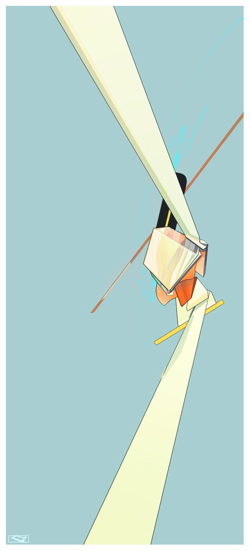
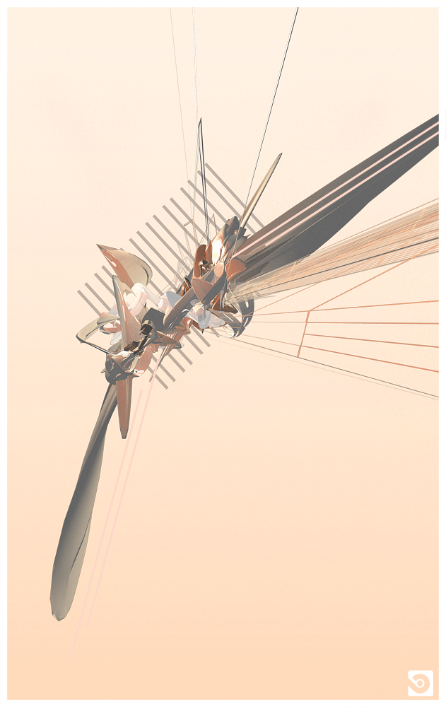
abstractmix — Settle

Published: 2006-03-12 05:14:14 +0000 UTC; Views: 4382; Favourites: 139; Downloads: 603
Redirect to original
Description [link]
dC
24|Calibre

I should make more for the next pack, feeling sucky lately.
Related content
Comments: 29

Fabrikken [2008-10-02 22:20:52 +0000 UTC]

Nice, I see a house for some reason.

👍: 0 ⏩: 0

FireStormFriend [2008-08-07 14:09:20 +0000 UTC]

awesome!!!!do u mind if i use this for an inspiration?

👍: 0 ⏩: 0

Stezy07 [2007-12-26 14:15:15 +0000 UTC]

Looks well nice, cartoony. Sweet.

👍: 0 ⏩: 0

qu4ku [2007-08-17 16:17:38 +0000 UTC]

nice.

👍: 0 ⏩: 0

dtbsz [2006-07-24 12:53:53 +0000 UTC]

👍: 0 ⏩: 0

pureverve [2006-07-08 08:09:37 +0000 UTC]

i like it alot... doesnt look as 3d as your others, this has a more simplistic, smoothe painting feel to it... very nice.

👍: 0 ⏩: 0

alexmayr [2006-06-13 16:15:20 +0000 UTC]

very neat look ... really like the colors

👍: 0 ⏩: 0

koinoi [2006-05-10 06:59:41 +0000 UTC]

awesome!

👍: 0 ⏩: 0

Gillham-san [2006-05-03 18:01:52 +0000 UTC]

The outlines here give definition . . .

👍: 0 ⏩: 0

hello-mitzi [2006-04-21 13:05:58 +0000 UTC]

wow! great!

👍: 0 ⏩: 0

TWENTY4e [2006-03-29 16:51:08 +0000 UTC]

Beautiful colorsand the minimalistic design is wonderful...

👍: 0 ⏩: 0

Akutou-san [2006-03-15 01:27:24 +0000 UTC]

I love your colors dude. tasty.

👍: 0 ⏩: 0

dposeur [2006-03-13 12:15:18 +0000 UTC]

love the minimalist aspect to this.. so simple so graaand. the open blue makes you feel like you're breathing fresh air..

👍: 0 ⏩: 0

VahagByurat [2006-03-13 08:18:02 +0000 UTC]

👍: 0 ⏩: 0

Syretrip [2006-03-12 19:35:54 +0000 UTC]

I dont think this one sucks.
colors is nice, and i like you did shadow on it

👍: 0 ⏩: 0

Pt3r [2006-03-12 18:06:06 +0000 UTC]

it rocks! great!

👍: 0 ⏩: 0

horaciophd [2006-03-12 16:36:19 +0000 UTC]

awesome

👍: 0 ⏩: 0

juss [2006-03-12 16:22:49 +0000 UTC]

wicked, love it.

👍: 0 ⏩: 0

digitalshock [2006-03-12 15:11:18 +0000 UTC]

sexual bitch

👍: 0 ⏩: 0

fokuz [2006-03-12 14:20:02 +0000 UTC]

nice work man.

👍: 0 ⏩: 0

ebr [2006-03-12 13:03:00 +0000 UTC]


Thats kickass, it looks very cartoonish, but still has your usual style.

👍: 0 ⏩: 0

denull [2006-03-12 12:54:37 +0000 UTC]

loving it!

👍: 0 ⏩: 0

F3rg [2006-03-12 08:49:06 +0000 UTC]

awsome work, i really like that cartoon look to this

👍: 0 ⏩: 0

griz- [2006-03-12 07:31:06 +0000 UTC]

that's yummy

👍: 0 ⏩: 0

riseTM [2006-03-12 06:42:17 +0000 UTC]

this is great. Love the reflections and shadows.

👍: 0 ⏩: 0

Speakerbox [2006-03-12 06:03:58 +0000 UTC]

Looks great really, but it seems a bit too similar in form to about two other images in your gallery.

👍: 0 ⏩: 0

expansiondesign [2006-03-12 05:20:35 +0000 UTC]

YES! i was so excited when i saw this... and then i clikced on it and boom... it is actually shit... haha nah jk... i luuuv this.. the thick line is so fresh with this style... and the cartoony kinda feel... .adn the transparetns and shinesand aww awsome!!!! teh outline really makes it cool tho! blue bit in bkg is nice too... i should buy a set of prints from u! or maybe jsut get u to send the files and ill send money hehe

👍: 0 ⏩: 0

thefifthorder [2006-03-12 05:17:04 +0000 UTC]

sucky my ass

👍: 0 ⏩: 1

jspsfx In reply to thefifthorder [2006-05-13 01:30:10 +0000 UTC]

Gross...

👍: 0 ⏩: 0