HOME | DD
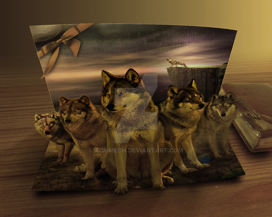
 acmmech — Card Wolves
Published: 2010-02-12 12:47:02 +0000 UTC; Views: 4542; Favourites: 112; Downloads: 18
Redirect to original
Description

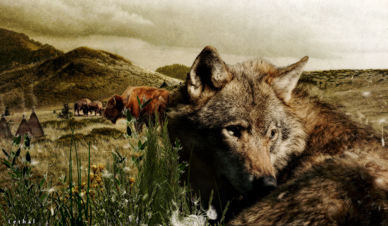
 Original work [link] The inspiration of the Card and Tutorial from ~AlexandraF [link] The inspiration of the view from =ForestGirl [link] Great thanks for :Wolfs : -- ~ChrysocyonFrax [link] [link] [link] [link] -- ~Seductive-Stock [link] -- ~InToXiCaTeD--StOcK [link] BG & Sky : -- *CB-Stock [link] -- !black-halo69 [link] Cliff : ~polinife-stock [link] Storm : ~SheisprettyStock [link] Grass & Stones : ~compot-stock [link] Cosmos : #resurgere [link] Table : ~DH-Textures [link] Old Book : ~nightgraue [link] Bow : !Free-Stock [link] Card is made using Ps pin tool . Dont forget, comments and critique welcome and appreciated.
 ----------
~GetWatchers is an artists group created to help artists increase their audience by getting more visitors & views. If you need more exposure of your arts and if you wanna discover some talented artists, come join us -> HERE <-.
__________________________
Free DXF and vectors Designs ready for cutting CNC
FreeDXF.com

Related content


Comments: 46


I could only be so lucky to receive this beautiful card................
👍: 0 ⏩: 1
 (Smile)")


This is very cool. Love the concept and it's a really unique piece...really great job on this!
👍: 0 ⏩: 0


")


what a great manip! i really like the original,too
👍: 0 ⏩: 1


It's not a real card? D:
Love it anyway <3333
The only problem I see is that the last wolf is a little too blury DX
👍: 0 ⏩: 1

You are right that is not real card and i put a link of its tutorial
thanks for your comment

👍: 0 ⏩: 1
You're welcome **o(^w^o )**
👍: 0 ⏩: 0

 - :D")
Thanks a lot I really appreciate your selection
👍: 0 ⏩: 0

I really like the colours in this, but I think the wolves are slightly too blurry, maybe use a smaller (usually 1 or 2 px)/sharper brush tool at a low opacity to cut through some of the 'outer' hairs to make it fit more. I also think that maybe the background should have a higher contrast, so the wolves stick out more and maybe look at some images concerning light, since the lighting doesn't fit sometimes, and the bg to the right is slightly too blurry, possibly blur the wolves legs slightly or sharpen the bg more.
Good concept, however
👍: 0 ⏩: 1
great thanks for your complete critique ...i really appreciate it and hope to adjust my image later ...
👍: 0 ⏩: 0

 (Wink) - ;)")
and great thanks for the comment
👍: 0 ⏩: 0


very original and very cool colors ... congratulations nice work...[link]
👍: 0 ⏩: 1

I really like this idea. A pop up card.
Perhaps a small shadow behind the wolves would have made it a little more 3D looking. But hey this is great.
👍: 0 ⏩: 1
thanks for your idea and the comment
👍: 0 ⏩: 1

could tell me plz why its not perfect ?? tell me what you see to make it better
👍: 0 ⏩: 1

The perspective just seems a little skewed. Thats all.
👍: 0 ⏩: 0


And thanks for the 1st comment here
👍: 0 ⏩: 0