HOME | DD
 Adalbertus — Practice makes perfect

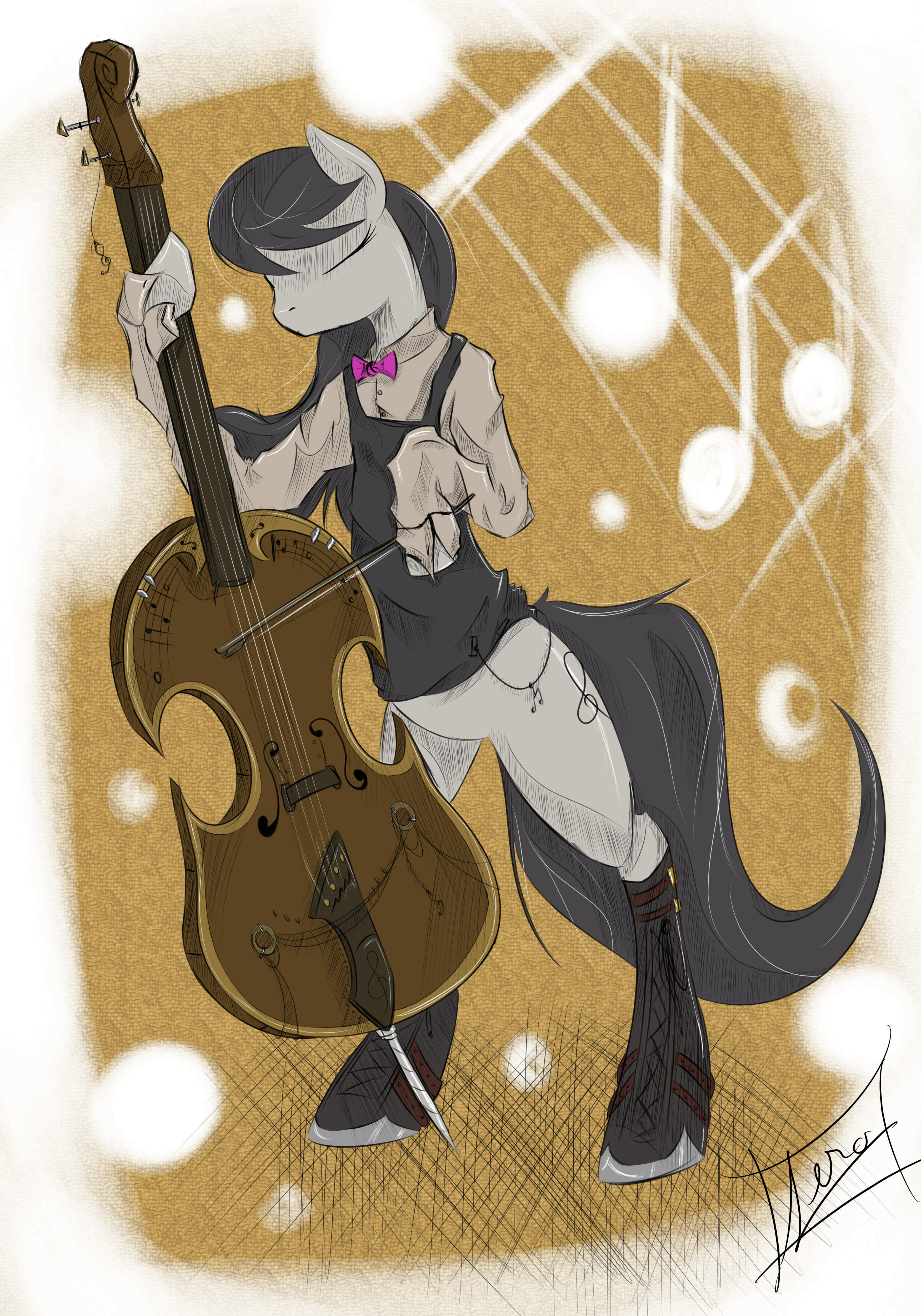
#anthro #octavia #pony #little
Published: 2015-12-23 23:33:33 +0000 UTC; Views: 2650; Favourites: 136; Downloads: 73
Redirect to original
Description
my part for the pony calendar 2016, go check it out here:Related content


Comments: 25

This portrayal of Tavi is almost unbelievable! I just... Wow. Anatomy - excellent. Clothing - excellent, not smutty, just sexy and relaxed at the same time. Her body language leaves room for multiple emotions to be projected- frustration, confusion, distress...
In short, I *love* this painting. 11/10 much wow.
👍: 0 ⏩: 1

I am very glad that you like it
👍: 0 ⏩: 0

Masz naprawdę fantastyczne prace i genialny styl
 (Smile)")
👍: 0 ⏩: 1


Bardzo podoba mi się atmosfera na obrazku, światło nadaje mu przyjemny urok, chociaż dałabym je w jaśniejszym odcieniu i wyostrzyła lekko cienie, szczególnie na podłodze i zaznaczyła je także od firanek. W poprzednim komentarzu już owe firanki zostały wspomniane. Ogólnie podoba mi się dobór kolorów i anatomia jest naprawdę świetna. Ewentualnie z małym wyjątkiem, ręka którą podnosi do czoła jest za krótka w przedramieniu, porównywalnie do drugiej. Ale np. dłonie są już super, włosy też.
Tak więc miękkie cienie wyglądają ślicznie, ale przy takim mocnym oświetleniu byłyby nieco ostrzejsze (szczególnie za obrazem, bo wygląda, jakby się unosił w powietrzu w jakiejś odległości od ściany). Zabrakło cieni pod strunami. A kolorowy lineart najlepiej działa tylko najbliżej źródła światła, tutaj jest niepotrzebny np. na obojczykach i prawej nodze.
👍: 0 ⏩: 1
taaa... dużo drobnych błędów... kiedyś się nauczę ")
👍: 0 ⏩: 0

Hi! I saw you were requesting critiques so here's mine:
The first impression the viewer gets from your piece is a soft yet dramatic feeling from your beautiful use of lighting.
What's good:
>Your use of lighting is excellent and really compliments the piece well. The light source is really clear and a lot of artists struggle with that so well done!
>The detail on the instrument is really magnificent. I know how hard it can be to get the perspective and details right and you've pulled it off really well. It's impressive!
>Even though the background is simplistic, it works with the contrast of the detailed pony and instrument and draws the viewers eyes to that immediately.
>From your piece it is obvious you are knowledgeable with anatomy and even though i'm not too aware of proportions of anthropomorphic ponies but the anatomy looks as if it is in proportion and works well with the piece.
To improve:
>Try to avoid shading with grays/unsaturated colours/shade or multiply effect. Try adding more contrast and depth to your piece by using different hues in your shading and lighting. Done correctly it can make your art stand out even more and look aesthetically pleasing. A good tutorial for this is here. Try experimenting with colour.
>Use references and textures for fabrics! The curtain in the background look very unnatural and stiff. As well as it doesn't look too much like a curtain because it looks so smooth. By adding texture to the curtain it would look more realistic and easier to see that it's made of fabric. If you look here and here , curtains usually have more folds and little creases than your piece and they're both good references for you to inspect how the wind affects the fabric as well.
>The expression of the pony is unclear to me. With your title practice makes perfect and the bow being on the floor I feel as if they should be irritated or angry with themselves for getting it wrong? Try to experiment with making emotion clear through expressions. It can add to the impression of your piece.
>The stool is missing a leg. From the positions of the other three legs the weight of the pony would not be equally distributed and so she would fall backwards off the chair.
Good luck with your art. I hope you like my advice!
👍: 0 ⏩: 2
I mostly agree with this comment! Although I must say that multiply and/or shade effects are sometimes done really impressive and many people use that, it's nothing wrong using that whatsoever! I see why you pointed it out though, as it usually doesn't look too good with just black, and even worse with grey.
So yes, I can agree that Adal should use more varied colors for shadows, but I simply cannot deny the usefulness of those effects alone c':
👍: 0 ⏩: 1
Yup I completely agree that it can be done amazingly at times but I tend not to recommend it because it doesn't help with learning color theory and I have seen many artists become reliant on it and therefore hinder them improving c:
👍: 0 ⏩: 1
That's a good explanation.
👍: 0 ⏩: 0
Thank you for this comment, I love getting feedback like this
as far as shading goes, the whole character is gray and despite my attempts to mix in some yellow and orange from the light, I couldn't escape it. I'm not all that happy with how shading came out here, I definitely have better works in that regard.
and yeah, curtain does look flat and boring. I need to start playing with textures, but it's one of those "maybe next time" things. <_<
She was suppose to look tired and a little bit resigned, like, she's been practicing all day. But I agree, sometimes my expressions fail to show what I intended them to show.
as for the stool... well... to be honest, I just hoped nobody would notice that ")
👍: 0 ⏩: 1
No no don't think you're a horrible terrible person! I'm just trying to help you improve c:
👍: 0 ⏩: 1
Yeah, I know, thanks for the feedback
I will try to work on textures a bit
👍: 0 ⏩: 0

Shit, it's been a really long time since you drew Octavia.
👍: 0 ⏩: 1
