HOME | DD
 AdamoN — Arch. Synth. 3rd semester
Published: 2010-11-14 10:52:27 +0000 UTC; Views: 1694; Favourites: 16; Downloads: 0
Redirect to original
Description
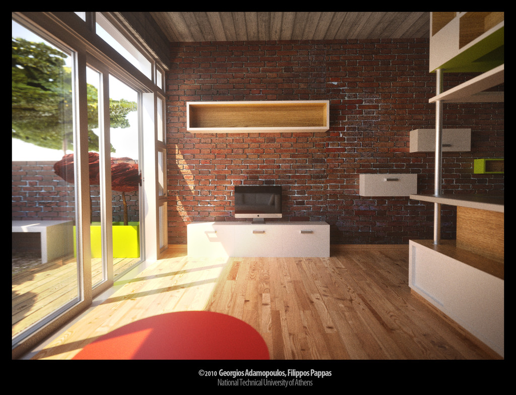
Interior of a small apartment for a couple.Part of a 3rd semester project for the School of Architecture, 2009.
Modelling in Cinema 4D, rendering with Maxwell, about 24 hours on 3 nodes.
Collaboration with
Related content


Comments: 14


nice. a sense of place and solidity. I like the internal brickwork in particular
👍: 0 ⏩: 0


the apple (tv) is a lil bit to small! and what´s the green thing out side? and the white behind the green? 3rd semester...
👍: 0 ⏩: 1

Well, that iMac was precisely modelled (some day during holidays I had spare time to fool around) based on measurements on the physical model so it may look small (to you or someone else), but it's actually in the right scale.
That "green thing" is supposed to be an abstract tree! ")
Those minor details weren't being taken into consideration by the professor anyway.
That white thing is an overexposed Maxwell Physical Sky and it is overexposed because as in real life (unless you're doing HDR photography), when you want an indoor scene to be properly exposed, the openings and everything outside them tends to come out overexposed. I could have added a background image in post work but as I said these details didn't matter and we were really on a hurry/tired/fed up with this project to bother about that small part of the sky being white.
 (Wink)")
👍: 0 ⏩: 1

The brick I could almost touch and feel. Why the disortation outside?
Good work
👍: 0 ⏩: 1
Thank you! Do you think the bricks outside are distorted? They seem ok to me, they're just blurry on the part that the two windows overlap, maybe beacause of the glass difraction...
👍: 0 ⏩: 1
It is the trees outside am worried about.
👍: 0 ⏩: 0


Looks great. The brick wall catches the eye.
👍: 0 ⏩: 0

Amazing quality
Luv the minimalistic furniture
You really did a great job
 (Smile)")
👍: 0 ⏩: 1