HOME | DD
 addictedtopunk — I'm so close, yet too far
by-nc-nd
addictedtopunk — I'm so close, yet too far
by-nc-nd

Published: 2013-07-31 21:29:40 +0000 UTC; Views: 618; Favourites: 8; Downloads: 0
Redirect to original
Description
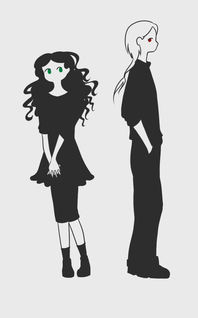
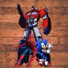
>O< WuuuuuuuuuuuuThat's why I'm sayin dude, my 4th serious attempt at watercolor and look what I got! I personally think it's very fine, ignoring some mistakes, but I still don't know how to use watercolors yet
I designed this leather armor using some refferences pictures but I swear is original xD I still can't draw Kabrok without thinking in red. That's his color, his element (fire and wind) and all I imagine is red, orange and black.
Finally I decided what style I want for Iris, the royalty and the city. Something very simmilar to greek, but brilliant colors and some jewels in arabic style. She lives in an arid place and she uses cloaks too, and will always have something around her neck or arms.
That dress is very informal for her. Let's add jewels and she's a princess again xD
:3
By the way I was searching poses and I get inspired. Iris' pose is from and Kabrok's pose is from well almost it changed a bit xD
-Update 6-nov-2014-
Hello fellas. This is my favorite watercolor piece of mine. I'd like you to tell me if you like the effects I tried to made here. I am still learning to draw and paint, so don't be so strict xD No, just kidding please tell me what i should improve. Thank you all

Related content


Comments: 21

ProjectComment
Hey
So, watercolor. I'd say you did fine for your level -- actually, you managed quite well, I'd think! I'm definitely liking the simplicity of the netire piece, it really ads to the illustration than subtracts from it. The colors chosen compliment their characters nicely, and the lady's pose is quite eye-catching.
Her dress was painted nicely as well, though I have to say that the armor was done better C:
Now, the weaknesses:
The man's pose is a little lackluster. Almost plain next to the lady who seems to just pop out with her dynamic pose. There's also a tiny issue with their head anatomy, but that can be easily fixed by practice. So. The yellow is bleeding into her arm. You may want to control your wash better next time to prevent that.
Their names (?) on top are a little blurred, mostly due to the camera quality, which you can't really fix right now, I think?
But all in all, you did fine
👍: 0 ⏩: 1

First of all thank you so much for critiquizing
Even if my intention was to made the man more... pasive, i think the pose is not the adequate to show his personality and doesn't compliment the picture very well, i know o:
What anatomy problem? You think is too small or too big? :U
Again thank you thank u very much!
👍: 0 ⏩: 1
Oooh, I can understand better now that you stated your intentions :3
His pose is fine, then. Just a little bit of tweaking to make it more..natural. Right now he's twisted toward her a bit awkwardly, like he's forcing himself to face her, a bit. Something like slumped shoulders, maybe a little shy side-glancing
(And as for anatomy, the head's a bit on the big side. But that's about it ")
No problem
")
👍: 0 ⏩: 0

ProjectComment
It's a nice piece. I like the colours and the overall feel of the characters. It feels like illustrations to a fairy tale! I think though you could work more on their poses. They are generally good, There's a lot of energy in the womans pose, and it has a nice silhuet. The man's pose could be better. There is something wrong with his right arm. I think in a position like that his elbow would point more outwards than inwards, and you would over all see less of his lower arm, but yea foreshortenings are hard to do. If you need resources for poses, there is a very good goup called dAPoses that has a lot of stock images just of poses. There is also SenshiStock and RobynRose that put up stock photos (However RobynRose have been inactive for a long time now, but the stock is still there). Also try and think of how the pose would look in a silhuet. It makes for a much more interesting composition, if you can see how a person stands just by the silhuet. Also makes the piece easier to read. But keep at it! Sounds like you have quite a project in mind. The best of luck with it!
👍: 0 ⏩: 2

*gasp* A sign of life!!
Let me take this oppotunity to tell you that you make/made great stock!
👍: 0 ⏩: 0
Thank u very much for your critics
About the poses, was taken from some poses references, sighly changed because i wanted to focus more on the tecnique of painting than a pose ^^
Well, his left arm could have been worked better, yes x.x I mean if you do that pose in the mirror you'll see it has sense but it doesn't look nice after all.
Ye i follow senshistock
Thank u very much!!!
 (Smile)")
👍: 0 ⏩: 1

I've never said this ever but...the lack of detail is what makes me like this photo, the balance between detail and colour is definitely different but i feel like the colour makes up for the face, nothing in this is exaggerated its all calm but also filled with stories as im getting a nice vibe from this artwork
👍: 0 ⏩: 1
. 3 . thank u very much!
👍: 0 ⏩: 0

I like how you managed to use watercolour in such a good way, all is so defined, even the details and the shadowing
👍: 0 ⏩: 1
>//u//< thank u very much
👍: 0 ⏩: 0

Really like this style and how the breastplate turned out.
👍: 0 ⏩: 1
>///< thank you so so much
👍: 0 ⏩: 1