HOME | DD
 Aeires — Bio Med
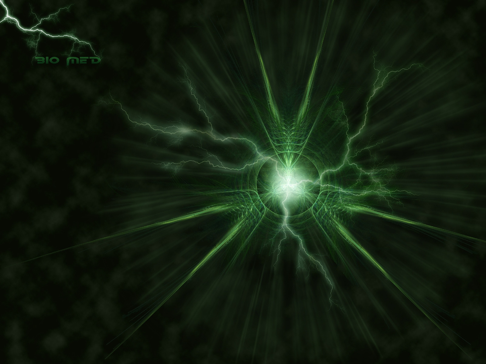
Published: 2005-07-06 06:41:07 +0000 UTC; Views: 2535; Favourites: 63; Downloads: 423
Redirect to original
Description
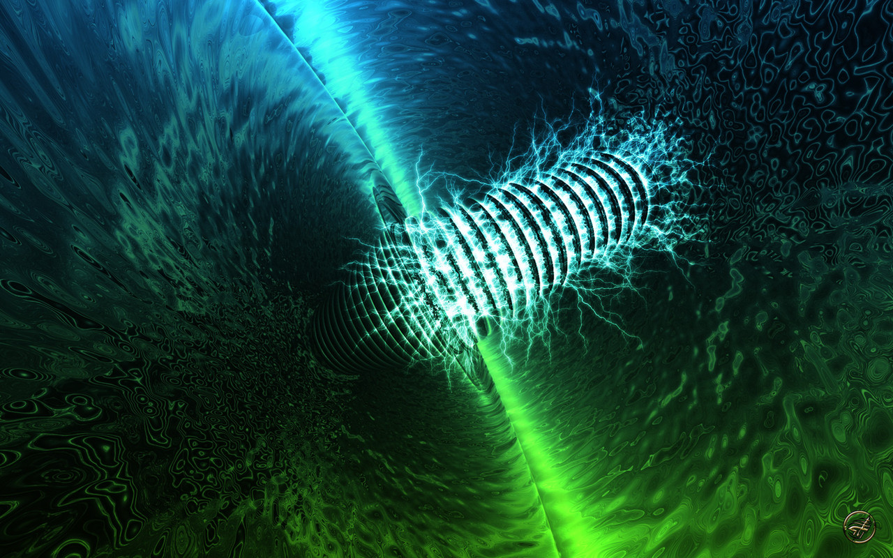
Apophysis and Photoshop. Tried a lot of new things on this so I hope you like.Edit: lightened fontwork.
Related content


Comments: 80

Cool! Have not seen you around as much lately! You must be a busy Man!!!
👍: 0 ⏩: 1


nice work, the flame looks good and the additional work in photoshop blends in perfectly with it. it took a reality check of "wait, apophysis can't do that" for me to realize the lightning wasn't part of the original render, hehe.
👍: 0 ⏩: 1

Always good when you catch people doing a double take.

👍: 0 ⏩: 0

gorgeous work.
i like.
very nice. i think the font should have been something a bit thinner, mainly because something so think just detracts from the beauty of the fractal.
otherwise, it's quite a beautiful piece.
👍: 0 ⏩: 0

Wow, great job Jeff! I love how the lightning is coming out of the centre of the fractal and the cloudy background. Great post-working!

👍: 0 ⏩: 1
Thanks, Deb. I have a long way to go but feel like this was a good step forward.
 (Smile)")
👍: 0 ⏩: 0


")

Looks very organic and lightning-ish at the same time. I'm reminded of a neuron.
Again, great use of greens and blue-greens. You've got a way with them.
👍: 0 ⏩: 1
Thanks. Looked at a few different colors with this but liked the green the most. Thank God no Matrix comments.
👍: 0 ⏩: 1
I think it looked way too organic to be anything Matrix-y. I didn't see any visual connections that would make me think that.
👍: 0 ⏩: 0

Looks very interesting, and the colour scheme is rather nice as well
👍: 0 ⏩: 1


It looks to me, as if the centyr is the Core, and around it there are lightnings. bacause of the high energy of the Core..
It's very nice, really
👍: 0 ⏩: 1
Thanks. The center was perfect for the energy source.
👍: 0 ⏩: 1

Thanks, glad that you do.
👍: 0 ⏩: 0

The lightning definately goes well with this design.
👍: 0 ⏩: 1

Awesome! Wow! Something a little different
👍: 0 ⏩: 1
Spent all day going through tuts for this.
👍: 0 ⏩: 0

I do. Very nice use of both programs.
👍: 0 ⏩: 1
Thanks. Hope to keep pushing the limits of my level.
👍: 0 ⏩: 0

ah another very nice one. your workd just amaze me each time.
👍: 0 ⏩: 1
Thanks. Always trying to improve my work.
👍: 0 ⏩: 0
<= Prev |