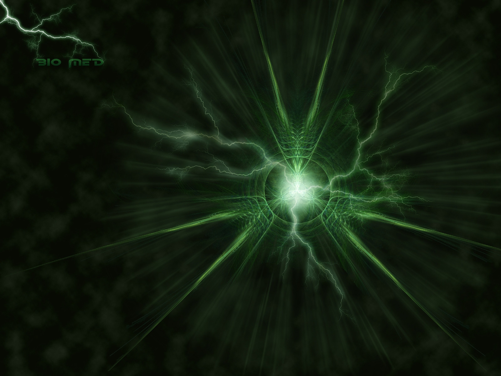
HOME | DD

Aeires — Bio Med

Published: 2005-07-06 06:41:07 +0000 UTC; Views: 2516; Favourites: 63; Downloads: 423
Redirect to original
Description 
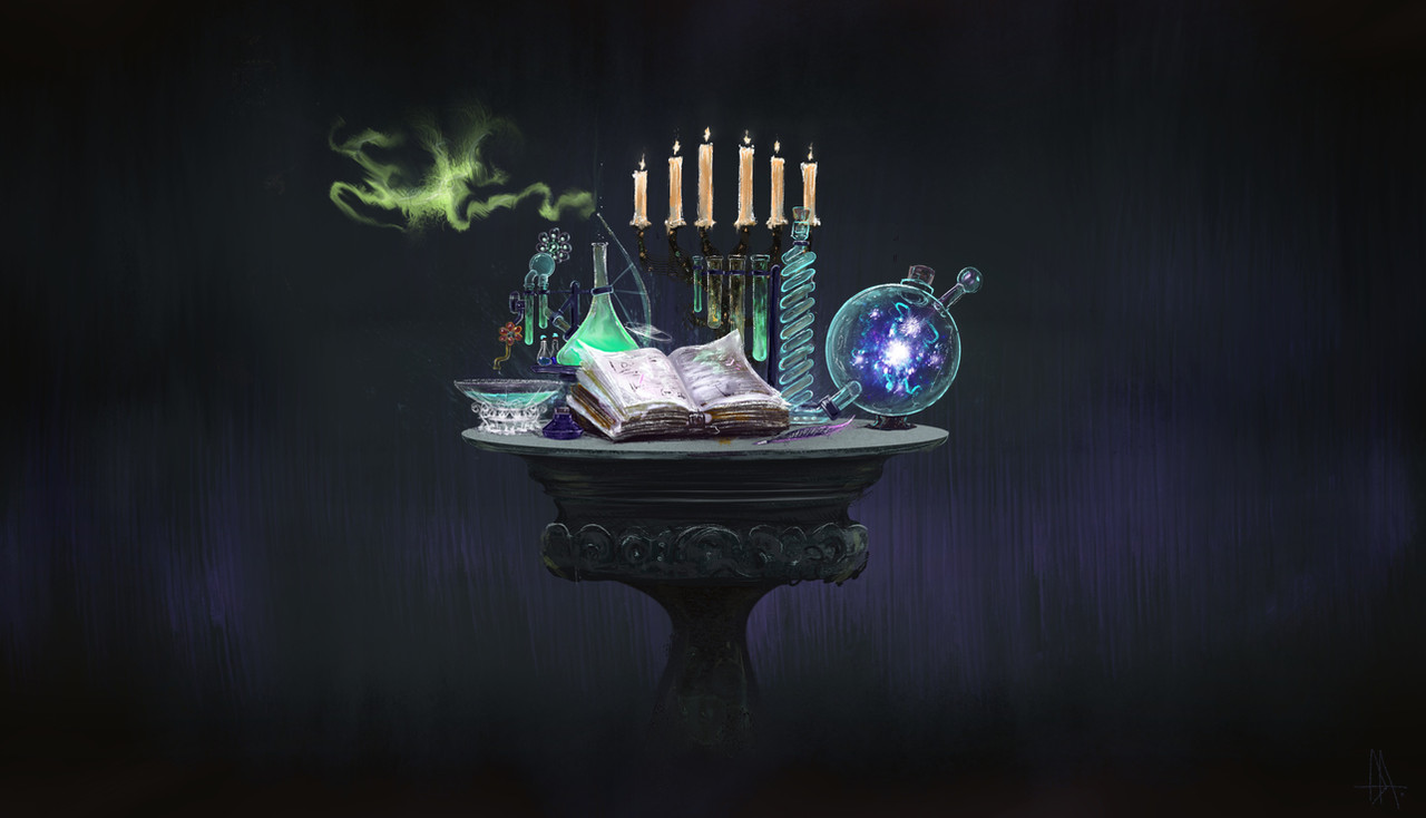
Apophysis and Photoshop. Tried a lot of new things on this so I hope you like.

Edit: lightened fontwork.
Related content
Comments: 80

Aeires In reply to ??? [2005-10-06 03:18:59 +0000 UTC]

Took a lot of work. If I could have done it larger I might have printed it.

👍: 0 ⏩: 0

SaTaNiA [2005-07-31 17:54:24 +0000 UTC]

really nice flame !!

👍: 0 ⏩: 1

Aeires In reply to SaTaNiA [2005-08-04 00:56:45 +0000 UTC]

Thanks. Really happy with the way this came out. Need to do some more in this direction.

👍: 0 ⏩: 1

SaTaNiA In reply to Aeires [2005-08-04 15:29:18 +0000 UTC]

no problem
Thats really cool
continu like this !

👍: 0 ⏩: 0

Zalmaki [2005-07-26 15:52:39 +0000 UTC]

My, you [i]do[/i] have a lot of fun with symmetry in Apophysis, don't you? Kyoo!

👍: 0 ⏩: 1

Aeires In reply to Zalmaki [2005-07-28 02:47:19 +0000 UTC]

Yep.

Actually I love the three point rotations because they give you a great bilateral as well as rotational look.

👍: 0 ⏩: 0

Fangfingers [2005-07-14 10:00:06 +0000 UTC]

... ..simple and effective as well ..........it radiates ...... AEIRES POWER ( ECHO ...ECHo ...ECho...Echo...echo...ech...ec.. )


-

👍: 0 ⏩: 1

Aeires In reply to Fangfingers [2005-07-20 06:40:03 +0000 UTC]

I think this was one of my most worked and accomplished postworking image. Also one of the least appreciated, go figure. And people wonder why I continue to go back to fractals all the time.

Thanks for the vote of accomplishment, especially coming from the photoshop wizard yourself.

👍: 0 ⏩: 0

heraldoftruth [2005-07-13 02:11:10 +0000 UTC]

I am slightly dissapointed... don't know why. I think that it is the color, but I really can't see anything that I don't like. The fractal is spectaculer and the lightning is unusually good.... I don't know.... maby increase the size of the pattern and change the color.... Oh well thats the best I got nice work, keep it up.

👍: 0 ⏩: 1

Aeires In reply to heraldoftruth [2005-07-20 21:43:13 +0000 UTC]

Thanks, that's no problem. I do a lot of different styles and techniques so I know not everyone is going to like every twist and turn of the road I travel. Feedback is still appreciated though.

👍: 0 ⏩: 0

jrsaldana [2005-07-09 14:56:26 +0000 UTC]

beautiful....

👍: 0 ⏩: 1

Aeires In reply to jrsaldana [2005-07-10 06:19:57 +0000 UTC]

Thanks.

👍: 0 ⏩: 0

SarahTsukimi [2005-07-09 14:21:10 +0000 UTC]

Wow, you changed the whole image to something electric! It looks pretty cool! Very science fiction-like.

👍: 0 ⏩: 1

Aeires In reply to SarahTsukimi [2005-07-10 06:18:03 +0000 UTC]

Lot of work into this one. Spent the whole day in tuts.

👍: 0 ⏩: 0

OwNz [2005-07-08 11:00:02 +0000 UTC]

nice work bro

👍: 0 ⏩: 1

Aeires In reply to OwNz [2005-07-10 05:47:35 +0000 UTC]

Getting better at this.

👍: 0 ⏩: 0

bluesypher [2005-07-08 06:25:18 +0000 UTC]

Beautiful. I love the lighting, and the greens. Great work!

👍: 0 ⏩: 1

Aeires In reply to bluesypher [2005-07-10 05:50:49 +0000 UTC]

Thanks. I think I feel the most pride with this than all my 'abstract' images.

👍: 0 ⏩: 1

bluesypher In reply to Aeires [2005-07-12 01:17:12 +0000 UTC]

You're welcome!

👍: 0 ⏩: 0

Smuggler-Of-Mos-Espa [2005-07-08 03:16:57 +0000 UTC]

Excellent work. I love the colors and the lightning.

👍: 0 ⏩: 1

Aeires In reply to Smuggler-Of-Mos-Espa [2005-07-10 06:11:00 +0000 UTC]

Thanks. Feel real happy with this one. Hope I can duplicate it but slightly different.

👍: 0 ⏩: 1

Smuggler-Of-Mos-Espa In reply to Aeires [2005-07-11 02:35:08 +0000 UTC]

Not a problem.

👍: 0 ⏩: 0

exquisiteoath [2005-07-07 12:18:35 +0000 UTC]

This might sound like a strange response, but I find this really fun.

👍: 0 ⏩: 1

Aeires In reply to exquisiteoath [2005-07-08 02:10:10 +0000 UTC]

That's cool, I had a lot of fun working on this one.

👍: 0 ⏩: 0

thebluapocalypse [2005-07-07 05:26:28 +0000 UTC]

heh, beautiful work, once again. the green is a nice shade and the i like the lightning. i like how you used clouds as a back for this instead of a blank black, it adds a fuller feel to the picture. great job!

👍: 0 ⏩: 1

Aeires In reply to thebluapocalypse [2005-07-08 02:08:11 +0000 UTC]

Thanks for noticing that. I tried to add things without overpowering it and thought a textured background would help the depth of the image.

👍: 0 ⏩: 1

thebluapocalypse In reply to Aeires [2005-07-08 04:36:26 +0000 UTC]

and it did.

youre welcome.

👍: 0 ⏩: 0

trinity-77 [2005-07-06 23:42:15 +0000 UTC]

does have that bio feel to it. i like the green a lot. beautiful piece to grace a desktop.

👍: 0 ⏩: 1

Aeires In reply to trinity-77 [2005-07-08 02:07:05 +0000 UTC]

Thanks. Not quite up to your skill level but getting there.

👍: 0 ⏩: 1

trinity-77 In reply to Aeires [2005-07-08 02:10:37 +0000 UTC]

oh ppffttt... that's so not true.

👍: 0 ⏩: 1

Aeires In reply to trinity-77 [2005-07-08 02:15:07 +0000 UTC]

Shattered.

👍: 0 ⏩: 1

trinity-77 In reply to Aeires [2005-07-08 03:54:25 +0000 UTC]

ummm you had just as much to do with that as i did.

👍: 0 ⏩: 0

cherry65 [2005-07-06 23:00:16 +0000 UTC]

Really nice, love it. And the color is great

👍: 0 ⏩: 1

Aeires In reply to cherry65 [2005-07-08 02:06:34 +0000 UTC]

Thanks, Helen.

👍: 0 ⏩: 0

ladyfirari [2005-07-06 19:36:59 +0000 UTC]

lighting affect YAY!! ^_^ great job! ^_^

👍: 0 ⏩: 1

Aeires In reply to ladyfirari [2005-07-08 02:06:14 +0000 UTC]

Gotta love that lightning.

👍: 0 ⏩: 1

ladyfirari In reply to Aeires [2005-07-08 14:46:36 +0000 UTC]

hehe yup! my favorite element besides fire.. >.>

👍: 0 ⏩: 0

Xeyda [2005-07-06 18:54:13 +0000 UTC]

Very interesting! Good color and lightwork.

👍: 0 ⏩: 1

Aeires In reply to Xeyda [2005-07-08 02:05:43 +0000 UTC]

Thanks.

👍: 0 ⏩: 0

jondapicam [2005-07-06 17:02:08 +0000 UTC]

Nice manip!

👍: 0 ⏩: 1

Aeires In reply to jondapicam [2005-07-08 02:05:05 +0000 UTC]

Thanks.

👍: 0 ⏩: 0

xaphan [2005-07-06 15:26:12 +0000 UTC]

nice edit!!! :-D

👍: 0 ⏩: 1

Aeires In reply to xaphan [2005-07-06 15:28:14 +0000 UTC]

Thanks for the advice.

I was going to swap the font but couldn't remember which one I used after I rasterized it.

👍: 0 ⏩: 0

solidtransient [2005-07-06 14:08:21 +0000 UTC]

nice lightnight! good color too

👍: 0 ⏩: 1

Aeires In reply to solidtransient [2005-07-08 02:04:48 +0000 UTC]

Thanks. Digging abstract work but finding it really difficult and time consuming.

👍: 0 ⏩: 0

CptObvious [2005-07-06 13:57:09 +0000 UTC]

Kind of reminds me of the biohazard symbol, except way cooler. And with lightning. Nice work.

👍: 0 ⏩: 1

Aeires In reply to CptObvious [2005-07-08 02:04:11 +0000 UTC]

Almost called it that but figured it would be too cliche. Trying to get a bio med tech job so that worked for me.

👍: 0 ⏩: 1

CptObvious In reply to Aeires [2005-07-08 04:32:21 +0000 UTC]

sweet. keep the good deviations comin'

👍: 0 ⏩: 0

EddieTheYeti [2005-07-06 13:00:57 +0000 UTC]

Wow! That one is different! Very electric!

👍: 0 ⏩: 1

Aeires In reply to EddieTheYeti [2005-07-08 02:02:59 +0000 UTC]

Thanks, Eddie. Hopefully more to come.

👍: 0 ⏩: 1


| Next =>