HOME | DD
 Aeires — Reaction WIP

Published: 2005-07-28 03:21:09 +0000 UTC; Views: 859; Favourites: 22; Downloads: 169
Redirect to original
Description
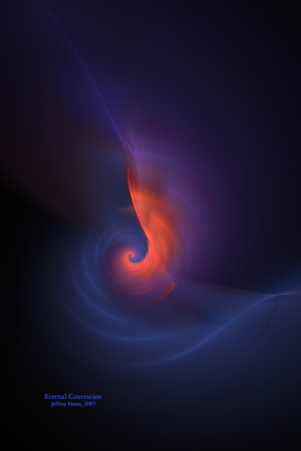
This is the beast that's been killing my computer. Still need a lot of work but some feedback would be appreciated. Not even settled on a name yet, but it looks like a chemical reaction taking place so I penned it that for now.Related content


Comments: 56

Thanks. It was a different direction for me that I'm glad I took.
👍: 0 ⏩: 0

Thank you. I was going to scrap this but too many people thought I shouldn't.
👍: 0 ⏩: 0

I like...the name that comes to me is "Angelic Nucleus"..it has a rich chemistry versus religion thing going on with the candle-esque area and then the 'peptide' looking helix strands...
👍: 0 ⏩: 0

You've got bubbles it looks so sci-fi effects
👍: 0 ⏩: 1
Thanks. Those little bubbles made the image.
👍: 0 ⏩: 1
*gets a needle and pricks the bubbles*
Can't see any now *giggles*
👍: 0 ⏩: 0

You call this work in progress? O.O It's awesome! I love the pattern and it's softness. The reddish colours look great in this image. There's one thing though, there's a lot of 'empty space' at the sides. Maybe you could move a part of the image a little closer, like a slight zoom? It's just a suggestion, the rest looks perfect to me. ^-^
👍: 0 ⏩: 1
I'm rendering the final product right now. Basicly I did a lot of color tweaking and gave it a ton of depth through color controls. The empty spots look more natural now because they are going to be more shadows now to snap the depth. Can't post it til monday though because of the DA birthday but that's fine, I've been working on this for a long time.
👍: 0 ⏩: 1
That sounds really promising!  (Smile)")
👍: 0 ⏩: 1
Decided to post it today. Give me a few minutes.
👍: 0 ⏩: 0

Hey! This looks like a natural gaz commercial or something!
👍: 0 ⏩: 0

Yeah, you are right.... This looks like a flame product of some chemical reaction. Quite chill and explosive at the same time. Cool!
👍: 0 ⏩: 0

Wow!
I' d say emphasize the "woven" texture of the lighter areas outside the main flame, as well as toning down the white
This has hints of intricacy around the edges that make the mistiness almost...frustrating, to me.
I want to see more in it, somehow. Nonetheless, it' s become my wallpaper for the time being...
Looking forward to the next version!
")
👍: 0 ⏩: 0

its does look like something bubbling up inside a glass...guess what you name is fits more..some kinda chemical reaction
👍: 0 ⏩: 1
I've made a little progress as well as a final name for this one. It is slightly darker in some ways but the rest I'm keeping as a secret till it's done.
👍: 0 ⏩: 0


👍: 0 ⏩: 1
The one coloring algorythm doesn't want to share the sandox with the other ones. Makes for extremely long render times.
")
👍: 0 ⏩: 1


To me it looks a little unfinished indeed but no idea what else to do. I don't know what you have imagined. What should it look like when it is finished? You said something of a chemical reaction but the bubble pattern is too constant for that in my opinion. Yeah and more complex colors and textures. I think it needs mor depth to become a scene based on a chemical thing.
Thank you for showing me the link!
👍: 0 ⏩: 1
I think it's more close to being done than I had originally thought. I made some small progress these past few days but I haven't had the time to work on it like I normally do. Hopefully next week I'll have it posted as a finished image instead of a WIP. Still not finished on a name also, so that will evolve with the help of the input and what the image turns out to be.
👍: 0 ⏩: 0

Thanks. Won't be too drasticaly different. All the changes I've made since have been real subtle because I'm still looking for a perfect texture to add to it. Might just call it done with what I have at the moment though.
👍: 0 ⏩: 1

You're welcome!!! I'll keep an eye out for the new one!!!
👍: 0 ⏩: 0

I don't think there is too much I would add. Personally I would make the 'bubbles' in the centre a little more defined - not sure that you even can since more often than not UF doesn't do what you want it to but has a mind of it's own. I may even be inclined to play around with the textue a little more.
It is also a spectacular image just the way it is.
👍: 0 ⏩: 1
Thanks, Deb. Yeah, the layers are rather tricky. I made a little progress but I've gone through a lot of oca's so far. If I can't find something that goes with the shapes I'll call it done.
👍: 0 ⏩: 0

i dunno ...theres an old axiom in art and advertising ...remembered by K.I.S.S..... which means ... Keep It Simple Stupid
THis is so near perfect to me as it is ..it is hard to fathom delicate adjustments without actually playing with them myself ...but ... .... i think any changes should concern light or color only ... for instance ...possibly an orange brightening slice on either side in the bunsen burner red ya got there... possibly shaded up to an almost yellow ...SO it looks like the flame is reflected /refracted in the red parts...
THEN i dont think the white around the flame is too hot ... as has been suggested...i think it just needs some hot reflection in the 4 blue balls in the upper right corner.. the reflection spots should be perspective /respective to the center flame white ... that allows you to spread the eye for an overall balance easier .. or center the eye if you choose ...whatever you prefer ...contrary to artsi fartsy believe,...balance is NOT the same for everyone... THis way you please more than one sense of it with the same pic..
leave the rest of it alone
--
👍: 0 ⏩: 1
Thanks, Jim. I'm having a tremendously difficult time finding things that work with this. I've been tempted to use a second formula but that puts me right back to the beginning of finding things to mess with. I made a little progress yesterday but I'm finding this more done than I had originally thought. Next wednesday is my last school day so I'm going to hit it hard that night and the rest of the week. If I don't find anything else, I'm rendering it.
👍: 0 ⏩: 0

 (Wink)")
Thanks. Still trying to be unique in an artform filled with repetition.
👍: 0 ⏩: 0

I'm just going to 
👍: 0 ⏩: 0

reminds me of a flame. not a fractal flame silly.. but a fire flame. the colors are insanely awesome!! well done Jeff!
👍: 0 ⏩: 0


I like it, though it doesn't look finished in my opinion. I don't know what to think about it other than I agree with your words, chemical reaction. Maybe....if you had some more solidarity to it? I dunno...not a pro on this type of art, but just my outlook ^_^
👍: 0 ⏩: 0

I recognise the formula you've used, and yes it does take forever to render. 
👍: 0 ⏩: 0

As a title, might I suggest, "Flame of Life"? The bubble stuff kind of reminds me of DNA strands for some reason, twisting out from the creation spark. Or something. It's gorgeous regardless.
👍: 0 ⏩: 0


Hmm... I think the white may be a bit too bright, but don't get rid of it altogether... maybe just lower the opacity or something.
I really like the composition of this piece; don't change that at all! But you might want to add just a little bit of color variation near the top of the image... the large blue expanse gets a little boring.
Overall great, but definintely room for improvement.
👍: 0 ⏩: 0

Hey, great work! I really like how this turned out!
👍: 0 ⏩: 0

Beautiful sofness on this image
if you make change, make another one picture for not erase that one

👍: 0 ⏩: 0

- - - Great image - - - 
- - - - - - - How about - - - "Birth of Fire"
👍: 0 ⏩: 0

Beautiful!
Again, something new. I like all the details in this picture, especially those small bubbles
👍: 0 ⏩: 0

Nice colors")


👍: 0 ⏩: 0

I think it's very beautiful!!! Real nice work!!!!!!!!! I can't wait to see the final fractal art, but I like this one already!!!
👍: 0 ⏩: 0

This is a great idea ... I see electron transfer between proteins .... I look forward to seeing what you do with it!
👍: 0 ⏩: 0


Gorgeous! Love the small bubble helixes floating about in the flame. Looks like something biological is going on, too, like pieces of DNA, RNA forming!
The colors are just fantastic!
👍: 0 ⏩: 0

Coolness.
Yeah, the main thing to improve like everyone is saying is to make sure the light blends with the stuff above it, like by a change in the color.
👍: 0 ⏩: 0

I'm with Funygrl. The white is a touch too distracting. I think going from blue to gold (which is at the heart of the flame there) might look more interesting, and contrast better against what little magenta you've got going in the corners. I'd also suggest getting some more of that reddish or pinkish color in there as an accent to bring out your blues.
Your composition looks nice, although I wonder if adding a touch more space under the "flame" shaped thing may pull your focal point out a bit more? Maybe turn this into one of those really tall and skinny pieces--it looks like it could carry that well.
I like your various spherical shapes and swirly motions. The smoky look nicely suits what you've been doing here, so I'd suggest some way to keep that.
Hope I've helped.
👍: 0 ⏩: 0

I agree 
👍: 0 ⏩: 0
| Next =>