HOME | DD
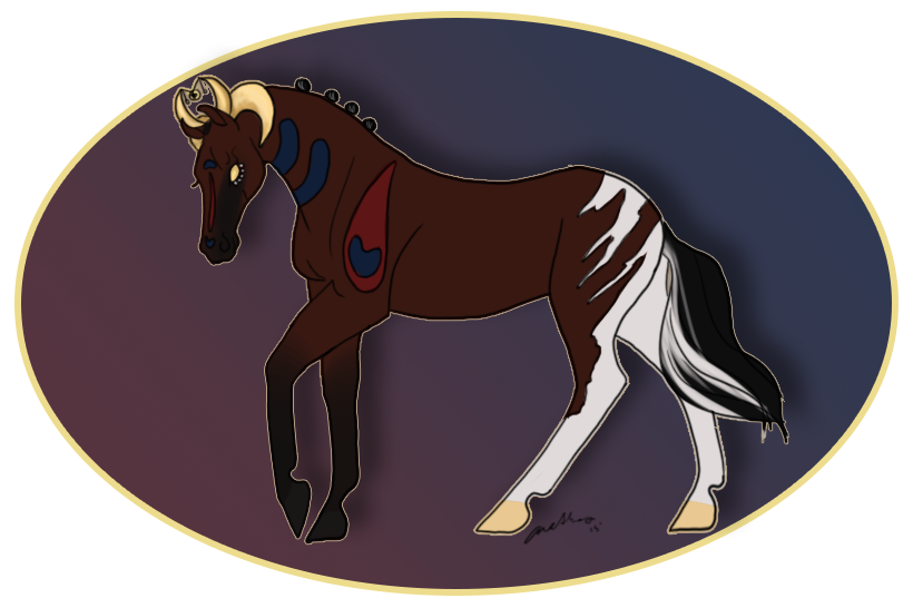
 aethlos — In a Fog [manipulation]

Published: 2014-04-18 21:18:21 +0000 UTC; Views: 746; Favourites: 24; Downloads: 0
Redirect to original
Description
CLICK TO ENLARGE OTHERWISE IT IS BLURRY!
My piece for EquineGraphix's Auditions.
 (Smile)")
Stock
BG-fav.me/d5qf880
Horse-fav.me/d6h6ut7
Everything else- aethlos
Related content


Comments: 9

Hi there! I'm here to critique this piece, as you requested in equinspiration !
First of all, I apologize for taking so long to get to this! Hopefully I can make up for that with a very thorough response. c:
Before giving any constructive criticism, let me say first that I absolutely love the composition of this piece. Yes, your horse is placed smack-dab in the middle of the image (and some might berate you for it!) but I feel it really works here. I can't quite put my finger on exactly what it is that makes it work, but I really like that!
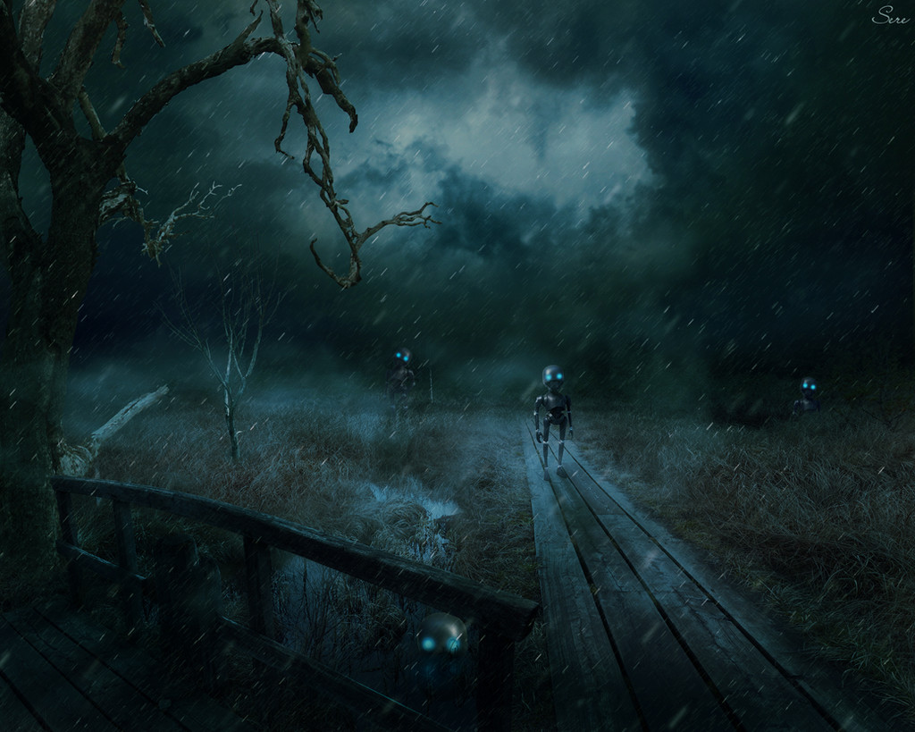
However, unfortunately, I don't feel like your lighting and color choices are really enhancing this - in fact, I feel they detract from what could easily be one of your best pieces. For images to be visually interesting, they need some sort of contrast - from light to dark, or in focus to blurred, et cetera. I know you want to give off a dark-themed image, or portray a night scene, but that doesn't mean you can't have contrast in light and color! Take a look at this image , for example - it still portrays itself as a dark night scene, but there is enough contrast for you to make out all of the details. Also, note that nothing in it is black! There are definitely times to use very desaturated colors in your manipulations, but consider when that might be - don't think that just because you want to have a night or dark scene, your entire image has to lean toward gray-black rather than more saturated colors. And, in general, you should try to use a range of saturations through your light values. For example, if you have very saturated light colors, your darks and shadows would be less saturated, and vice versa.
I hoped this helped some! I can't quite make out a lot of your details, so I can't really comment on technical skills of this piece such as hair painting, grounding, or horse detailing - but that's okay, because this image doesn't need those things. All you really need to make this much more successful is to add some visual interest by adding color and contrast. c:
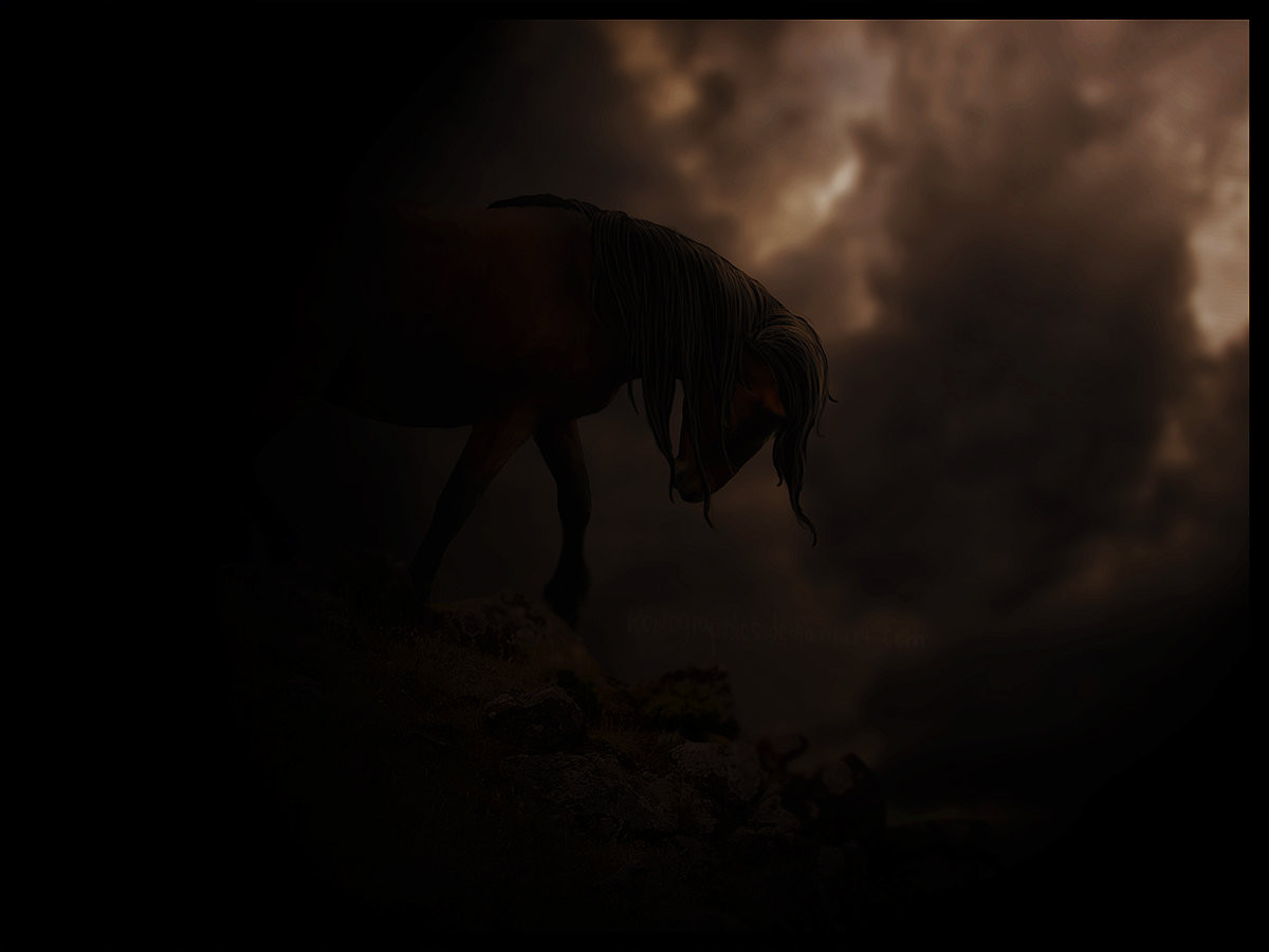
Wait, just enlarged it. I can see a lot more of the detail when I zoom in completely. I used to consider this an important thing to add, maybe about a year ago. I'd spend ages working on details close up, and then ask people to full-view it to see all the effort I put in - such as in this piece (seriously, download it and look at those dern details!). However, I think I was definitely mistaken. You should aim to make your images stand out at all resolutions - and that starts with the thumbnail size. From a thumbnail, you should be able to tell whether an image has a solid composition, if your eyes are drawn to the correct place in the image, if you have a good use of color and contrast, and you should above all be able to tell the basics of what's happening in the image. If it doesn't look interesting as a thumbnail, after all, do you really expect a lot of people to click it and look at it in a larger size to begin with?
Second, your uploaded image size should be no larger, or not much larger, than most people's screen width. The maximum that most users here are able to see is about 1920 pixels wide, so I usually now upload images between 1700 - 2400 pixels in width (and only higher than 1900 when I really want to show off some details, such as in my last manip!) This is because you should not expect that the majority of your viewers will view the image any larger than its smallest size, where the dA sidebar is at the side! I personally view everything in full-screen (where the sidebar is pushed down), but that might not be true for everyone. If your image only looks good at full-screen, this detracts from the viewing experience of the users who don't use it! Furthermore, if your image doesn't look good in a small view or at full-screen, can you really expect people to want to click to full-view (at the uploaded image resolution)? The second reason to be sure to scale down your images before uploading is because frankly, dA is not photoshop. PS is much better at resizing images, and thus a small image that you make yourself will have better quality than dA's smaller version. You can also check things like sharpness if you resize through PS and fix those things beforehand. c:
Okay, finished now - I hope this helped!
👍: 0 ⏩: 1

Thank you so much for this critique! I do struggle with my composition and lighting and trying to work on that.
")
👍: 0 ⏩: 0

this is certainly one up to your amazing standard !
👍: 0 ⏩: 1

apart from the dark bg,if you enlarge it it's true beauty comes out!!
great job,i love it!
PS:Good luck in the audition!
👍: 0 ⏩: 1
