HOME | DD
 affekt — Altitude

Published: 2006-04-04 08:21:22 +0000 UTC; Views: 1796; Favourites: 34; Downloads: 467
Redirect to original
Description
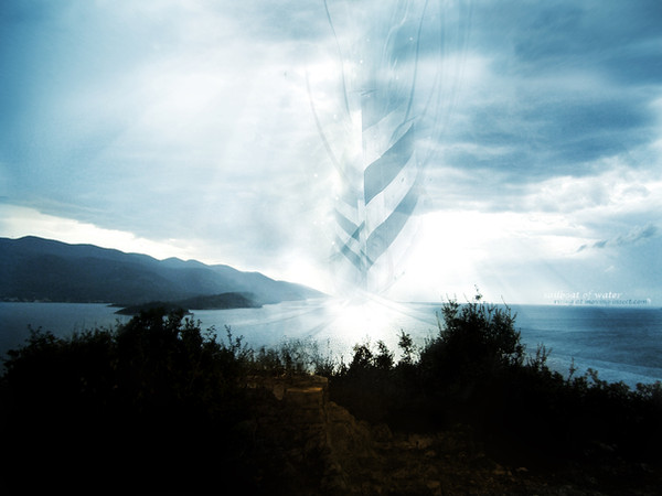
-Desktopography ; 2
 to all involved.
I noticed a comment about how most of the Desktopography images were just "stock with displacement and typography".
I thought I would just mention here that I took this photo myself on a trip to Wales.
Related content


Comments: 24


Looks very nice man. One of the better one's out of the desktop thing.
Good job bud.
")
👍: 0 ⏩: 0

not much to be said that hasnt been said..nice minimal style with great typo..nice colours too
👍: 0 ⏩: 0

Love this man. My only gripe is the MT in there, its font and orientation makes it stand out a bit too much I think.
👍: 0 ⏩: 0


Smooth as hell dude. Love that typography/2d very stylish.

👍: 0 ⏩: 0

Really neat view. Everything is blended well together. Though I will probly will get rid of the text if i use this wallpaper, just a habbit of mine, i hate text on wallpapers.
Great job , nice one.
👍: 0 ⏩: 0


really nice, great minimalistic blend of colour with nature. nicely executed.
👍: 0 ⏩: 0

love the range of colours in the sky, and how it contrasts with the foreground.
👍: 0 ⏩: 0


Long time no chat! I hope all is well with you, and again, I'm sorry about your gf and my "over-advice" haah.
👍: 0 ⏩: 0


Nice Effects! How did they came oyt so nice? What tools did you use?
N.
👍: 0 ⏩: 0

though the MT™ really doesn't fit, the rest is cool... but predictable. As in if I heard Kevin and Desktopography, I'd imagine something like this in my head automatically.
👍: 0 ⏩: 0

Very functional as a wallpaper.
I love the way you arranged the typo, I like how icons fit in there with out making it look cluttered.
Light and dark contrast works perfectly as well.
Perhaps I would have darkened up the sky just a bit or brought out the saturation for a little extra pop.
I'm currently using this wallpaper now, thanks Kevin.
👍: 0 ⏩: 0

Very dark to the lower part yet colourfull for the upper part, nice balance i must say and nice typo man, perfect fit for a desktop
 (Smile)")
👍: 0 ⏩: 0


Really loved this one Kevin. The minimalism and smoothness give such a feeling of tranquility to the desktop.
As for the typography, top notch
👍: 0 ⏩: 0