HOME | DD
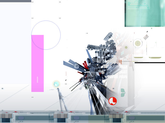
 affekt — CGLL?

Published: 2006-03-01 15:30:20 +0000 UTC; Views: 1580; Favourites: 29; Downloads: 535
Redirect to original
Description
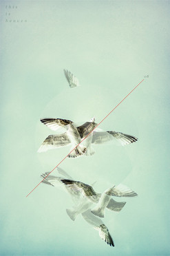
CGLL?Personal Print.
Related content
Comments: 26

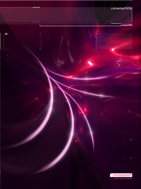
Excellent color, detail, and unique style. It reminds me of something you may see inside the head of a madman, as he rocks back and forth on the linoleum floor, grinning wide with a bit of eye twitch.
The side-title thing is not "Unique" but is is pretty rare, and adds to the effect of the deviation. Makes it look like a real print rather than just something you're going to print later, almost as if you made it, and then scanned it after printing.
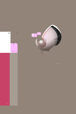
It just keeps me guessing, with the milk bottle, the random letter, and the pixellation. Like the bird just like, died or something and being transported out of the Matrix.
👍: 0 ⏩: 0

wow... very brilliantly done.. i like the way u strach back wings!
👍: 0 ⏩: 0

There's something captivating about this. I love it
👍: 0 ⏩: 0

This is creative and ..well neat. I can tell thought was put into placement no doubt. I dont think this one hits me the same as the others. Keep it up man. You keep rollin out good stuff.
👍: 0 ⏩: 0

some real nice style in there, like how the pixelation seems to emulate the texture of feathers.
👍: 0 ⏩: 0

It needs to be in a magazine. All the elements are flawlessly placed. I can't imagine a single aspect of the piece being altered for the better.
👍: 0 ⏩: 0

like wirestyle saide, your work is so precise. damn, i love it.
👍: 0 ⏩: 0

Quite beautiful work.
I really like the purple shapes and the typo .
Not sure what i think about the CGLL text, i think the typo is quite cool in general.
Really good work anyways.
👍: 0 ⏩: 0

There's something very surreal about it. Could be the soft glows and fragmentation. Very cool. Typo is a winner and the color scheme definately is one too. Nice going, Kevin.
👍: 0 ⏩: 0

SEAAAGGUUULL!!!
No really, this is sexy. I love that ultra-KM-stylized bird thing, if that is indeed a bird thing. You minimalist style is always top notch, and your typography fits perfectly. Awesome work my friend.
👍: 0 ⏩: 0

its very nice , only problem i have is the dots in the background but overall its very nicely put together
👍: 0 ⏩: 0

I like the way you have created something new and abstract from that bird, good job..
👍: 0 ⏩: 0

Everything you do is to a pretty high standard i would say, i can see you adding and tweaking each little part until it is complete, it seems always a lot of thought also goes into your work, anyway good stuff, good use of typography and colour...
👍: 0 ⏩: 0

very nice. i really like your left-side labeling scheme. it's different.
👍: 0 ⏩: 0
