HOME | DD
 affekt — monosquared

Published: 2004-10-20 14:32:36 +0000 UTC; Views: 1572; Favourites: 39; Downloads: 716
Redirect to original
Description
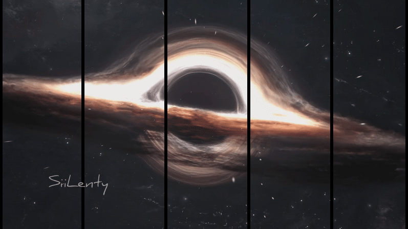
_mono²4EII
My first image for 4-Effect release.02: "Coma Machina"
I think I need to create more of a powerful appearance at the crevice where the lighting is flowing from, but i'm pleased with the 2d and overall appearance.
The website should be ready within the next couple of days.
Related content


Comments: 46


I like the "progress" idea, sweet. I dont like the typography, but I really really do like the colors and the lightning.

👍: 0 ⏩: 0


This one is very simple.
Things I Like:
1) Colour scheme is good.
Things I Don't Like:
1) Forms are basic.
2) Typo is basic
3) Lens flares are too obvious.
Overall, you're not doing anything with this. As I said, colour scheme is cool, but this piece is not exactly pushing boundaries. Remember dude, innovation, not imitation. Create for yourself, create yourself.
👍: 0 ⏩: 1

No lens flares, I can assure you that was the first thing I learnt. 
👍: 0 ⏩: 0

yes
i luve it !
nice work and on the 2d and the dark render
is cool  (Wink)")
good work


👍: 0 ⏩: 0

I like the colors and the "metallic" look of this one - it shows great lightnings, too. Good job on this one!
👍: 0 ⏩: 0

I really enjoy the simplicity (as in minimalism) of this peice, it's a rarity in the world of "abstract" artwork.
👍: 0 ⏩: 0

looks gooey
the tech pwns and the colors are beautiful
👍: 0 ⏩: 0

very nice and clear 2d, tho the rest is kinda unexciting
")
👍: 0 ⏩: 0

This is a really great pic, love the colours and the smoothness!
👍: 0 ⏩: 0

Looks nice. good use of tecnical. If that progression bar is coming from the left it looks 40% complete though....

👍: 0 ⏩: 0

crisp. this is beautiful. the colors, lights, 2d and quality on the image is just dope
👍: 0 ⏩: 0

I like colours and lights but i think 2ds are a little bit typicals
👍: 0 ⏩: 0


mFg kev, i look at this and think how far you've come art wise..it's simply amazing.
👍: 0 ⏩: 0


yes i love teh flow m8. the colors are delicious.
also, the brushing work and teh background are excellent.
nice 2d designs too
i lovin it
mP
👍: 0 ⏩: 0

interesting work.
if I were to change this it would be the font and also I would make the pink rod things white, and maybe a little bit of that pink on the outlines.
👍: 0 ⏩: 0

how the hell!! my devwatch missed this. Anyways great colours man , they really suck you into the picture its a very good image .. combined with structure and form you've really got it balanced.
Muchos
👍: 0 ⏩: 0


Indeed awesome work  (Smile)")
")
👍: 0 ⏩: 0

fantastic work! Love the colors and ambient feeling!
👍: 0 ⏩: 0

great image..lovely colors and blob-like background is awesome. instant fav 8)
👍: 0 ⏩: 0

I loved this when I saw it like... 3 weeks ago? It still as fresh and orgasmic as I've first seen it. Wonderful colors and a great touch of 2D make it an instant fav. Great stuff mate.

👍: 0 ⏩: 0

aah makes my eyes go ballistic
the good work...
👍: 0 ⏩: 0

Bad-ass colors, beautiful to look at. Great 2D and smooth render too.
👍: 0 ⏩: 0

Nice color choice .. 2D and render are awesome .. I like it very much good work
👍: 0 ⏩: 0


Wow bro, this looks preety dang slick. Nice color's and nice liquidy shapes.
👍: 0 ⏩: 0

Want some hard assed comments?
Add brushing to the picture, techlines won't cover up everything, they should add to the picture.
Speaking of techlines, I decided to stop using them because I felt they were consuming the image. But hell you're not me.
Less shiny abstract, more shape, more light, more life.
Other than that, good colouring and balance.
👍: 0 ⏩: 2
They make me sound like I know nothing. I take offense to that. I'm just trying to be helpful, that was uncalled for.
👍: 0 ⏩: 0

I've got to disagree with everyone of your comments... there not "hard assed". They make you sound like you know nothing.
First of all, this doesn't need no more brushing than it already has. Adding more will just drastically over do th image. The techlines don't cover anything up because there is nothing to cover up, and they do add alot to the picture.
Second. It doesn't need more light to have more life. It has enough life as it is and sets alot of emotion because of the light and colours it already has.
👍: 0 ⏩: 0


well then so will i...ill release whatever images arent already when teh site is released
Awesome work here, very different, but u are right about it needing to be more powerful
👍: 0 ⏩: 0


great job
👍: 0 ⏩: 0