HOME | DD
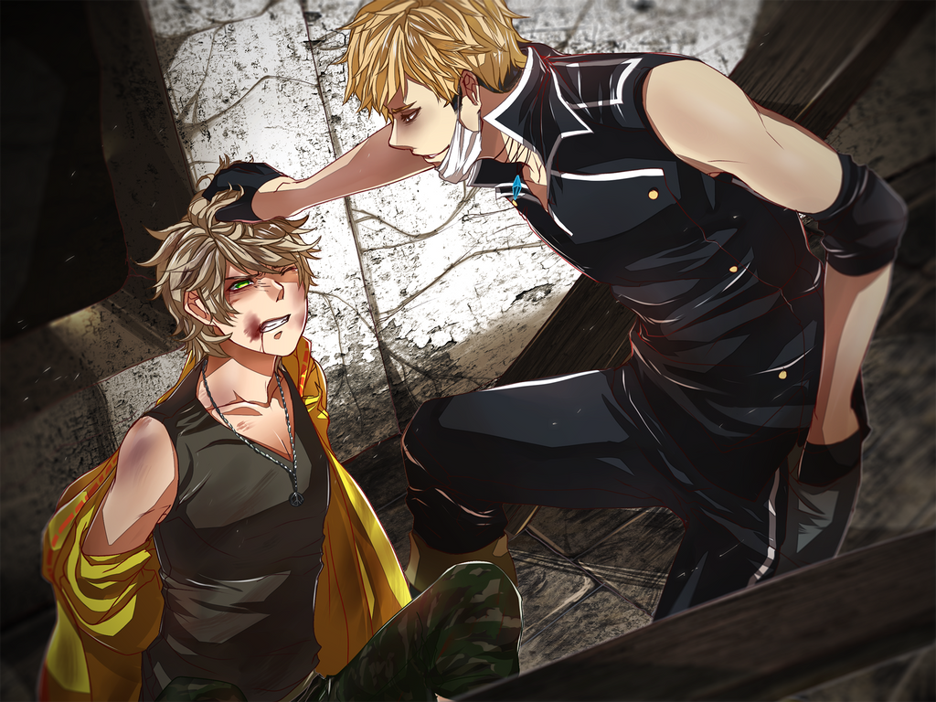
 ahjojing — trying some new style

Published: 2012-12-02 14:30:25 +0000 UTC; Views: 793; Favourites: 15; Downloads: 8
Redirect to original
Description
I'm trying some lineart style, the left is a rough-like or pencil like, while the right is the usual cell shade I use, an ink look and a solid look. which lineart is better? x'DRelated content


Comments: 33

They're bot relly awesome!! 0o0
I prefer the test one though, i'm not sure why, I just do x
👍: 0 ⏩: 0

ahhh aku monopli aja!, saya pilih dua-duanya !!!
👍: 0 ⏩: 0


It's very hard to choose since the right one is really neat and beautiful BUT the sketchiness of the left one makes its charm ... x3 it's just hard ! both are amazing
👍: 0 ⏩: 1

dawww, thank you ;;u;; I'll keep that in mind xD
👍: 0 ⏩: 0

kalo kiri banyak garis arsirnya lo banget dir
tapi yg kanan lebih rapih akoh suka
jadi gue pilih kanan karena kalo clean itu asdfghj
👍: 0 ⏩: 1
tapi yang kanan lebih makan waktu dan sekalinya ga rapih jadi jelek banget mel :')
makasih udah milih hoho <3
👍: 0 ⏩: 1


dawww, I enjoyed linearting the left one tho xD
👍: 0 ⏩: 0

ea.. beda tipis banget itu mah.. yg mana juga boleh.. tapi krn hidungnya diarsir dan garis mulutnya kurang tegas yg kiri.. aku jadi pilih yg kanan.
👍: 0 ⏩: 1
haha justru artist mesti meratiin hal2 kecil :3 oke2 tengkyuhh xD
👍: 0 ⏩: 0


yg kanan di warnain y lineartnya .
still overall bagus kedua duanya
sebenernya tergantung gmn cara coloring ao guu san 
kalau saranku memang yg cocok sama tipe cell shading adalah yg lineartnya kiri yg hitam, kesan " deepnya lebih dalam " biasanya memang cocok buat yg tipe drawingnya manga
kalau memang mau coba tipe lineart yg halus seperti yg kanan n linenya di warnain saranku memang 'warna' pada gambarnya ttp hrus ada kesan kedalamannya / alias lebih gelap ( baik cell shade ataupun painting )
👍: 0 ⏩: 1
wah, makasiih ;;u;;
aku emang lebih sreg sama yang kiri karena yang kanan sering jadi acak2an hahaha xD
makasih sarannya xDD
👍: 0 ⏩: 0

For the hair, I really like the test. For the face, I really like the usual  (Smile)")
👍: 0 ⏩: 1
daww, thank you~ I'll try to experiment with it xD
👍: 0 ⏩: 0

I like the new style. It gives the drawing a ruff, bolder look.
👍: 0 ⏩: 1

I like it better in the face on the left but it might be a bit dark in the hair, so maybe just use a bit lighter lines in the hair, not as light as the one on the right just a bit lighter than on the left. but the face on the left looks great the way it is. in my opinion
👍: 0 ⏩: 1
oh okay, thank you so much for the suggestion
")
👍: 0 ⏩: 1

They're both good to me, but the right seems slightly better.
👍: 0 ⏩: 1

yang kiri lebih luwes.. yang kanan lebih rapii yg mana aja bagus kok xDD
👍: 0 ⏩: 1
asdjhadsghja okeee, akan di pertimbangkan :'''3 makasih nekosan <3
👍: 0 ⏩: 0

mmm...
I think I prefer your newer style it looks good ~ <3
👍: 0 ⏩: 1