HOME | DD
 aip — Mouse
Published: 2005-06-23 13:09:05 +0000 UTC; Views: 122; Favourites: 2; Downloads: 17
Redirect to original
Description
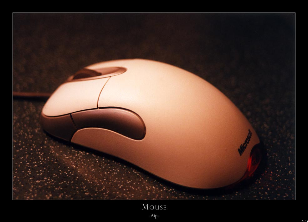
Ok, im only posting this one because I want comments and critique about the lighting, DOF and composition mainly.I just needed something to photograph, so ignore the fact its a microsoft mouse
")
Advanced C&C encouraged.
Related content


Comments: 14

I really like the colour in this one man, but like some of the others have said the contrast between the lit area and the darker parts is a little too harsh.
But that is some very sexy mood lighting the mouse has going on.
👍: 0 ⏩: 1

the lighting makes it look very sexy
it also draws the eye to the left hand side of the photo
👍: 0 ⏩: 1

hahah! hey, still life!
👍: 0 ⏩: 1

yeah i know- and it looks really good
👍: 0 ⏩: 1

The lighting is very nice, but I'm not too sure about the composition. It seems to lack a direct focal point, so my eye is drawn to the point where it is best lit. Unfortunately, it is one of the least visualy appealing/interesting points of the subject. I really like the highlit edge on the grey bit on the side, it adds alot of texture to the peice.
👍: 0 ⏩: 1
Cheers mate.
You're right. It lacks a defined focal point, or even a point. I usually try and convey a thought or purpose in my photos.
Thanks for the C&C though, much appreciated.
👍: 0 ⏩: 0

ok C&C it is....
DOF could be a tad sharper on the top left (near the scroll wheel)esp when full viewing.. then again it's not really the main focal point... my eye is drawn to the lighter section on the top then drawn to the darker side section and finally to the writing and light on the far right end...( when viewed on smaller image)
there's a section on the mouse pad? table top? or whatever its sitting on, that looks like a reflection? or bump? line? in the surface that is somewhat distracting... (left side foreground)
all that said the use of warm tones is very appealing to ones eye  (Smile)")
keep it up!!!!
👍: 0 ⏩: 1
Cheers dude!
Yep, the desk top has a seam in the join... I should have thought about that when i took it... I noticed it too when I saw the print.
Cheers for the C&C too. I tried to achieve warm smooth tones here, hence the really short DOF, maybe too much?
👍: 0 ⏩: 1
nope i dont think the warm tones are too much they work well
👍: 0 ⏩: 0
