HOME | DD
 akbart — Death Korps of Krieg Commissar

Published: 2008-11-12 17:43:56 +0000 UTC; Views: 28300; Favourites: 109; Downloads: 11932
Redirect to original
Description
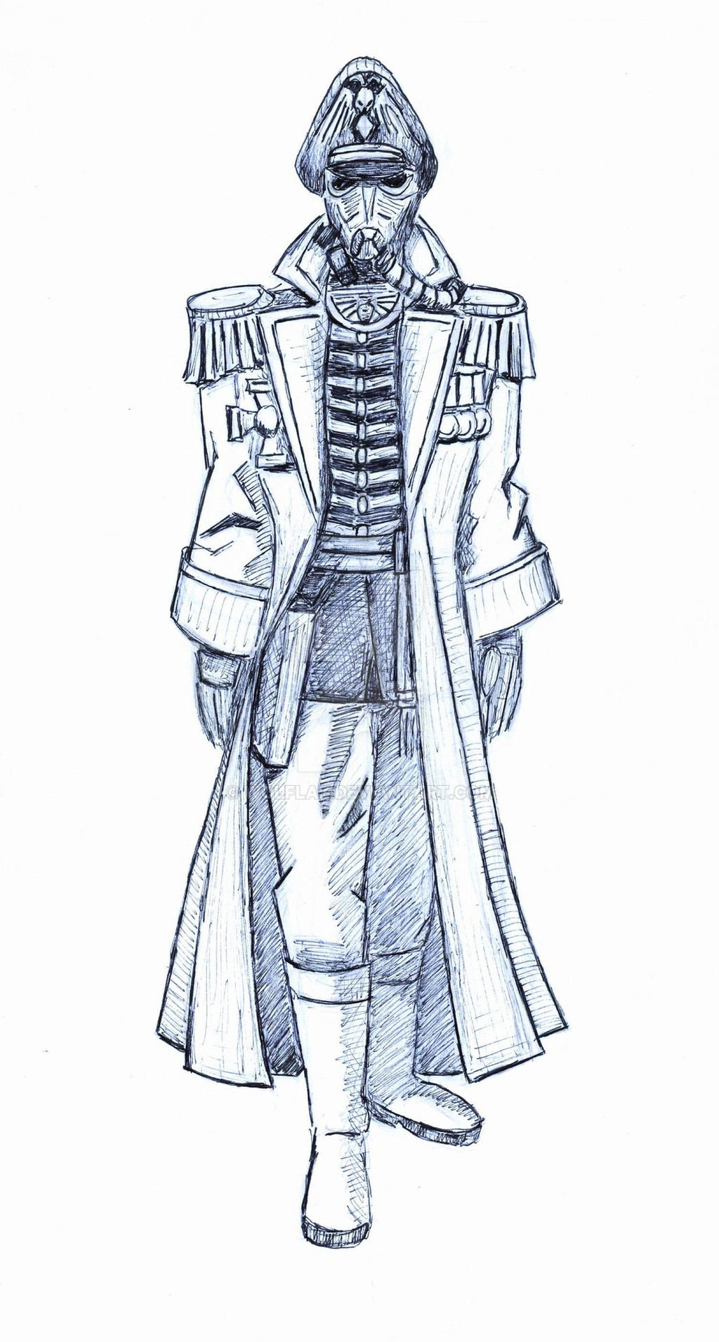
Warhammer 40k Death Korps of Krieg Commissar.I really don't know what should I think about colors.
They are in many places too dark, some badly lighten.
I don't have experience with PS, whereas original scan is to shiny.
I've used some mixed techniques of shading.
With no idea at my side:
Idea of position and style by Wolflaz.
[link]
Related content


Comments: 12

death korp of krieg fanart is pretty popular and this commissar is one of my favourites. I think its the shape that I like, it's a bit lankier than most. Great job!
 (Smile)")
👍: 0 ⏩: 0


Good, but it looks like Kronen from Hellboy in a fancy jacket. But thats pretty cool too.
👍: 0 ⏩: 0

")

Dude! Great work! I jumped when I saw it! *dread*
-Mandalore
👍: 0 ⏩: 0


Interesting...the link through my orginal deviation does not work...Could you check it, please?
👍: 0 ⏩: 1

Yes, I it didn't. I've repaired it. Must badly copy yours.
Sorry for that.
akbart
👍: 0 ⏩: 1

While your shading techniques could use some more work, the stance and shape of the Kommissar is great.
👍: 0 ⏩: 0