HOME | DD
 AlexanderFriedl — easyport - easytemplates.org

Published: 2009-03-19 15:12:51 +0000 UTC; Views: 5426; Favourites: 21; Downloads: 135
Redirect to original
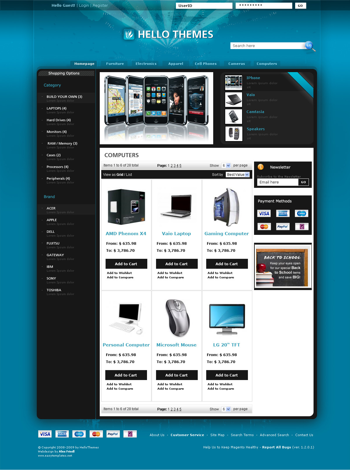
Description
BUY at [link]www.easytemplates.org
Related content


Comments: 17

Das Logo ist definitiv pimperiiish!
Nice concept, btw
 - :D")
 (Wink) - ;)")
👍: 0 ⏩: 0

sieht gut aus, ich mag besonders das Logo und die Navigation
 (Smile) - :)")
👍: 0 ⏩: 0

it looks good just that logo that probly need a bit of work doesnt seem to be fitting in there.
👍: 0 ⏩: 0


Not a big fan of the gradients as background element, but it looks yum
👍: 0 ⏩: 1


erst jeden Tag ein design uppen und dann 4 wochen gar nichts ^^
Finds auf jedenfall cool. Schön Schlicht... für nen coder perfekt... die müssen nicht mit effekten Punkten.
👍: 0 ⏩: 0


The news content box lets this one down, but, apart from that its good.
👍: 0 ⏩: 0


Sieht geil aus! mach vll. die Box mit dem Zitat kleiner und mach noch irgendwas mit den Content, einfach weiß sieht meiner Meinung nach nicht gut aus.
btw Metallica ftw!
👍: 0 ⏩: 0