HOME | DD
 AlexanderFriedl — jmcrew v2

Published: 2008-10-06 21:20:14 +0000 UTC; Views: 14986; Favourites: 60; Downloads: 284
Redirect to original
Description
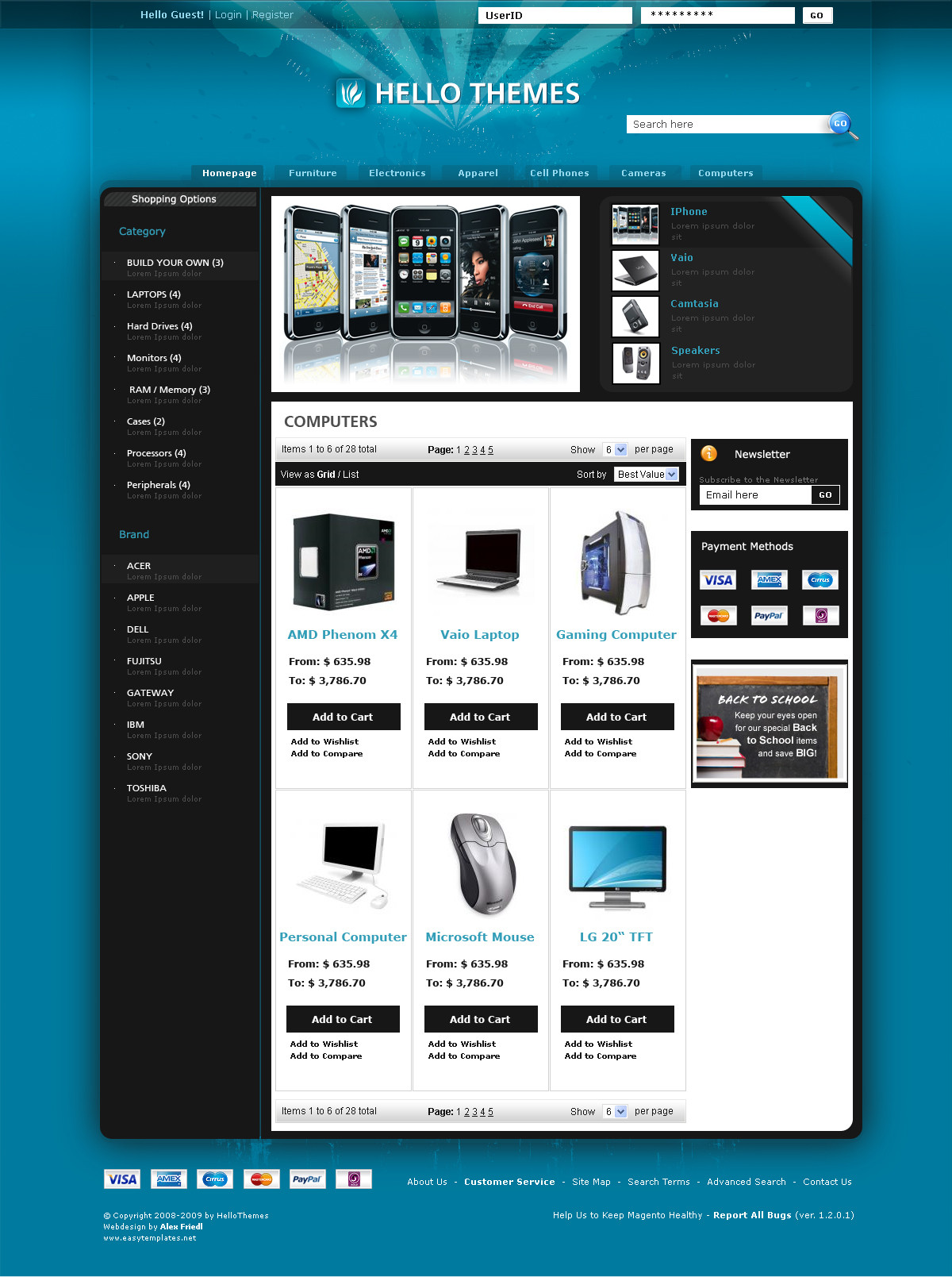
hi,i started this piece for the very best clan on eart -> www.jmcrew.net www.jmcrew.de
page is offline at the moment.. didn't pay the space for years ^^ (really). seems as if they noticed. its gonna be online soon. still need someone to code it -> ICQ: 278958010
comments appreciated!
/update1
Related content


Comments: 38

What is the menu-font? This is not Tahoma i see... Very original idea.
👍: 0 ⏩: 1

hm, i dont know. its standard-font for sure. arial?
👍: 0 ⏩: 0

 (Smile)")


Kleinwenig von Herr-H´s neuem abgespickt oder? ....aber wenn dann nur minimal, kann mich auch irren^^
aufjedenfall cooles teil
 (Wink)")
👍: 0 ⏩: 1
loginbutton ähnelt, okay.
👍: 0 ⏩: 0


yo, verblüffende ähnlichkeiten
👍: 0 ⏩: 0


geiles teil ")
greeetz
👍: 0 ⏩: 0

logo und footer solltest du nochmal überarbeiten aber sonst richtig hoot!!<2
👍: 0 ⏩: 0


Sehr geil, aber die font in der navi gefällt nicht s.
👍: 0 ⏩: 0

echt schniecke^^
nur "stats" der platz gefällt mir nicht
aber torzdem einen
👍: 0 ⏩: 0


finde ich irgendwie echt cool.
normalerweise find ich es besser wenn alles etwas getrennt ist, aber hier ist es irgendwie fresh
👍: 0 ⏩: 0


definitiv das beste was ich je von dir gesehen hab!
logo etwas verpixelt
👍: 0 ⏩: 0


mach die navi-font nicht kursiv, sieht besser aus
ansonsten hab ich eigentlich nicht viel zu sagen, smileys sagen mehr als 1000 worte ^^
👍: 0 ⏩: 1
fettes danke^^
navi font mach ich noch standard
👍: 0 ⏩: 1
und die content font nen tick größer
👍: 0 ⏩: 1
hehehe alles klar^^
👍: 0 ⏩: 1

ich liebe das design!
würde zwar an den trennlinien im unteren bereich arbeiten, aber sonst geil!
👍: 0 ⏩: 1
thx ^^
ja, ich geh allgemein nochma drüber. psd datei is aber zu groß für meinen arbeitsspeicher.. da verlier ich die lust, wenn allein das speichern ~5min dauert
👍: 0 ⏩: 1
wenn die psd zu groß ist, raster die textebenen, die ziehen verdammt viel arbeitsspeicher...
👍: 0 ⏩: 1
ja schon, will mir aber alle möglichkeiten offen halten^^
👍: 0 ⏩: 1
mir ist noch etwas eingefallen...
du kannst bei den Voreinstellungen mehr Speicherplatz auswählen, also wenn dein RAM voll ist verwendet er dann den Speicher von D:/ zum Beispiel...
👍: 0 ⏩: 1
ach krass, voreinstellungen? ich schau kurz. falls ich probleme habe meld ich mich nochma bei dir^^
👍: 0 ⏩: 0