HOME | DD
 AlexandrePh —
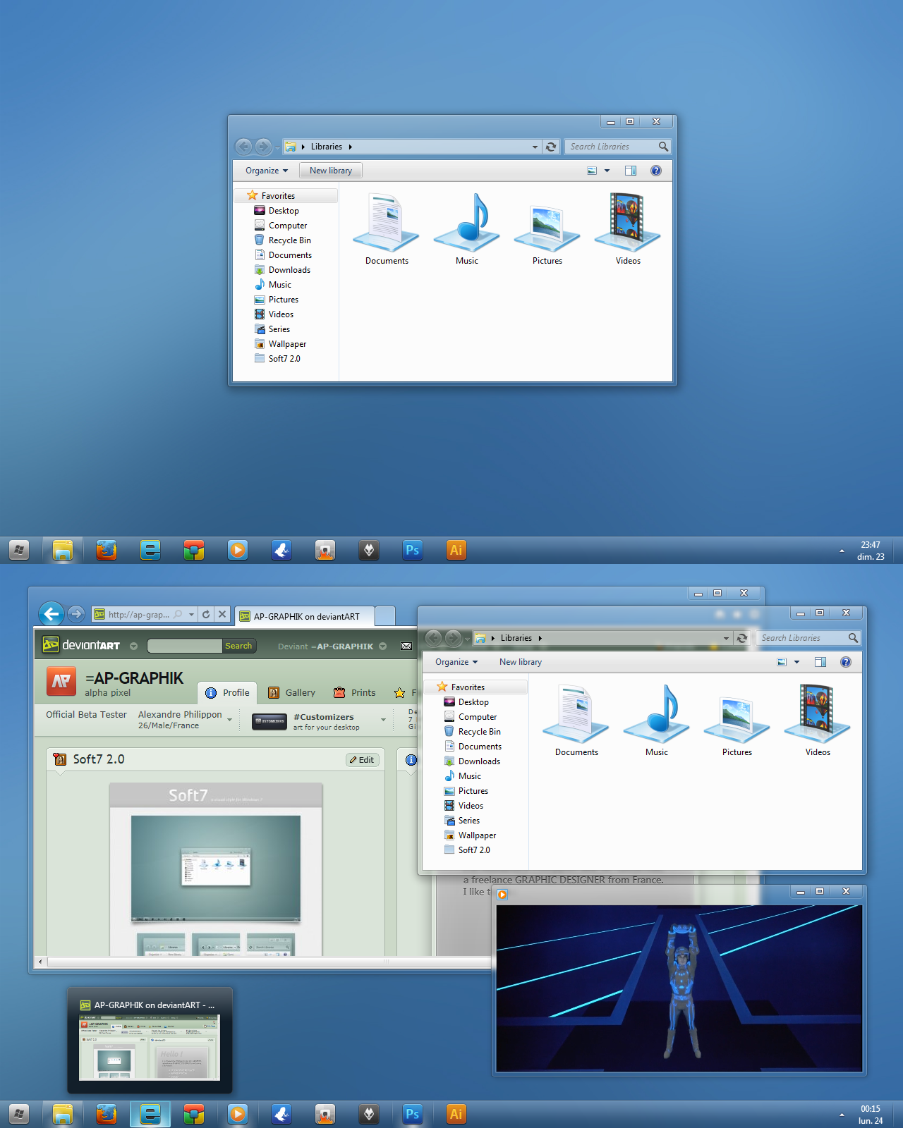
Soft7 1.7 for Windows 7
by-nc-sa
AlexandrePh —
Soft7 1.7 for Windows 7
by-nc-sa

Published: 2009-10-31 04:05:35 +0000 UTC; Views: 251705; Favourites: 414; Downloads: 43760
Redirect to original
Description
SEE THE LAST VERSION : Soft7 1.8Wallpaper included (1680x1050) : Soft7 download the Wallpaper pack for additional colors.
Icons not included : Token by brsev
Start orb not included : steelOrb by me
 (Smile)")
Firefox theme not included : Strata40 v0.4.3 by SpewBoy
with StrataBuddy Firefox 3.7 Addon by BoneyardBrew
EDIT : Thanks a LOT for the DD, I'm truly grateful !
Such a joy after all this work !!!
Thanks a lot !!!!!!!!!!!!!!
Related content


Comments: 410

Could you make a version of this vs with favorite links background color similar to leopard?
👍: 0 ⏩: 1

Why this version and not the 1.8 ?
Why sending me a comment AND a note ? don't you think I already receive too much messages per day ??
Well, what is the favorite links you're talking about ? in the start menu, the superbar ? could you show me a screenshot of the part of the leopard visual style you like ?
I wish to precise that I don't want to copy mac's visual style, I only do things that I found great and some looks like mac. It's a "soft" version of aero, not a leopard skin for windows.
Anyway, thanks for your interest and suggestion
👍: 0 ⏩: 1
I prefer 1.7's superbar than 1.8.
Anyway, I'm talking about the navigation pane at the left of the explorer windows, if you could make its background color like that of Soliq7.
👍: 0 ⏩: 1
well the superbar is exactly the same between 1.7 and 1.8, it's only the selected open windows that changes.
ok, well it's not a bad idea, I may not make it blue, I think I will try a slight gray, if I found where to change it. I'm only a beginner with Vista Style Builder
👍: 0 ⏩: 1
Ok, I'll wait for that, hope you can make it soon.
👍: 0 ⏩: 0

Extremely nice incoprporation of the Token Icons, I used them for Rocketdock.
Great Style! It's extremely elegant!
👍: 0 ⏩: 1
Where can I get more W7 Styles, so far I've got like 3 and I wanna try out some more. I gotz this one, the 3 Gaia09 ones and some dark one
👍: 0 ⏩: 1
lol, sends me off to crappy sites with no custom stuff just, colors
thx anyways! ^^
")
👍: 0 ⏩: 1
I don't know much, I only go on dA, which sometimes leeds me to some sites but that's all.
And for W7 I haven't search a lot, when I started my theme there were almost no theme at all and now I only use mine
👍: 0 ⏩: 0

nice theme. what program did you use to make it, or did you code it yourself?
👍: 0 ⏩: 1
I just change the default theme with Restorator and Photoshop + Gimp.
Thank you
👍: 0 ⏩: 1
thanks
👍: 0 ⏩: 0

i like the 1.6 version better when the mouseovers had a clear background instead of a more opaque grey ")
👍: 0 ⏩: 0

ok i just used your version of patcher
then restarted the computer then just copied your theme folder in resources folder in the c/windows and am trying to apply the nothing is changing
👍: 0 ⏩: 1
first it's not C\Windows, it's C\Windows\Theme.
Then pay attention to copy the file and the folder INSIDE and not the entire folder.
maybe it's now time to try the 1.8 version of it ^^
👍: 0 ⏩: 0
can any one help me all other custom themes are working but i cant install this theme plz help
👍: 0 ⏩: 2
Explain me exactly how you do to install it.
but yes it perfectly works, you just have to read the description, and maybe some commentaries
👍: 0 ⏩: 0

Follow the guide. Works perfectly.
👍: 0 ⏩: 0
It works ?
I'm glad to hear it !! ^^
👍: 0 ⏩: 0

Tried about 3 times.Downloaded the Patcher,Runned at administrator,patched the 3 things,then copied the theme in C:\Windows\Resources\Themes,double clicked the .exe,restarted,and still the same skin.
👍: 0 ⏩: 1
you said you double-click the exe? there is no exe inside it.
you have to put only the file and the folder called soft7 inside the Themes directory, not everything that is on the rar, the this 2 inside the Soft 7 folder inside Soft7_1.7_by_AP_GRAPHIK folder.
You're supposed to see some changes directly when you launch the theme, before restarting I mean, because restart is just so that everything applied perfectly, do you see some changes when double click on it ? Does the theme appears when you right-click on your desktop and go to Personalize (under Installed Themes) ?
👍: 0 ⏩: 0

It workes with Windows 7 x64. I'm using also W7 x64. The problem may be on your side dealing with Windows 7.
👍: 0 ⏩: 0

Great update, thanks.
Thank god the damn Vista-blue menus are gone!
👍: 0 ⏩: 1
Thanks !!
Yes I also hate this color ^^ but I admit that the blue of Win7 is far better than the green-blue from Vista !!
not enough better !!!
")
👍: 0 ⏩: 0

Getting better and better as always. Favoriting until the world blows up...
👍: 0 ⏩: 1
👍: 0 ⏩: 0
Thank your for this great theme. I saw your preview 1.8 and that you changed the min/max/close buttons. That's a great idea, because these buttons are much better. Please color them on move over and push.
I love your theme and I'm also doing grafics all the day (my job) and I hate the MS cleartype shit. That's a pain for a graphic person. So I changed all the fonts an you theme to Verdana Quality:NonAntialiased. This is much better (for me).
Out of this case I also changed the shellstyle.dll from you theme, so that the previewpane only used Verdana in 8 , 9 or 10 size also "without" the cleartype shit and added a "blend in motion" effect for the text into the shellstyle.dll.
If you like it you can download it here: [link]
It for the normal not the "On Top Version". I do not know if they are different. Just test it.
BTW. You should give your new version a try and change all the Segeo UI fonts (execpt the button font) to Verdana with Quality:NonAntialiased. It looks much better. The Segeo UI fonts are only usefull if you enable "Cleartype" because the font is special made for Cleartype and if you turn Cleartype off is horror.
What are you using to edit your theme? VistaStyleBuilder? If not - its the best program to change Windows 7 themes.
👍: 0 ⏩: 2
So... ^^
The caption buttons will be colored in the SoftAERO version of my theme but not on this one.
Personally I didn't find that the cleartype effect with Segoe UI is bad, maybe you didn't adjust it the right way, there is a lot of option, no ?
I don't see much changes using your shellstyle, only the blend in effect in detailspane, but I think it adds too much importance for this part of the explorer, when I click on a file it's rarely to see its information so I prefer the way they appears by default. And I'm sorry to say that I'm not a huge fan of Verdana, it's too much round and it appears flat to me, I prefer Segoe UI or the Lucida Grande from Mac.
About the cleartype effect, I'm totally not saying that it's perfect, if you're a graphic designer like me you may know that text (and pictures) appears better on a mac because of its way to show it, it shows less pixels and have a better way to deals with gradient which is a lot better for the eyes (at least when you work on images all the day ^^)
For now I'm only use Photoshop to change PNGs and Restorator to edit the msstyle. I heard of VSB and I might test it but I'm really busy right now so I'm not in a mood to try different method to work. I may see it next week.
Thanks for this comment and all this recommendations, it's welcomed and I listen carefully to it
👍: 0 ⏩: 1
Restorator is to much time investing and you can not change other values. Try VistaStyle Builder and you will see how fast it goes and what you can do with it. I think when you first use it you will love it any never work with Restorator ([link] ).
Well two people and two minds. We live in a time of LCD monitors and when you run your LCD in native resolution than everything is clear and no one needs Cleartype. Cleartype is made for analog monitors. And Segeo UI is made only for Cleartype. Have you switched off Cleartype in your Windows 7 already? Do it and you will see that Segeo UI is a worst font. I love sharp text and because of this I'm using Eizo monitors and one one needs Cleartype with that. Try it - switch off Cleartype on your system and you will see the shit. Microsoft is thinking about that and the next SP1 for Windows 7 will have the option the disable cleartype completely and also that the user can change the systems font already. That means back from Segeo UI to a font that not needs cleartype like Tahoma ar MS San Serif.
BTW. Changing all the fonts in a theme takes a few minutes within VistaStyleBuilder
👍: 0 ⏩: 1
Sorry for the very late answer...
I've tried Vista Style Builder but I can't manage to do everything I want for now, I'll have to find a tutorial.
I thought the Cleartype effect was made for lcd screen...
I've turn off cleartype yes and I can't read anything when I do it, the letters are too thin for my eyes, because they are only 1 pixel large.
I don't know how the image is on an Eizo screen which is twice the price of my screen, but I've got a 22" Syncmaster 226BW from Samsung and it rocks too, and it's surely better with cleartype correctly tuned on it.
Of course I will have to see for myself the difference on your screen and then I could really talk about it, because I'm sure it's better for you but I don't see it.
The one true things that I don't like about VSB is that it's not a freeware... I'm a linux fan, I like free logs, I only use Windows because of the logs I'm using which are not compatible with other OS.
👍: 0 ⏩: 0
I found a bug in 1.7. Check the file Default__Rebar_BackgroundImage.png. This image is used when you click in the Windows Explorer -> Organize -> Show Menu. It's the background image file for the small menu band. See the white pixel in the left corner and also the image is to small. The blue selection goes over it. The blue band shows the max. height of the band and you see the free black space above the grey band. This appears only in the windows explorer. All the other programs use a different image for the menu background! Heres a screenshot: [link]
👍: 0 ⏩: 0

Great great style.
so clean and elegant.
much more in line with how an OS should look like in the 2009.
a request:
The Bar-on-top style have the same gradient direction as the bottom bar. This works mush less elegantly than the bottom bar does. Can you please release a version with reversed shading gradient for the top bar? and maybe remove the white line in the edge?
(or simply can you tell me how to find it in restorator, and I'll just edit it myself?).
thank you!
R.
👍: 0 ⏩: 2
Yes I alos think that OS in 2009 should look better, they haven't evolved in the last years...
Yes the superbar on top is bad for the moment and I will make a new one but I totally don't know when...
I'm not sure the 1.8 version will be release this week..... or maybe yes but not with everything I wish to add
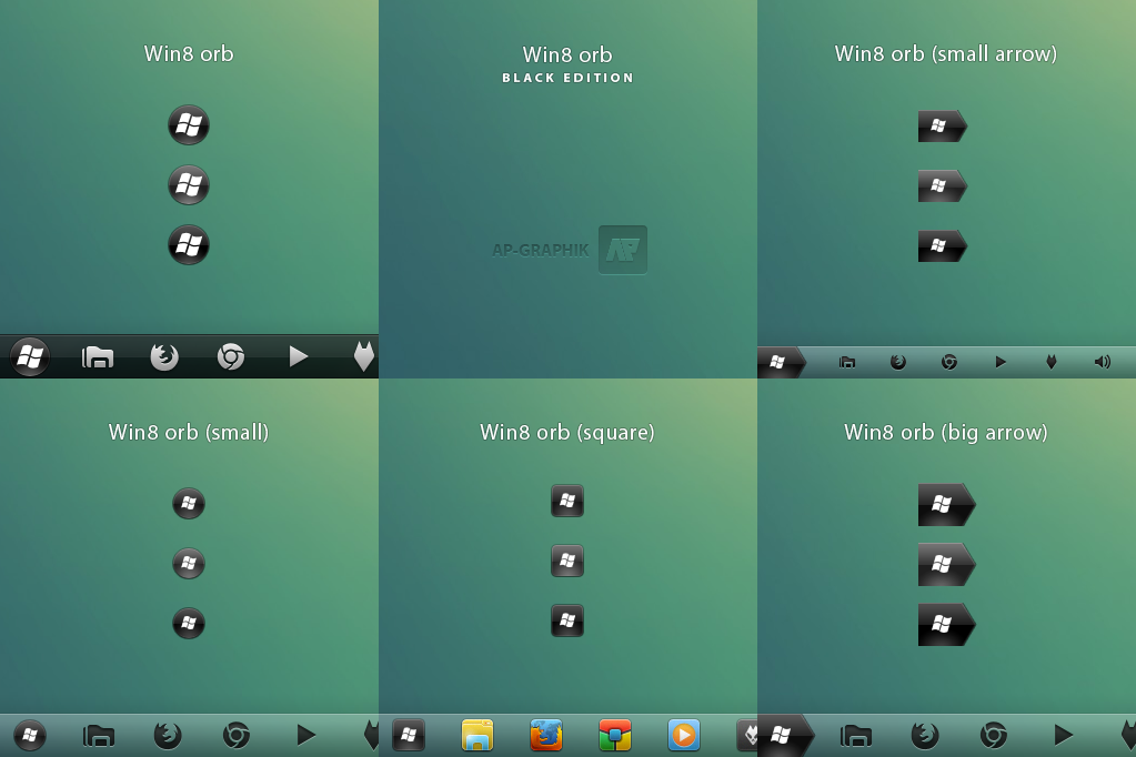
the numbers of the png are 1029, 848 and 1107 (for the desktop shortcut).
thanks for the comment
👍: 0 ⏩: 0
Sorry, I just realized I re-requested this.
I apologize for pressing on this.
I enjoy your theme still very much.
cheers.
👍: 0 ⏩: 0

If I would like to return to the default Aero theme, what should I do?
👍: 0 ⏩: 1
right-click on your desktop : Personalize, and then select the default theme
👍: 0 ⏩: 0

How do i change Explorer icon? The other icons are easy to change o.O
👍: 0 ⏩: 1
answer is on the page of my start orb, I can't explain every small details here and I don't have the motivation to explain it for the 250 times ^^
👍: 0 ⏩: 1
But i dont wanna replace my Explorer, i just wanna change the icon, nothing else?
👍: 0 ⏩: 1
everything is explain on the description or on commentaries if you've got problems !
Read the answer I gave to Shourijo (on THIS page) which is already a quote from an answer I give to someone else... please !
👍: 0 ⏩: 1
There is no reason to get angry...
Anyways i got help on WinMatrix.
👍: 0 ⏩: 1
lol
I was not angry ^^ I was just saying that the answer was already written as I've said on my other answers.
👍: 0 ⏩: 1


| Next =>