HOME | DD
 AlexandrePh — Win8 orb for Windows 7
by-nc-sa
AlexandrePh — Win8 orb for Windows 7
by-nc-sa

Published: 2011-01-08 17:51:16 +0000 UTC; Views: 98560; Favourites: 205; Downloads: 29905
Redirect to original
Description
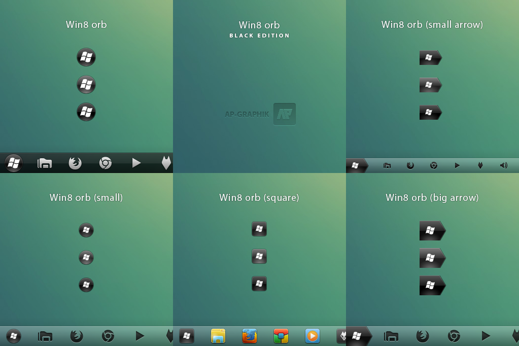
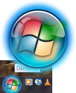
Win8 orb, a start orb for Windows 7, made in the style of Internet Explorer 9Normal and On top version
last version of explorer
explorer.exe for Windows 7 64bits & 32bits (build 7600.16450) included !
Now with the last SP1 versions !
DO NOT USE WITH ANOTHER VERSION of windows !!
BMP and PNG included
Preview made with :
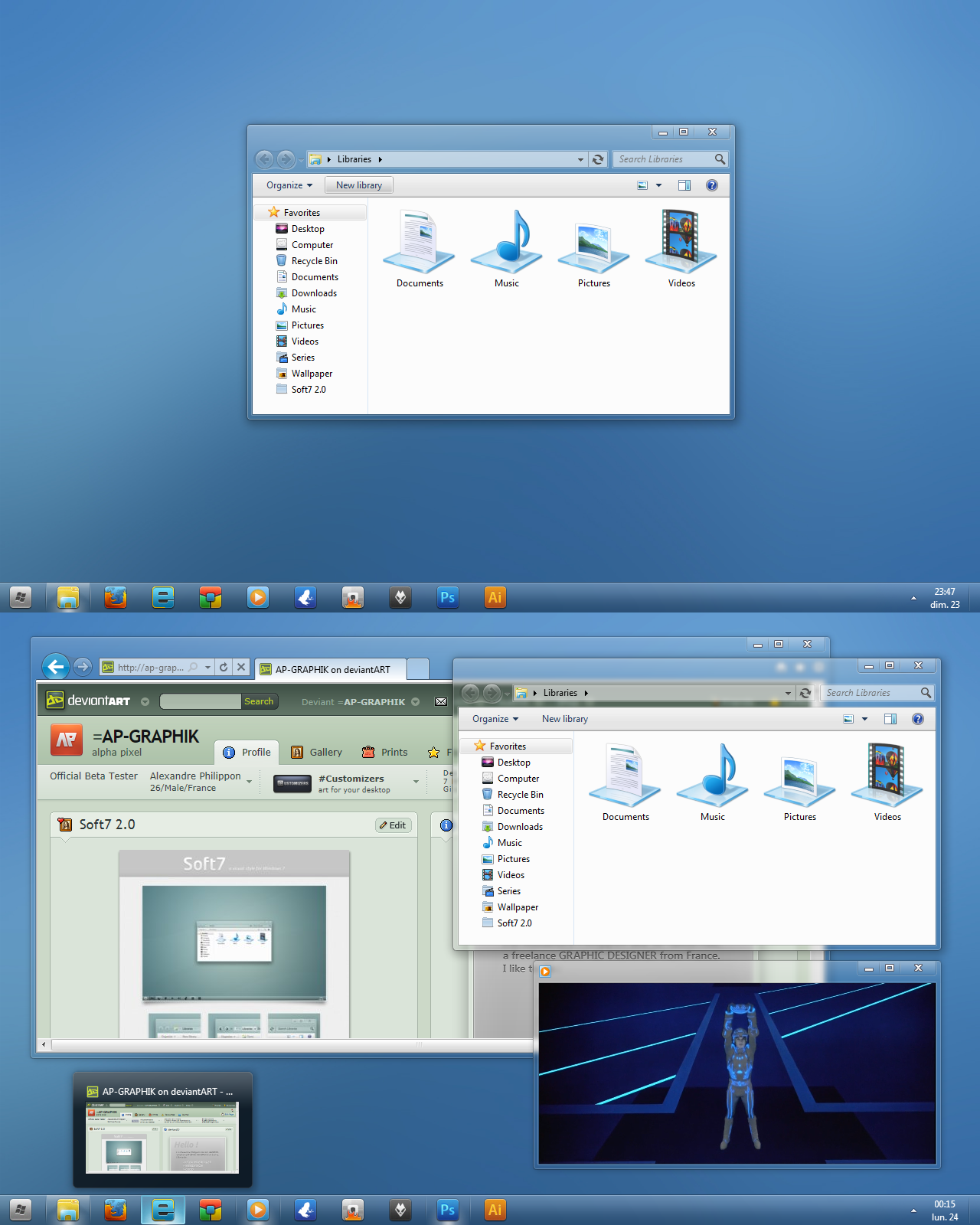
Windows theme not included : Soft7 2.0 by me
Icons not included : kARÉ by me
Wallpaper not included : bebequ3 by art-styles
Taskbar Drop Shadow by sweatyfish
***
HOW TO CHANGE YOUR START ORB :
------------------------------------------
Method 1 :
********
Use this other tool to change the exe : Windows Theme Installer by Kishan-Bagaria
Method 2 :
********
add a "take ownership" shortcut to your right-click
 (Smile)")
[link]
and use the old trick by using the task manager, end explorer.exe, then browse and replace
Method 3 : (thanks to yayme)
********
[link]
Or you can use a resources hacker like ResHacker or Restorator in order to change the picture inside the explorer.exe.
(C:Windowsexplorer.exe)
Don't hesitate to ask if you encounter problems !!!
HOW TO CHANGE ICONS ON THE SUPERBAR :
First, place your shortcut on the desktop, change icon by : right-click > Properties > Change icons > browse..... > OK > OK
only then place this shortcut on the superbar,
and now it works.
I hope you like it !
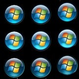
Check my other start orbs
Related content


Comments: 120


Good!
It can be used well with the IE 9 nav button.
👍: 0 ⏩: 1


I agree
But today I've made a smaller version, based on my steelOrb.
I also wish to do an alternate version, with the normal state being fully transparent, like the inactive navigation buttons of IE9, and maybe I'll do a smaller flag for this version
👍: 0 ⏩: 0

EPPPIC, can soft 2.0 be in this style.
👍: 0 ⏩: 1
Actually, I'm not really sure what theme would suit with this orb ^^ But Soft7 is totally not made to be like that, they can be use together for those that like it but that's all
👍: 0 ⏩: 1
Maybe a theme with the same kind of glare like this one? :/ I really like the new IE 9 button styles. Oh, you should make another theme. I really want to make one myself but Windows Style Builder costs money, is it possible for you to send the files for the program over? ")
👍: 0 ⏩: 1
Hahaha !! And do you also want me to send you Photoshop ? Because if Win Style Builder cost money, what are you going to think about it
👍: 0 ⏩: 0


Very cool, using it right now
and i like the description: Win-8- orb, a start orb for Windows -7-, made in the style of Internet Explorer -9-
👍: 0 ⏩: 1
Yeah ! I'm glad you see it too ")

👍: 0 ⏩: 0

Looks very nice. Great work
👍: 0 ⏩: 1
No problem. You should a smaller version though, the size of the current is a bit too big in my opinion
👍: 0 ⏩: 0

 (Wink)")

How much i should wait for for Soft 7 2.0 final?
👍: 0 ⏩: 1
It will be finished near the end of january
👍: 0 ⏩: 0


Well done mate. But I think the circular line should be dark blue not grey. Personal taste btw, cos it looks gorgeous
👍: 0 ⏩: 1
I've only made it to match with the Internet Explorer 9's navigation buttons ^^
But I think that the transparent black line is good in the fact that the superbar itself is made with a similar black transparent line.
But I do like to do the borders from the same color as what's inside (like my avatar for example
👍: 0 ⏩: 0

That's one great orb, it looks very clean
👍: 0 ⏩: 1

I've updated it, it now contains the png as well
👍: 0 ⏩: 1

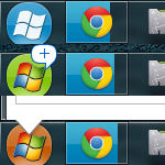
is the normal state glass or blue ???
which state is the screenshot?
looks very nice.
👍: 0 ⏩: 1
It's the normal state, blue.
The glass effect is for inactive state to me, that's why I didn't made it that way. But I've thought about the glass effect, I don't know, maybe I'll do it for a 2nd version. Would you like it ?
👍: 0 ⏩: 1
i would love it..
but i wont use it because it wont match my icons
if i make it ill make the normal state transparent.
on hover it becomes blue..
and when pressed it becomes darker.
but i get ur point.
blue for normal works better with IE9..
as a startorb is always ready and needs attention
👍: 0 ⏩: 1
I won't use it too ^^ I only made it for the idea
I should also make a different preview for my start orbs, with the 3 states.
For this one the clicked state is slightly darker than the normal state (more blue actually)
And I also think that a glass start orb is very good looking ^^ I'll do the second version when I'll find the time.
👍: 0 ⏩: 1
great
and il be fixing that bug
👍: 0 ⏩: 0

thanks for request

👍: 0 ⏩: 1
I'll make a small and a square version too ^^ Now that I have the effect it won't be very hard.
👍: 0 ⏩: 0

Very nice man, but is this still a w.i.p cuz this could be better!!
👍: 0 ⏩: 1
I've made it to match the Internet Explorer 9's navigation buttons, and it's almost perfectly copied I think. Maybe the windows logo isn't perfect...
Ok maybe the inside stroke isn't exactly the same if you look very closely
The problem with this blue is that it's very hard to find something that goes well with it...
👍: 0 ⏩: 0


I like the concept behind it. You should make a rounded-corner version to match with your icons
👍: 0 ⏩: 1
| Next =>