HOME | DD
 alexdesigns — The VISUALSIGN

Published: 2007-05-19 17:28:39 +0000 UTC; Views: 25629; Favourites: 211; Downloads: 799
Redirect to original
Description
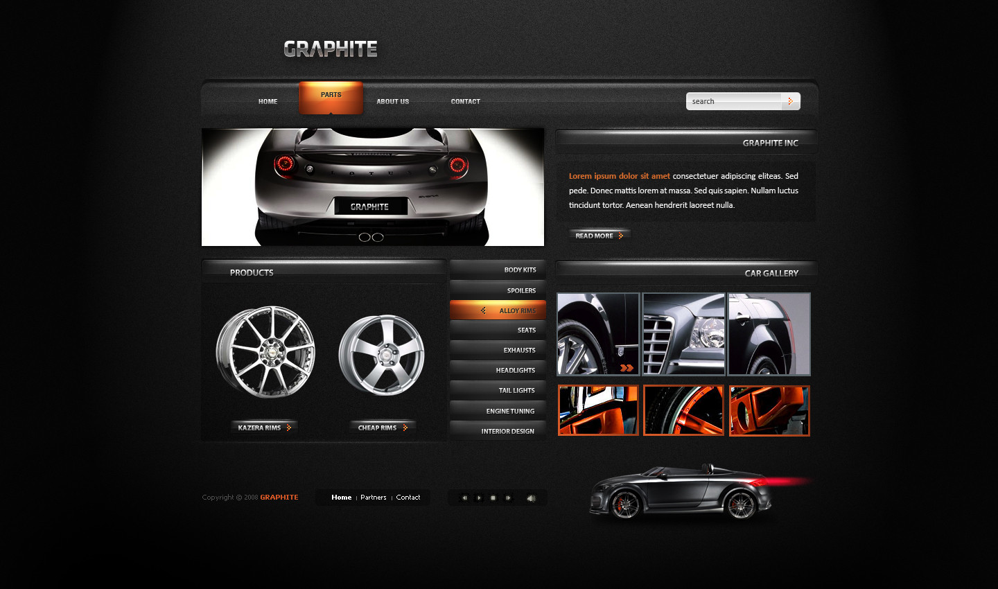
Name: The VisualSign.Purpose: A made-for-practice, complex website design for an invented art community.
Time spent: Approximately 7-8 hours excluding breaks, thinking periods and such.
Resources used:
- Couch from sxc.hu
- Girl stock from *yellow-stock
- Icons from [link]
- Clock from Windows Vista Widget
Description:
Took me quite some time and I'm quite happy with it. I love how green can be mixed with white and black, they're the colours that I find the easiest to work with so this is why you might have noticed that I used a lot of green in my latest submissions.
Like I said above, this is supposed to be a website for an online art group, however, it isn't supposed to be as populated as deviantART is..
Maybe it misses some links to some specifc features but I wanted to keep it less complex when it comes to the usability, but I think I've done quite good in both usability and design.
Might come up with some changes sooner or later.
EDIT:
Many said it's a bit too green, so I changed the colour scheme a bit, and changed some stuff around to make it easier to the eye. I personally think it's more professional now and quite better than before.
In case you didn't see the previous one, here it is: [link]
Related content


Comments: 117

i love ur work, where i can find typography for web??? can u help me?!
👍: 0 ⏩: 0

its really very nice! your color, your management i think all iz gud!
👍: 0 ⏩: 0

I like the way you setup the calendar and the clock, it looks nice.
👍: 0 ⏩: 0


The amount of detail on this piece luks so gud & pro.... very neat..
Keep the gud work up!

 (Wink)")
👍: 0 ⏩: 0


 (Smile)")


wow this is so good, omg
hey can i try to recreate it, for practice.
👍: 0 ⏩: 1

Hmm, yeah, I guess...
Try to implement your style too, don't just recreate it though!
👍: 0 ⏩: 0


")


That's the greatest webdesign-comment I've ever seen.
👍: 0 ⏩: 1

The 'toned down' version is definitely better. Brilliant design
👍: 0 ⏩: 0


I really like this green color scheme, but somehow the blue buttons doesn't seem to fit...
The structure is very clean, I really like it.
👍: 0 ⏩: 0

awesome work dude, i love the header part of it...
check my new work [link]
👍: 0 ⏩: 0

nice design. the colors give personality to the site and it's a easy to read and to watch theme. nice and intuitive layout.
👍: 0 ⏩: 1

it's good altough, the main color wouldnt be my fav color ")
👍: 0 ⏩: 1


This is hot. It does look a lot nicer than the previous, more neutral and less distracting.
👍: 0 ⏩: 0


yeah, the green is much better, the header still resembles the previous one....fix that up and I think it will be perfect
👍: 0 ⏩: 0


thank you!
You're using your club's account to give comments?
👍: 0 ⏩: 1
| Next =>