HOME | DD
 AlexGarner — Psylocke Cover Process

Published: 2008-12-16 21:54:23 +0000 UTC; Views: 54957; Favourites: 1602; Downloads: 0
Redirect to original
Description
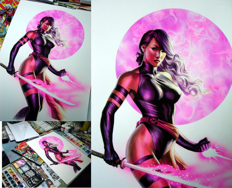
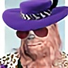
Just thought I'd show some of the process for this cover. I begin with the traditionally done pencil sketch submitted to Marvel for approval, then I work on the values and lighting in grayscale, and finally I add color and texture. In this particular case, with just a single character close-up, it wasn't very painstaking.I adjust and tweak the structure as I paint. If you have the luxury of time, you can assess flaws much more objectively by setting the work aside and not looking at it for a few days.
Related content


Comments: 168

")

nice, i think i'll go with the pencil sketch too, psylocke looks more appealing in that one
👍: 0 ⏩: 0

i absolutely LOVE the drawing half. i think traditional is SO nice sometimes.

👍: 0 ⏩: 1

Yeah, I agree. I sometimes feel I should to go back to more traditional pencilling in my work. I just get caught up in all the cool tools in Photoshop and Painter.
 (Smile)")
👍: 0 ⏩: 0
amazin al. is the grays done w dodge n burn?
👍: 0 ⏩: 1
Actually, no. Just a grayscale palette. I don't use dodge and burn that much really. They're too intense most of the time.
👍: 0 ⏩: 1
they can be a little intense i agree. i've seens some friggin excellent paintings lately tho that use those tools to greater effect than i'd thought previous to achieve some wonderful effects!
👍: 0 ⏩: 0

i think i like the initial sketch more than the rendering. something about the nose.
👍: 0 ⏩: 1
Yeah, iIm kind of with you on that. The nose on the finished piece is a little too petite and plastic-y. Looks more natural on the pencil sketch.
👍: 0 ⏩: 1
could probably be fixed by widening the nose on the finished... move the highlight out a bit more instead of having such a steep inward curve.
the rest of the peice is beautiful. I am especially impressed with the shoulder.
👍: 0 ⏩: 1
Love to, but I'm afraid it's a done deal. Ready to print!
Thanks again!
👍: 0 ⏩: 0


Cool lines, lots of energy. I love the brushstrokes in the hair, too.
👍: 0 ⏩: 1

Punk? Um, thanks I guess...
👍: 0 ⏩: 0


Beautiful work. Thanks for the "behind the scenes" look.
👍: 0 ⏩: 0

Hahahaha... process? What process? It's like if I drew an egg shape in drawing number one and the next drawing was Batman flying over a 5 point warping fisheye lens perspective shot of downtown Gotham all up lit with awesome shadows. And then said: "see how I did that?"
Hahaha, good stuff though.
👍: 0 ⏩: 1
Yeah yeah yeah... I kept saving over the grayscale file as I worked, so this is all I had. People keep asking for how I did it, so I thought this might alleviate my answering the same question 800 times.
Stop laughing dammit.

👍: 0 ⏩: 1

Why you... I'll give you yer durn drawlins!!
👍: 0 ⏩: 1


Awesome!
How you put the colors on it?
Different layers set on color or multiply mode?
👍: 0 ⏩: 1
Thanks! Layers on color mode. Sometimes overlay. I also use color balance layer masks as well.
👍: 0 ⏩: 0


Thank you so much for showing the process of creating this cover. Really generous of you!
Plus, Waaaaaay cool.
👍: 0 ⏩: 1

Awesome to see your work like this. (When I first taught myself to paint on the computer, I never did things in gray values, but I started to understand it more and more as I did pieces like that.) But again, great work dude!
👍: 0 ⏩: 1
Don't forget to drop by when you can too

👍: 0 ⏩: 0

you really should do a tutorial o.o
this looks amazing and the result is even better
👍: 0 ⏩: 1
TY! I need to save more iterations of the process, but I keep copying over them as I work. I'll try better next time.
👍: 0 ⏩: 0

Such a cool process, it makes me want to see even more steps in between...outstanding work, Alex...
👍: 0 ⏩: 1
Thanks! Yeah, I need to save more iterations but I keep forgetting to do that. I'll try to remember next time.
👍: 0 ⏩: 2

Please do! I barely understand the layer process. It would be a neat tutorial.
👍: 0 ⏩: 0

damn, so you basically repainted this badboy.... looks like a cool process=]
👍: 0 ⏩: 1
Not really repainted per se. It's more adding color on top and then refining it.
👍: 0 ⏩: 0


Have you taken any formal painting classes or are you more instinctual? Again, I just think this is perfect in every way.
👍: 0 ⏩: 1
I took a few classes at Watts Atelier. I really didn't understand value that well back then, but the instructors showed me the burnt umber underpainting process which really opened my eyes. I just applied that idea to grayscale in Photoshop and experimented with adding color. I guess they just helped me think in different terms of how to approach the process. I'm sure a lot of digital painters already had this figured out way before I did.
👍: 0 ⏩: 0

nice job man, interesting to see your process.
👍: 0 ⏩: 0

I really love the line art on this.
👍: 0 ⏩: 0
<= Prev | | Next =>