HOME | DD
 alextass —
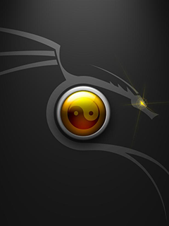
ego-altergo.com logo
alextass —
ego-altergo.com logo
Published: 2011-03-17 00:15:55 +0000 UTC; Views: 29487; Favourites: 586; Downloads: 883
Redirect to original
Description
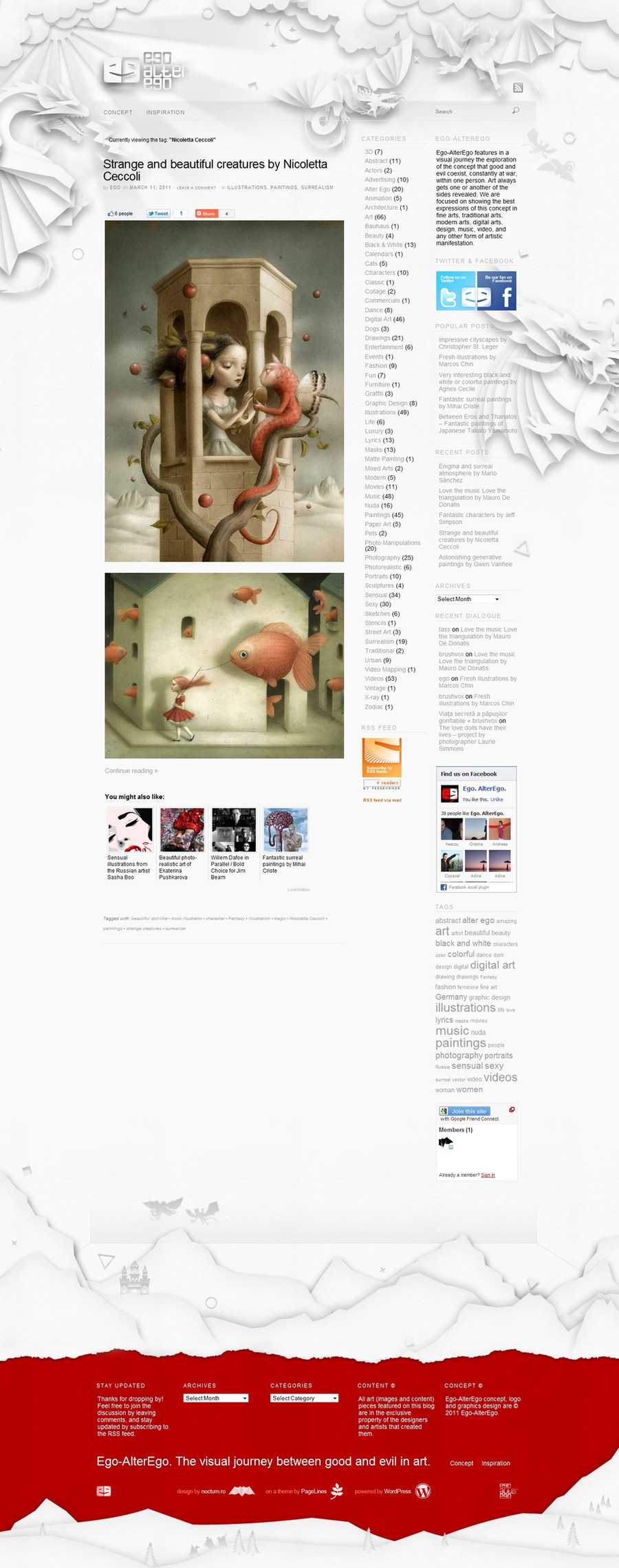
"Ego-AlterEgo is a visual exploration of good and evil in art." So it is an art and design related blog. The logo shows 2 E letters, stylized to look like 2 heads face to face smiling to each other while in the same time forming a big smiling head (half lighten, half in shadow).You can visit the site www.ego-alterego.com to see it in action (both in header and footer).
What do you think about it?
Related content


Comments: 85


This is very cool. I like it and very innovative.
👍: 0 ⏩: 0


SO KEWL..!!!
great concept with simply colour.. just WOW!
👍: 0 ⏩: 0


")

 (Smile)")


wow, i love the way the dragons look like they are paper
👍: 0 ⏩: 1

thank you, that was my intention too.
👍: 0 ⏩: 1


I love the idea and just the dragons in general.

👍: 0 ⏩: 1
")


love dragons,and the colour contrast is a def. eye catcher.
👍: 0 ⏩: 1
thank you. i hoped that too.
👍: 0 ⏩: 1
really cool.Looove the Dragons. I saw you had one with just the Dragons but in white,you should do them in red and a white background-just them
👍: 0 ⏩: 1
hey, interesting idea, not sure how the paper feel style would look like but i might try this, thanks for sharing.
👍: 0 ⏩: 1
no prob, if you do-let me know cuz i wanna see it-please
👍: 0 ⏩: 0

i luv the cut-out effect you put on..this is cool!!!
👍: 0 ⏩: 1
thank you, really glad to hear!
👍: 0 ⏩: 0

I find it kind of weird that your dragon illustrations and the logo got denied several times for the #design-addicts group yet here you are sitting pretty with a DD. The thing that turned me off was the sun burt masked over the logo. I found that it only took away from the logo. Congratulations by the way.
👍: 0 ⏩: 2
Regarding "the sun burt masked over the logo", my intention was to give more personality to each face (hair/beard) and also to add more joy to the face build with the 2 profiles (which maybe because of the eye style difference appeared under some angles to be sad).
👍: 0 ⏩: 1
I guess the sunbursts kind of makes sense when you put it in that context.
👍: 0 ⏩: 1
Thank you for your comment. I find that acceptance in any place is quite a subjective matter depending on the chooser taste. The sun and also the dragons are part of the 'identity', part of the site layout for which the logo was made. I included them in the logo images as well just to show more of the full concept rather than only the logo. I also think that i am very lucky about the DD. I am really happy to see such a good feedback for it and for the whole project in the online community even thou not everyone is a big fan of it/them.
👍: 0 ⏩: 0


Thank you, i hope you will consider the same way about the website/blog.
👍: 0 ⏩: 0


Perfectly well! Very interesting technics... It is necessary to try
👍: 0 ⏩: 1
Thank you! Yep, you should, i was having this in mind for a long time now.
👍: 0 ⏩: 0
| Next =>