HOME | DD
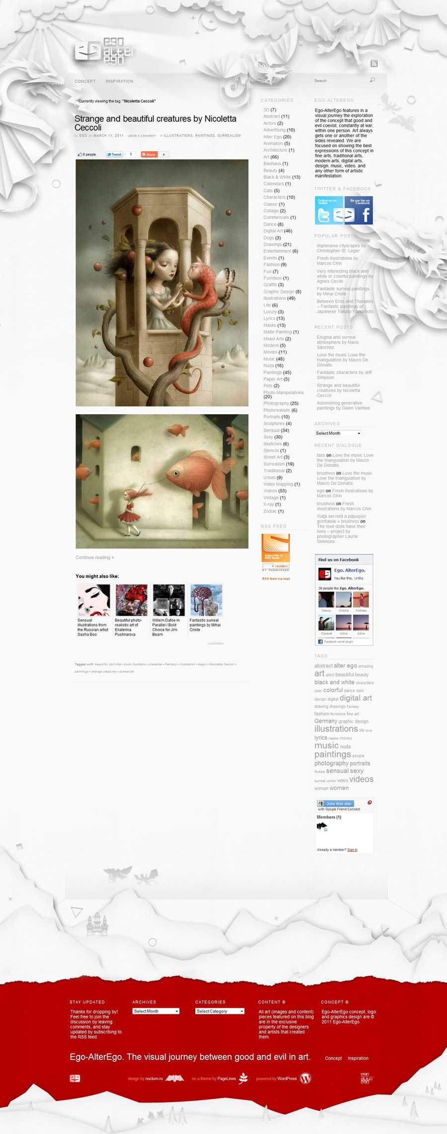
 alextass — ego-altergo.com web layout
Published: 2011-03-17 00:26:18 +0000 UTC; Views: 4951; Favourites: 92; Downloads: 232
Redirect to original
Description
www.ego-alterego.com website layout.Ego-AlterEgo is a visual exploration of good and evil in art, an art and design related blog.
What do you think about it?
Related content


Comments: 41


thank you. well i did first vector for each shape and then played a bit with gradients and shadows. i would recommend thou if you want to try to use only shapes and for the shadows to use blurred versions of the shapes or brushes arranged as needed depending on the light. that was my intention too byt then i realized that this would imply some extra hours and that this won;t be very visible on the website having most of the elements quite small.
👍: 0 ⏩: 1

Cool. I agree that making the shadows with blured versions of the shapes and/or brushes results in more realistic effect.
👍: 0 ⏩: 1

Looks awesome, though I think the name of the site disappears in the fantastic origami dragons etc.
👍: 0 ⏩: 1
Thanks. I have used it initially in red but it was too obvious, this is why i went with the same color scheme as the background for the logo too, to blend him in the 'action'.
👍: 0 ⏩: 1
I thought you'd probably have tried it. Excellent design though!
👍: 0 ⏩: 1
What should i have tried? Thank you.
👍: 0 ⏩: 1
Sorrry, I was saying that I thought you would have tried alternative options for the logo and this one was best.
👍: 0 ⏩: 1
To be hones this was one of the first ideas that i had for the logo. It went through a few customizations til the version that's now online. To be honest initially i liked it quite a lot, than i had some doubts about it, but after the rest of the graphics were done my sensation was and is that they work really well together so i've considered it 'the one', at least for the moment. Why mentioning about the logo, do you have any observations regarding it? Here [link] you can see it larger.
👍: 0 ⏩: 0


")

Footer is perfect, love the red and white connection!
👍: 0 ⏩: 1


amazing! goo idea, very simple but i like very much!  (Smile)")
👍: 0 ⏩: 1
