HOME | DD
 Alexx-C — Comic panel (ink and color tests)
#color #comic #design #fight #girls #panel
Published: 2014-12-05 04:31:39 +0000 UTC; Views: 5754; Favourites: 46; Downloads: 283
Redirect to original
Description
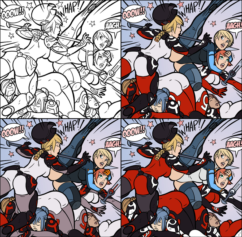
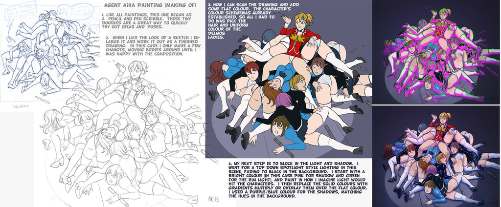
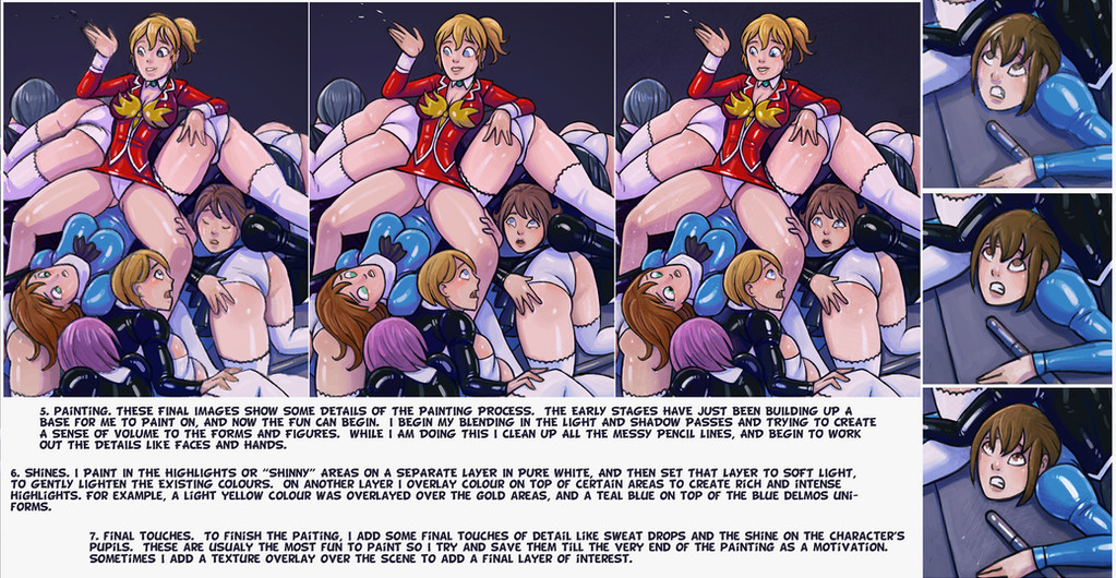
I decided to ink one of my comic panels and try out some of the costume color schemes I have been working on. Its good to see the designs in action, to get a better idea of how the final pages could look. I just did flat colors for now but I am going to play around with some different painting styles, like a two-tone anime look or maybe a loose digital painting look.Related content


Comments: 7

The pain vocals and the sound effects are really good. I especially like the color schemes in the lower right hand panel.
👍: 0 ⏩: 0


Not that you asked, but the lower-left is my favorite. The light cool grays pop better that the red, at least to me eyes. A lot of red makes it too busy and draws my eye in too many directions at once. The far blonde - I am assuming she is a focal point, might be better to have her 'swimsuit' area colored with that light blue. I also like the symbols being the things in red.
Anyway, great stuff! Thanks for posting more of your process.
- Ark
👍: 0 ⏩: 1

Thanks, I was thinking the same thing.. the red uniforms are super intense. Its probably better as an accent color.
👍: 0 ⏩: 1

I was actually gonna disagree and say that the 3rd panel was my favorite; the red makes them look imposing and evil whereas the white suits just kinda make them look drab (at least in panel 2). Then again, I don't know anything about art theories and the idea of red being distracting does sound pretty legit.
As for the hero, I kinda lean towards the 1st panel. The 3rd panel makes her look kinda like Power Girl and I prefer the fingerless look for her over having orange gloves. Then again, if she wore that many dark colors, it might blend too much with the dark armor of her enemies (especially if they wore red suits).
Of course, you didn't ask. I'll shut up now.
👍: 0 ⏩: 1
Thanks for the suggestions, I put these up to get some feedback and so far I've got some good ideas. I am going to do some more test to find a happy medium of red on enemy characters. There are going to be a lot of crowd scenes and pile ups so it will be important for the hero and enemies to stand out from each other.
👍: 0 ⏩: 0