HOME | DD
 AlfaFilly — The Selection - page 39
Published: 2010-03-04 07:28:19 +0000 UTC; Views: 10350; Favourites: 128; Downloads: 0
Redirect to original
Description
Next Page: [link]Previous page: [link]
First page: [link]
WARNING: This looks better on slightly dark monitored computers.
Goodness gracious, for some reason this page was a pain but I am quite happy with the result! Sorry for being so late with it!
Big thanks go out to ~Ayemae ! She suggested I use a blue tone for the shading instead of black and I definitely think it was beyond worth it! As well I decided to mess around with his collar area coloration so it would look better with his skin color.
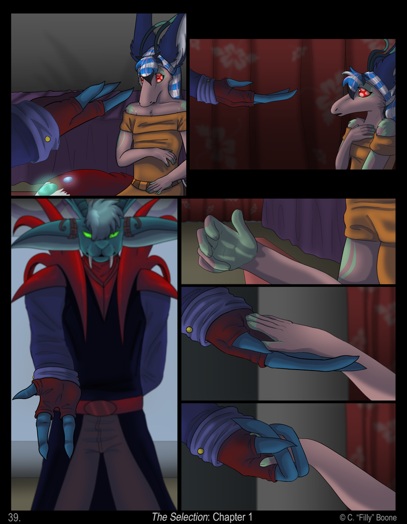
I nicknamed this page "The Hands Page" cause that's pretty much all it is lol
Unblurred Federico from panel 3: [link]
(Unblurred is totally not a word lol)
---
 Favorite panel: 2 & 3
Constructive Criticism, pointing out flaws, and spelling/grammatical help is DEFINITELY helpful!
Copyright © C. "Filly" Boone, AlfaFilly
Do not alter or distribute without permission.
Related content


Comments: 215


What is this man doing looking at this old stuff for?! Does he not know this stuff is old news and you probably have all the notes on what to improve already by now?
Hehe, yeah I do. I just wanted to mention how funny it is to look at Federico's giNORMOUS ears. I mean they just look so big, and knowing how tall this guy is, it makes them look all the lot bigger. XD
👍: 0 ⏩: 0

")

 (Wink)")

for some reason, I get a thrill! when i see this. like a sign of big things to come!
👍: 0 ⏩: 1


Urg, I'm sorry, but Feddy's eyes look wierd in panel 3. Dx One eye is pointing downwards it looks like and the other straight. Otherwise, the shading is really good and everything! :3
👍: 0 ⏩: 1

I dunno what you mean. :'D
Like, his eyes in general or his "pupils"?
👍: 0 ⏩: 2
His left pupil. Sorry, I couldn't find the right word.
👍: 0 ⏩: 0

I'm guessing that he doesn't have pupils, right? His eyes are pure glowing green O_o
It's AWSHUM!!
👍: 0 ⏩: 1
He does have partial pupils, actually. xD If you look reeeeaaally closely at his eyes you can see a dark spot in them. That's his "pupil". Though half the time you don't really see it.

👍: 0 ⏩: 1
B-B-B-But... But if I stare at it too long, his eyes will pierce into my soul!!!!!
👍: 0 ⏩: 1

OKAY.
So. Sorry I'm late.
You told me to critique TS last night but I completely got distracted.
But I'm doing it now!
So. I'm totally /trying/ to find stuff to critique.
But the problem is I'm not very good at critiquing stuff unless it's like anatomy or shading (Which you told me not to bother with when critiquing this).
So, the stuff I'm going to point out are going to be kind of nit-picky. Sorry if they seem whiny. Just remember YOU TOLD ME TO CRITIQUE IT. >C
So. I noticed on earlier pages that you did a lot of over-lapping on your panels. You don't seem to be doing that in newer pages, which makes me happy. In my opinion, having a whole page of over lapping panels looks sloppy, making it seem like you didn't plan the page ahead and just made it up as you went (and didn't have enough room for all the panels which is why they over lap). A few over lapping panels is fine, but not whole pages of it.
BUT like I said, you dun seem to be doing that now. I dunno if it's just because of the scene or you just stopped doing it.
The only thing I see going on now that kind of bugs (and this is nothing major), is the spacing between your panels. Aside from a few special panels (like the second one on this page), you have the exact same size spacing between every panel. I would recommend putting a little more space between some panels, especially when you go onto a new row. It just tends to flow better and doesn't make everything look bunched together. You've got them stacked like books on a book shelf. Give them some room, plus that spacing can add a lot of impact to certain panels.
In short, give some variety to the spacing. Don't use the same size every time.
Uh. So that's my over-all critique. Like I said, mostly nit-picky.
I'm gonna critique specific pages now. Though this is the first page I found something I felt the need to point out. So I'll critique this then continue on to the other pages. If I see something, I'll post it on that page as well.
The third panel of this page is suppose to have a very strong meaning. One of the most important characters in the comic is about to make contact with the main character. The hand is vital to this so I think it's great that you blurred the rest of him to bring focus on the hand. However, it's kind of in a weird place. Considering the hand is suppose to be so important to that panel, you've got it really pushed off to the side.
Like you said, this is the hands page. Hands should be the main focus. So forget the rest of Frederico (sp?), as awesome as he is. That panel isn't suppose to be about his face and torso, and with that much showing, even with it blurred, you really can't help but focus on everything but the hand.
I would recommend centering the hand. This would push Frederico out of the panel, which would bring focus back to the hand. That way the reader would look straight to his hand, not his eyes or red spikey...collar...thing (lol, not sure what you'd call it) which are very distracting due to their brightness in contrast to the rest of the panel.
OKAY.
Um. Long post is long.
I'M SORRY IF THAT WAS A BAD CRITIQUE.
I told you, I'm no good at stuff that isn't anatomy or shading. ;w;
I hope I didn't sound rude or harsh.
👍: 0 ⏩: 1
It's okay because I wasn't on that night to know anyway! 8D
But first of all, YAAY I knew you could do it!
I only wish I had more up-to-date pages for most of the story instead of the poopy ones I have now that I need to redo (pages 1-20-ish I mean). That way I would have more to see if there were any more repetitive mistakes I tend to make. But alas! I am a slow poke.
Yes indeed, I took your advice and stopped doing the overlapping as much since paaagge... 28? When you mentioned it way back then. I used to not really see them as a big deal but then I compared an overlapped page and a more ordered page of the same scenes and realized the overlapped ones did look very messy.
I'm a tad confused what you mean by spacing. Do you mean, like, the panel border thickness? Not the border around the entire page, the panel separation lines. Things. Whatever. xD I'm pretty sure that's what you mean but I wanna make sure.
That's actually a really good suggestion. I never thought of doing that. Seems I need to get more in focus with centering things as I've made similar mistakes before. lol
Considering someone else mentioned I needed to adjust the transition of his blurred body to the hand, I can fix this and that at the same time! DOUBLE FIX!
And I just. Call them. Um. Shoulder armor things. I think there's actually a name for them but I don't have a clue what it is.
NAW you did AWESOME
Very good tips that I can use for future (and redo) pages!
Thaaank yooou <33

👍: 0 ⏩: 1
Yay I did good. 8D
-Is happy-
Yeah, that's what I meant. The uh. Lines between panels. I dun think there's an official name for them. |D
Hope it helped!
Though like I said, there wasn't really much to suggest. xD Other than some anatomy and shading problems here and their, you've got a very good comic~
Though, honestly, I can't really say much about the story yet. Even though you've got 40 something pages so far, I still feel like it's very early in the story.
One thing I miiiight recommend, is if there's going to be any action in this (which I'm not sure there is), hurry up and get it going. I'm not talking like a full-blown fight or anything. Just something that doesn't consist souly of text.
Someone actually pointed that out for me on TTD. So far there's been nothing but talking. Which is kind of boring for a comic that's suppose to be kind of actiony (eventually).
Which is why I'm re-doing the first chapter. And why I made sure to throw some action into the first chapter of COB.
HOWEVER, I dunno if this applies to TS. Because honestly, I'm not sure what genre it is. Sooo far I'm kind of seeing it as drama. In which case, action is not necessary and you can just ignore this entire suggestion. xD
👍: 0 ⏩: 1
*gives cookie*
Ah ok, thought so. xD In that case, I think I might actually try that suggestion in this next page I'm working on. See how it works. :]
Yeah, though I label TS a Sci-Fi/Drama, if you exclude the whole alien bits it would be entirely Drama. Romance too, I guess, but there really isn't a lot of lovey-dovey stuff planned. Kailani and Federico's relationship is really more friend-like than OMG I LOVE YOU *kissy face*.
So most of TS's plot revolves around social issues rather than physical. Though there will be some chapters that involve action in the distant future when the story goes deeper. Not sure if it's required to really hurry it up or not since without all the little chit-chat kind of drama leading up to it, it really wouldn't be worth it. I'd tell you and get your suggestion but it's too spoiler-ific. xD

👍: 0 ⏩: 1
Good~
I can't wait to see the next page! C:
And I see~ In that case, ignore that suggestion. xD
Wow, I just realize, you dun really see many comics that are just...you know, not action/adventure. Seems like drama always comes in novel form, not comic.
👍: 0 ⏩: 1
Indeed! You really don't.
I'm actually surprised I have the number of fans for it that I do. I mean, I'm not hooking you guys in suspense about who's going to get punched in the face next or anything but something as simple as what the character is going to say next. Heck, I even trapped you guys with the mystery of a characters colors. I'd think it would get boring after awhile. xD Maybe everyone has a little Soap Opera love in them!
👍: 0 ⏩: 1
Lol, to be honest, drama/romance usually bores me to tears. I'm not sure why TS doesn't.
Maybe the furry, glowing aliens make up for it.
👍: 0 ⏩: 1
Saaame. Especially romance for me.
Science Fiction makes everything better! 8D
It's just a known fact.
Sparklealiens probably just intensify it.
👍: 0 ⏩: 0

Woo, I thought they'd never touch. J/k
Very strong and animated scene. And the lighting looks amazing on this old compy. I had realized my recent pictures were too dark when I used my lappy to draw them, so I brightened them here. Too dark next to black is overrated.
Now they will FLLLY away! SuperFeddy!
👍: 0 ⏩: 1
Let's hope neither are germaphobic!
Seriously! How lame, eh? Plus if you ever wanted to print something, usually the printed version is always darker so then it's all lame and stuff!
Oh what a lovely spectacle it will be! Hurry! Break out the video cam!
👍: 0 ⏩: 0


If you read *AlfaFilly 's Twitter account on her user page, it says when she's updating, or if she's missing an update and why. She was sick the last couple of times.
👍: 0 ⏩: 1
Neither do I. You don't need it. There's a feed right on Filly's page, under her journal with all her posts.
👍: 0 ⏩: 0

wow from the first page to this one your art improved so much. like i barley know you and im like so proud lol. the panel were shes like hesitating on putting out her hand is so brilliant on like the shadow lays. anyway amazing job
👍: 0 ⏩: 1
Haha, it's so true! It's crazy! :'D
Thank you very kindly! <3 Glad you like that feature. I thought it would add a bit more to the atmosphere.
👍: 0 ⏩: 0

Darn it! I wanted to keep reading! *says to self* Now I have to wait. 
👍: 0 ⏩: 0

Wow, you did a wonderful job on this page. My very favorite so far.
 (Smile) - :)")
👍: 0 ⏩: 1

Pure awsomeness
Although I half to say that Kailani's arm looks kinda.... non proportional in the first panel, like the forearm across her cheast is just a hair too short, but idk.
-waiting impatienly for next page-
👍: 0 ⏩: 1
Hmm... I think you may be right! I'll try to touch it up some
👍: 0 ⏩: 1
It was just something that stuck out to me. That type stuff always does.
-Hugs!!!!!-
👍: 0 ⏩: 0

Sooo awesome. Gotta love pages with just subtle acting and characterization.
👍: 0 ⏩: 1
Quite! It's very fun to do as well!
Thanks! C:
👍: 0 ⏩: 0
...nice, but I can't help but think it's sort of cliché. XD No offense.
This one really looks well done. I'll give you props for that!
But panel 3...not so much.
I mean the "blur" effect is good and all, but that hand that stretches out of that blur is just not right. There should be a consistent degree of "blurring" along the arm while it stretches out so you can tell how far he is and how long his arm is. I admit, and apologize, that I think this effect was done rather poorly. One half of his arm is blurred, then the other isn't! In fact, I think his elbow area is more blurred than the rest of his arm! It makes his arm seem a lot shorter than it should be. There is no gradual decrease in blur that, I think, would have really topped it off nicely.
I still really like this page though!
The thoughts that are going on between them: how Federico and Kailani think of one another, how they feel about each other's reactions...pure gold! XD
And truth be said, I can't help but laugh at Federico's expression on panel 3.
I just can't tell what the hell he's thinking!
It's so awesome, and yet, I can't explain why I think it's so awesome!
It just is! XP

👍: 0 ⏩: 1
I kinda think so too. xD None Taken!
Thank you for your honesty! I can very much agree with you. I'll be honest myself that I wasn't 100% certain whether it would turn out right or not. More of an experiment really, haha.
Hmm, I'll see if I can apply what you said into it. Maybe then it'd appear a tad better.
So many thoughts are buzzing around that they don't know what to say! xD
I know, he's just like " >:| "
He doesn't know how to vary his facial emotions that well.
Thanks!
👍: 0 ⏩: 1
Do you believe that "Ignorance is Bliss" crap?
I sure don't. ):<
So please forgive my impudence in advance.
For some reason, Federico really seems to lack all the thoughts Kailani is having now.
Poor Kailani, she's overwhelmed with emotions and such of the liking, while Federico is just going on without hinderence of any such kind while taking in his first impressions of her.
If he doesn't speak (or Kailani for that matter), than maybe they don't want to break the silence.
I know; once, I was in huge empty building with some friends. The silence was delirious! I swear you could feel the silence clinging to your throat, inabling speech. None of us spoke for half an hour! It wasn't until one of us walked out that we all followed.
👍: 0 ⏩: 0


| Next =>