HOME | DD
 algenpfleger — My Apocalypse

Published: 2007-07-29 10:45:35 +0000 UTC; Views: 9841; Favourites: 31; Downloads: 619
Redirect to original
Description
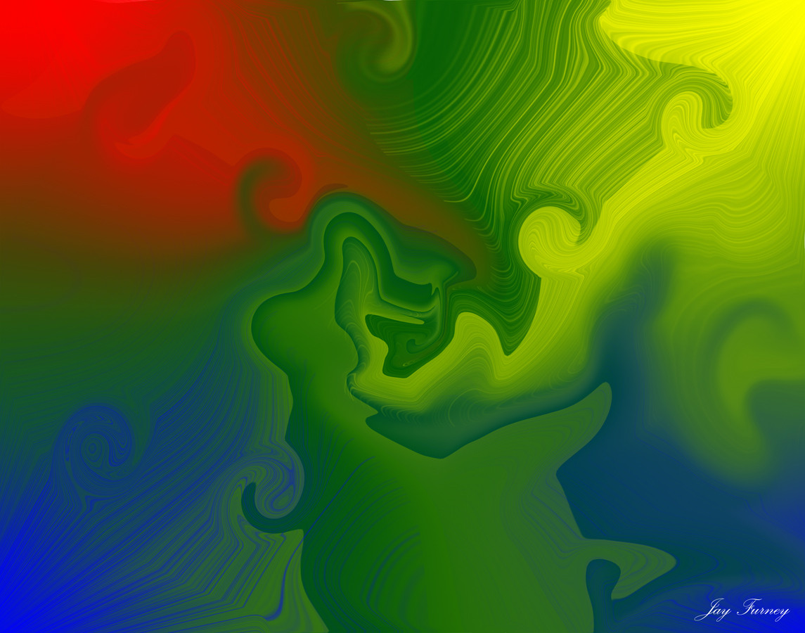
This one was a bitch to finish x___XActually was supposed to look like this: [link]
But went just... wrong >____>
And then i scrapped everything and started over, changing the whole composition to a triangle typa thing and adding those balloon-thingies.
But painting all the smoke was fun.
Done in oC 1.1, eventfile goes here: [link]
Related content


Comments: 14

Wow you improved so much in few years, that's amazing oô
👍: 0 ⏩: 0

Looks extremely precious, but the file cannot be downloaded again…
")
👍: 0 ⏩: 0

This looks exactly like the intro to one of my favorite games, Aquaria by Bit Blot.
[link]
[link]
It seems a bit coincidental, but is it possible that one inspired the other? If you ever have time, this game is worthwhile, if only for the musical elements.
👍: 0 ⏩: 0


holy CRAP! you should be happy it ended like this...it has such a cute yet sinister touch to what an apocalypse is!
this is quality work and i love it
Max
👍: 0 ⏩: 1

aww thank you  (Smile)")
👍: 0 ⏩: 1
loved it...as well as the rest of your gallery
👍: 0 ⏩: 0

After not finding 'quilty' in the dictionary i guess i have to say something like... they would have looked boring

👍: 0 ⏩: 0

na, es wird doch. übung macht den meister  (Wink)")
👍: 0 ⏩: 1
Danke
openCanvas ist ein japanisches Malprogramm, und 1.1 war die letzte Freewareversion davon. Im Prinzip kann das Ding nichts außer harte und weiche runde Pinsel, Blur und Radierer, und hat als Ebenenmodi lediglich *, + und -. Kein Overlay, keine Transparenz, deshalb haben meine Bilder normalerweise nicht mehr als ein oder zwei Ebenen ")
👍: 0 ⏩: 0

Weisst du, dass ich diese Rauchschwaden einfach genial finde?
Fast schon wie ein Festkörper stehen die da in der Luft und strukturieren den Himmelraum.
Ich finde die Farbwahl extrem toll, bei so rosa-lila werd ich eh schwach....und das Grün und Braun harmonieren auch (finde ich (naja, hör aber nicht so auf mich, in Farbharmonien bin ich eine ziemliche Niete)) die Grünfläche dagegen ist aber schon ein bisschen groß, wenn man das kompositionell betrachtet, und scheint schier am Rand zu kleben. Ein tolles Bild :3
👍: 0 ⏩: 1
Ui dankeschön <3
Ja, die sollten durch ihre Festigkeit und die Richtung diese Übermacht verdeutlichen, der der Junge gegenüber steht. Wären sie schwarz gewesen wäre das noch klarer gewesen, sah aber doof aus.
An die Farben taste ich mich ganz langsam ran, und mit diesen Pastelltönen kann man kaum was falsch machen...
Aber mit der Grünfläche hast du vollkommen recht, wie ich gerade geschockt erkenne. Stört die Balance irgendwie... hmm, wieder was gelernt. Danke dir
👍: 0 ⏩: 0