HOME | DD
 aLiTaBlondeGoth — Model Agency Ad
Published: 2006-10-15 20:33:44 +0000 UTC; Views: 240; Favourites: 0; Downloads: 2
Redirect to original
Description
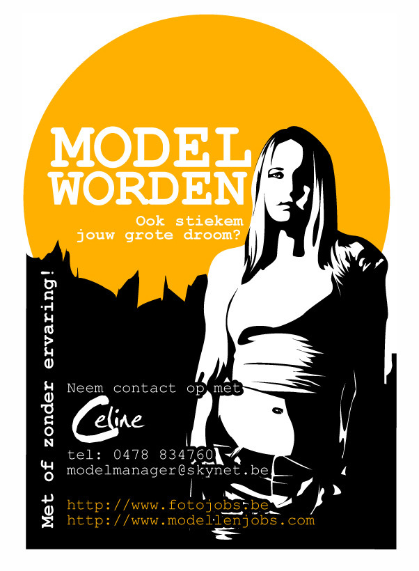
Model Agency I worked forNever trust them
 (Smile)")
Related content


Comments: 14

Like the orange and black.. it's one of my favourite colour combinations.. I think that including the black and white simplified version of the model is nice and it's pretty stencil-esque.. which is something i'm very fond of.. I think that the text and placement of the text is ok.. and it works, but could be improved..
but then again everything by anyone can be improved. Nothing is ever perfect.
👍: 0 ⏩: 1

Tell me how it can be improved
👍: 0 ⏩: 1
I think something a bit more stylish would be better. That seems a bit graphic.. 16 bit old school computer to me.. Maybe a fixed-width font? I quite like 'Futuristic Fixed-Width' .. it's on Dafont.org .. I think that would work quite well. Or perhaps something with some flicks.. like an older script font, but something 'elegant'!
👍: 0 ⏩: 1
hmmmm... I'll be thinking about giving it a more elegant touch.
Altough, this is a flyer that I designed to attract teenage girls. The kind of girls that think of themselves as "hot rebels". Girls that would love to be a model, but never really got interested because they think it's for girls like paris hilton only.
So, you're right, a fixed width would prolly be a better font, but I'm not sure about the classic font.
I have been thinking about designing a few more:
one for "older" models (women in their 20's) They like classic designs
and one for our erotic models (for some reason: usually women in their 30's and men in their 50's) But I don't know what kind of design to make yet. A naked chick would do, but is so untastefull. You happen to know a design element that screams "erotica" but is still quite classy?
👍: 0 ⏩: 0


Awsome! Well done for getting the job. I can't actually understand it...but thats life aint it. Thankies so muchly for the comment on my journal. It ment alot.

👍: 0 ⏩: 1

Very nice! Now don't get my wrong, but is the girl on the ad pregnant? I don't mean anything bad, but if she's not, I think you have to remove some white to the left of her so she won't look fat or pregnat.
👍: 0 ⏩: 1
Ahhh, yes, thanks for noticing
")
👍: 0 ⏩: 1
Great.  (Wink)")
👍: 0 ⏩: 1
Ahh, very nice
👍: 0 ⏩: 1
Cool! About my picture I'm making, I putted an Elvis haircut on me, it was great fun. Maybe I can upload it later. Tomorrow or so... and I'll show you, haha.
👍: 0 ⏩: 1
rofl! I'm looking forward to it
👍: 0 ⏩: 1
Haha, now I have uploaded them...
...this is me with affro:
[link]
...this is me with Elvis haircut:
[link]
👍: 0 ⏩: 0