HOME | DD
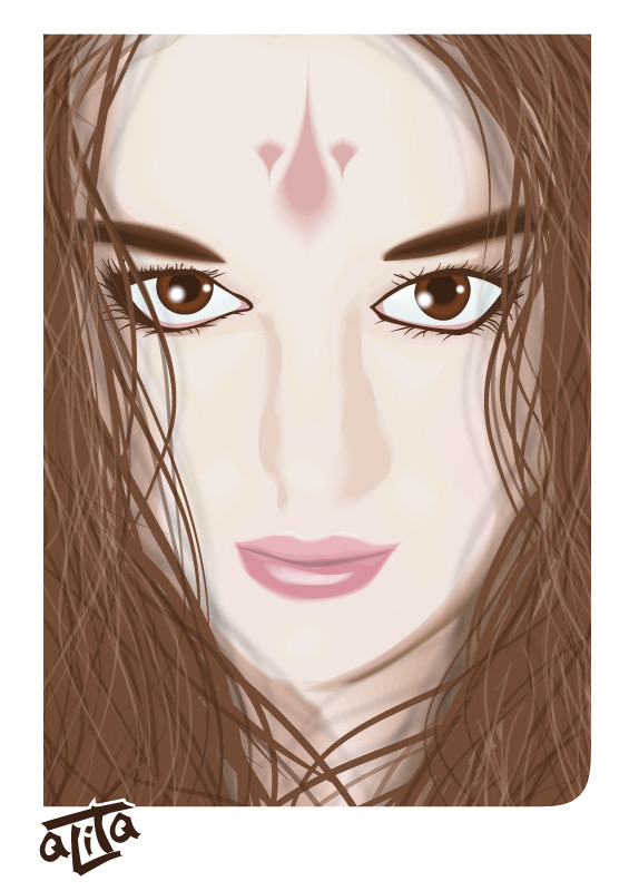
 aLiTaBlondeGoth — Portrait II
Published: 2006-12-04 10:42:36 +0000 UTC; Views: 230; Favourites: 0; Downloads: 6
Redirect to original
Description
Thank you:for the resources!
Couldn't have done this without you!
My first real try at digital vector painting, so bear with me. C&C highly appreciated.
Related content


Comments: 29

Hi, I like it very much. how did you do it, do you draw it on tablet? well I was looking at others that used the same stock photo. heres mine
Celtic Beauty
👍: 0 ⏩: 1

thanks for liking it a lot
No, I don't have a tablet.
It's a vector  (Smile)")
👍: 0 ⏩: 1
how does vector work, I keep hearing about it but Im ignorant.
👍: 0 ⏩: 1
the "mechanic" behind is is from the world of mathematics.
A vector is an equasion used to calculate the path that a line makes between 2 points.
So what does this mean for "art" purposes?
A bitmap (like a paint file, photoshop drawing, digital picture) is an image made up out of pixels. Small dots that have one color. If you zoom in close enough, you will start to see these small pixels.
A vector (illustrator, corel draw, ...) is (as I've said before) made up of mathematical equasions. (you don't have to enter these yourself, the program creates them when you draw paths) It has the advantage that it can be blown up to huge proportions without quality loss (as the calculation stays the same no matter how much distance there is between the 2 points) but has the "disadvantage" that you can only work in "patches" of color. It is hard to make soft edges or gradients (well, there are 2 gradients : line and circulair but you can barely use these in a decent artwork) . You have 2 options, either you make several layers under each other with a bit of a color diffrence so it looks like a gradient, or you can make an incredibly difficult equasion using the "meshing" tool (wich is hard and usually takes more time to make than to build diffrent layers)
So that is why many people hate working with vectors, because it takes twice as long to make something "realistic" than opposed to let's say photoshop. It's more made to do cartoonish drawing work, than photorealistic works.
Hope this helps a bit
👍: 0 ⏩: 1
thanks, ill have to look into vector art, because everything i see of it comes out great.
👍: 0 ⏩: 0

not really digging the nose, not quite formed, but the eyes are intense!
👍: 0 ⏩: 1
I know, I screwed up on the nose ")
But oh, it's not a big loss, I was just practicing. I wasn't even going to upload it untill my man said so
👍: 0 ⏩: 1

the tones are well done, the nose seems a lil incomplete but the rest of it is fantastic!
👍: 0 ⏩: 1
thanks
it was my first attempt at vectorial painting. Actually more of a practice piece, but hubby said it looked ok, So I uploaded it. Will prolly go into scraps later
👍: 0 ⏩: 0

Very good first try, well done.
The shine on the lips is excellent.
The nose needs more work. Try adding shadow below the nose to define the shape. Sometimes you need to add shadows in vector form that not present or not clear in the photo reference.
To give depth in the eyes you can add shadows under the eye lids.
All in all it’s a very good first try. Keep it up.
👍: 0 ⏩: 1
Thanks
I already knew I funked up the nose
And you are right, I didn't shade the eyeballs. Gonna keep that in mind for my next piece... wait, no. The piece I'm working at now is an old geezer in sunglasses, he doesn't have any eyes! ")
Thanks again!
👍: 0 ⏩: 0

actually, I was surprised how quickly I finished this one!
I finished it in an afternoon and an evening. So I worked on it for maybe 5 of 6 hours.
it was just an experiment in a new shading style, but I was quite happy with the results
Just you wait and see untill I finished the "real" piece I'm mastering this technique for. been working on it for 20 hours now and all I got is the face. I still have a whole body and background to make >_<
👍: 0 ⏩: 0


very nice work for first try..good job  (Wink)")
👍: 0 ⏩: 1

Ik zie toch wel ietswat celine erin
Mooi gedaan zenne
👍: 0 ⏩: 1
nee nee
👍: 0 ⏩: 0

wow that is great! The hair is is sweet! and thats the hardest bit to get right! the shading around the eyebrow is also a stand out and the eyes are good however they need to blend a bit more with the surround of the eye.
My only real critique is the definition around the nose, it needs to be more defined and sharp.
An excellent first vector, kicks the crap out of my first one.
Keep it up i will be watching ur progression.
👍: 0 ⏩: 1
It's not actually my first vector, it's the first one, I'm trying to be a "digital painter"
I just followed your tutorial. I wasn't actually planning on making this an art piece when I started out. I just wanted to try out your tutorial
I know I screwed up a bit at the tip of the nose, but when I tried to correct it, I couldn't blend in the shadows. Then I tried shading the whole nose part again, but it started interfering with the shadows on the eyes. And I REALLY didn't feel like re-shading the whole face (it took me hours!) so I just went back to the un-altered version. Looked better than my corrections ! LOL!
but hey, now I at least know: correcting shadows is hard. Try to get it right the first time.
Oh, but I have one last question for you! about the blending tool! When trying to make certain blends (especially when the smaller shape is V-shaped) I tend to get a blend where the "blending layers" come outside the bigger basic shape. What's the fastest way to correct this? Or is there a way around this?
👍: 0 ⏩: 1
is the shape within the larger shape?, also make sure that you close off all of your shapes.
👍: 0 ⏩: 1
how do you mean "close off"?
yes, they are inside one another. It usually happends to shapes with lots of twists
👍: 0 ⏩: 2
I'll try that
👍: 0 ⏩: 0
like all the anchor points join up.
im not sure what u mean but you can move the shapes and alter the path they follow when they have been blended.
👍: 0 ⏩: 0