HOME | DD
 anandgandhi — For Continuum
Published: 2006-07-27 23:06:51 +0000 UTC; Views: 4001; Favourites: 28; Downloads: 79
Redirect to original
Description
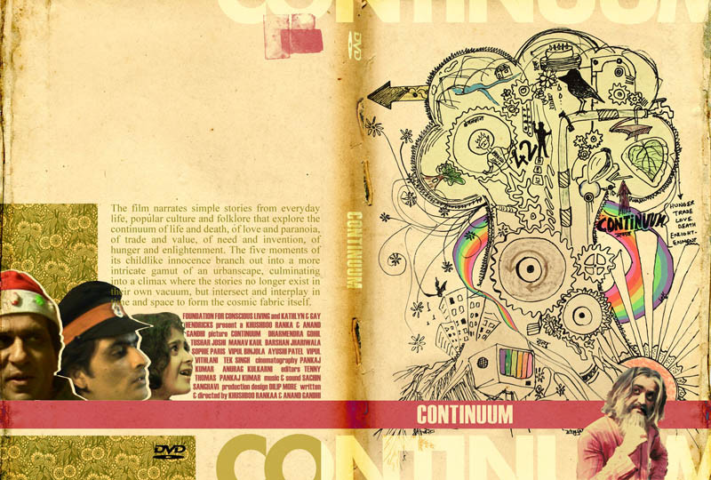
This is one of the ideas for the DVD cover of a film I just finished making with my girlfriend. I wasn't aware that I had to stick to the actual size, so I'd downsized it for the upload. I'll change it soon. It's my first ever work with pen and paper and mixed media and also one of the first few works I'm uploading here. Tips, guides and comments will be very helpful.Related content


Comments: 24

 (Smile)")


thanks! glad u liked it!
👍: 0 ⏩: 0

Nice, but I see five "continuum"'s. Too many, perhaps.
Colours are great though. Is it available outside India? Like, in the UK?
👍: 0 ⏩: 1
it's currently available only in the US... will soon be available world over... glad you liked it... i agree.. too much repeatation... but it's a DVD cover, so the title on the bar won't be seen on the front... thanks for the appreciation!
👍: 0 ⏩: 0


Thanks! The right side is the front of the DVD cover, the left is the back. Glad you liked it.
👍: 0 ⏩: 0

thanks man. i have also sent you a mail. do reply.
👍: 0 ⏩: 0

i loved the illustration.. and the way u've put rainbow colors in between... amazing wrk..
👍: 0 ⏩: 1
Thanks Jigisha. Do check out the film this month if you live in Mumbai. Screening schedule on my homepage.
👍: 0 ⏩: 0

arey buddhu! the hard disk has crashed and i've lost PSD files of all my works forever!
👍: 0 ⏩: 0


Very interesting concept, I think it works very well and have nothing to critique about. I find the words 'Continuum' on the very bottom and top a little distracting, but that's just me. Good job.

👍: 0 ⏩: 1
Thank you. I was myself a little unsure about the top and bottom crops.
👍: 0 ⏩: 1

This looks very interesting. I like the illustration.
👍: 0 ⏩: 1
Hey thanks. It's my first everwith pen and paper, so I am glad you liked it.
👍: 0 ⏩: 0