HOME | DD
 andidas — Fusionatics

Published: 2002-04-10 17:12:15 +0000 UTC; Views: 6041; Favourites: 22; Downloads: 2870
Redirect to original
Description
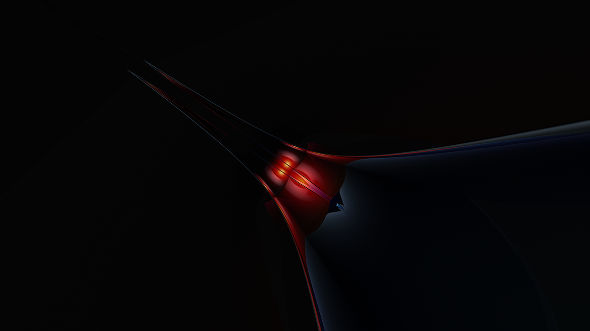
file contains 1280 & 1600 resblue color version and making-of available on my site
Related content


Comments: 43

weird title but its cool, rgb colors
i dont like artists that put their name so boldly but this one fits well u know ")
what i do like is 3d objects that you can see them as half wireframe, as u can beautifully see here
 (Smile)")
👍: 0 ⏩: 0

So sweet, Love the colors. Andidas the man.
[link] Newest deviation
👍: 0 ⏩: 0


OH, sorry, you're the same person, so sorry, i love it m8, used it for ages
👍: 0 ⏩: 0
OMG - FUCKING BULL SHIT - Can you get anymore lame??? It's a modified version of a wallpaper from [link] - get real man, stpo taking credit for other people's work, you didn't even mention him in the description to credit him. YOU SUCK
👍: 0 ⏩: 0

that's really beautiful. i want to keep staring at it but my eyes are starting to hurt.
👍: 0 ⏩: 0

Your style became very gentle and smooth with very smooth flowing forms and a delicate colourchoice!!!
👍: 0 ⏩: 0


very cool render&colors
also nice perspect
good work
👍: 0 ⏩: 0

nice ... Nice .. NICE!
-----
[link] Newest deviation
[link] My Home Page
.: L O B :.
👍: 0 ⏩: 0

a very cool and colorful piece... I like how it "could" represent the color wheel in a more modern way. Very nice
-----
Comments are contagious
- se55
gallery: [link]
website: [link]
👍: 0 ⏩: 0


Wow, very colorful, I think it looks good with all them colors. Nice work.
👍: 0 ⏩: 0

Great work mate rendering is very smooth.
-----
++[Kieran Hall]++
👍: 0 ⏩: 0

that's a badasss wall. oh-so shiny!
-----
:: paroxysm ::
[link] .: digitexturia
[link] .: KwanStudios
[link] .: deviantMAG
👍: 0 ⏩: 0


fantastic man. The plastic look is just great, but I think the background is a little bland in terms of light and shadow. It's all a little flat, some darker areas and movement of light would really bring the piece alive IMO.
Very nice work as is though.
-----
see me in a polar bear suit ?
http://www.sphosting.com/orangegfx/polar bear/pics.html
👍: 0 ⏩: 0

it has an emotional feel to it good one
-----
-sequence
[:formalphase:]
👍: 0 ⏩: 0
pixel-ated [2002-04-12 11:53:47 +0000 UTC]
sorta gorgeous reflection one gets in a glass. its purely amazing to look at....
-----
everything is possible nothing is wat it seems
👍: 0 ⏩: 0

Ooooh.. so smooth.. amazing render. The texture looks really cool.. the reflections are so beautiful.
Looks wonderful
-----
~fuzzydemon
queueueueueue
👍: 0 ⏩: 0

I can hardly be so cruel as to say something negative after all the "like deviation" comments above, so i will follow suit.
I do think your perhaps better at other styles, even though i have still voted having liked this. I think the best deviations are the ones that actually mean something, ie. your robot man. The thing is with this piece is you don't really know what to look at, becuase there isn't specific...do see what i'm meaning?
Very good still though, nice render
-----
:: ULTIM8TOR
:: 2002, Glorious Deviantart ::
👍: 0 ⏩: 0

wow, man i love this. the colors are perfect.
makes me feel like somethings chasing me,
i love it
its my new fav.
-----
_•_•_•_•_
540studios
the power to form
👍: 0 ⏩: 0


Now this is a good abstract 3D wallpaper. I wish the others would start being original as you are, andi.
-----
. https://www.deviantart.com/deviation.php? id=255725 . Stachtus and Erevus 2.0 ·Still Unfinished!·
. https://www.deviantart.com/deviation.php? id=189547 . As Close As We Could Get
. https://www.deviantart.com/deviation.php? id=251212 . . https://forum.deviantart.com/254631 . Support the :flageu: European Union's flag icon!
. http://www.djdimension.net/dap . Adopt a Deviant.
👍: 0 ⏩: 0

Looks trendy ...but it isn't, reminds me of Gordian Knot but it isn't.
Whatever it is, it's a very fine wallpaper to me.
👍: 0 ⏩: 0

i love the low saturation and how the objects get fat out from the centerand all the 2d circles kick ass!
-----
https://matanza.deviantart.com/gallery Sometimes Its Story Time
https://matanza.deviantart.com/gallery
👍: 0 ⏩: 0

Super-super-super-super-super-super-supe r-super-super-cool. Great job!
-----
👍: 0 ⏩: 0
pixelcatalyst [2002-04-11 01:21:36 +0000 UTC]
Nice wall!
i still couldn't forget your sunflower wall... this reminds me once again of that wall of yours.
-----
http://pixelcatalyst.plastiqueweb.com
👍: 0 ⏩: 0

Never thought i would see u make something like this
The forms have an excellent material on them, really sets off this whole piece. If you don't mind i would love a note on what settings u used for them The lighting in the centre is tight, and really accentuates the focal point. The background is simple yet very effecttive, the only thing i would change about this would be to get rid of the visible wireframe/mesh on the bottom form, it detracts from the fluidity here. Otherwise wonderful piece Andidas.
-----
||D.V.S||
👍: 0 ⏩: 0

I like this wallpaper a lot... you have really done a great job on the attention to detail. I like the fact that it doesn't seem too busy or cliché. Great job!
👍: 0 ⏩: 0

i really dig the color and the blobulous focal point. its almost like mercury rolling around on the floor!
-----
deviantART FAQ: https://www.deviantart.com/help/faq.php
jarkolicious.com: http://www.jarkolicious.com
👍: 0 ⏩: 0

hummmm.. nice fits cool in desktop and have good colors ..
nice and simple !
-----
__________________________________
Brazil gFx power
__________________________________
www.zaphp.cjb.net
👍: 0 ⏩: 0


Very nice! I think I found my new wallpaper
-----
Who is it that says most? Which can say more than this rich praise, that you alone are you?
https://www.deviantart.com/deviation.php? id=261133
👍: 0 ⏩: 0

mmmh smooth! And I think typo would ruin the whole minimalistic feel of this! Very neat rendering!
-----
let it lighten up your mood and desktop: https://www.deviantart.com/deviation.php? id=250352
👍: 0 ⏩: 0

All in all a more minimalistic piece, neat, stylish and really cool. The reflections kick ass. Nice choice of colors. Maybe its just me but I think it could use a small text/typography... would add a certain touch.. just a thought. However: I like it!
Good work!
-----
-[ VanNovA ]-
👍: 0 ⏩: 0


yay new stuff rom andidas!
-----
._______. d ++
verve.apri l.15th.
prepare.your self
http://www.alteredperception.org/ ._______.
👍: 0 ⏩: 0

the typo is really cool looking, typical blue which is a good thing, considering i like blue on my desktop great peice man, looks good
-----
-
++ WastedYouth Programmer - http://www.wastedyouth.org/ ++
++ deviantMAG Staff (Software Reviews) - http://www.deviantmag.com/ ++
👍: 0 ⏩: 0

I love this. The render is excellent. I love the background on this as well. The shapes are very soothing, not sharp like so many other pieces. Very nice!!
-----
elle
Get Fuzzified! http://www.comics.com/comics/getfuzzy/in dex.html
Remember, attitude is everything.
👍: 0 ⏩: 0

Love it
A real feeling of being suked in going on here.
Colouring is great. Looks very clean.
Keep 'em coming.
Oh yeah....thanks for your comments on my stuff
-----
:: Instead of sending me a comment thanking me for mine, why not visit my latest work https://www.deviantart.com/deviation.php? id=273176 and add your comments there ::
👍: 0 ⏩: 0
