HOME | DD
 andie5 — chess_in progress2
Published: 2006-12-01 07:22:35 +0000 UTC; Views: 139; Favourites: 0; Downloads: 1
Redirect to original
Description
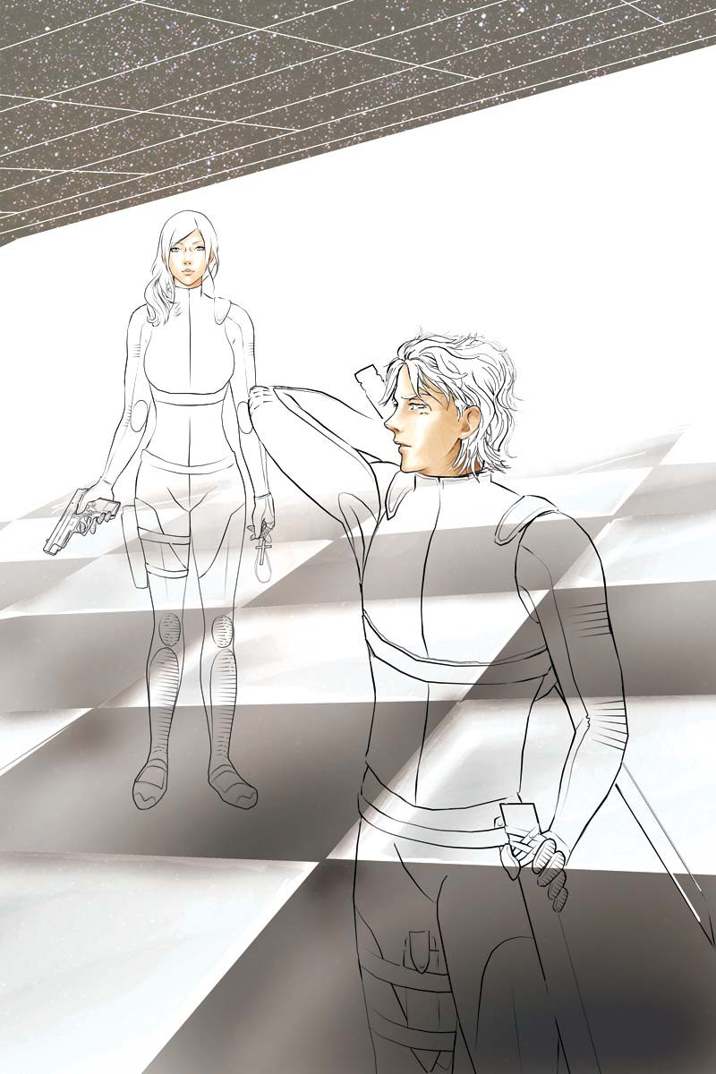
second render of the chess project. i'm liking how the chessboard turned out, though i like the ceiling even more! it just looks rather flat at the mo the faces were tricky to do so i had to use photo references, now i have to colour the clothes which is even harder arrrrrrrrr
everything is done with the dodge/burn tool on photoshop, it's a really nifty tool
") i recommend it! thanks for looking
i recommend it! thanks for looking 
Related content


Comments: 63

thanks ange! it's nearly finished, so i should post it up soon. havent heard from you in a while, everything alright?
 (Smile)")
👍: 0 ⏩: 1

Yep, all is well! I just finished my final exams, which were keeping me from making art or doing anything fun. I'm so glad I get to go home for the holidays now!
👍: 0 ⏩: 0

Ooh, I love how the flesh tones are turning out! Gooo Andie! 
👍: 0 ⏩: 1
Veddy welcome! I'm sorry to hear that you've been so busy recently, but I'm thinking of ya! So you take care and come back as soon as you're able, mew!
👍: 0 ⏩: 1
ah, that's much appreciated. however i am still here while i'm supposed to be working ")
👍: 0 ⏩: 1
Your bad Ash...and I'm good Ash...! I'm a goody-goody-two shoes! ^O^
👍: 0 ⏩: 0

This looks quite alright. Must take ages to tone and colour all the properties. Keep it up!
")
👍: 0 ⏩: 1
cheers darling. well, it's nearly finished. just can't be bothered anymore. i'm confused about which font to use for the typography tho. any recommendation for futuristic fonts?
👍: 0 ⏩: 1
Nothing to futuristic. Anything bashful and prominent will overpower composition of the illy. Simple and sleek. I'll showcase a list of fonts later. Let me think about it. Take a deep breath and get back to it after a long rest. I love you!!!

👍: 0 ⏩: 1
im using 'prototype' at the mo. oh, and something called 'digit' as well as 'nyet' for the russian feel. :showerfortwo:
👍: 0 ⏩: 1
Try the font sabotage. Not sleek but eligable. It's got scratch effects. Tried Russell Square?
👍: 0 ⏩: 1
i havent come across them yet. well, i'll try for the next project!!
👍: 0 ⏩: 1
Your excisting fonts look a little too futuristic and quite ambigious. Not the white on top, but the black at the bottom. Too much over the top.

👍: 0 ⏩: 1
yeah i kinda see that. can you guess what it says tho?
👍: 0 ⏩: 1

are you sure you don't want to give it just a little try?
👍: 0 ⏩: 1
Sorry to say this, but braille is more readable than that.
👍: 0 ⏩: 1
hehehe!!! well, someone managed to guess it right --> [link]
but then again, he's studying for his PhD bleh!
👍: 0 ⏩: 1
Really now! Hahaha. Perhaps the message would unfold it self, if I was to use a microscope. Then again, I don't think so.
👍: 0 ⏩: 1
")

aww come on, it's a list of sequential chess moves. the PhD guy got it right the first guess doh!

👍: 0 ⏩: 1
Matters not. The letters are unreadable. change the fonts into something more simple. I'm no chess wizard, so it makes no difference to me.

👍: 0 ⏩: 1
You just love a stupid log. Don't you.
👍: 0 ⏩: 1
Yes indeed they are, and the big wide ones makes an excellent stool for your tushy. Treat it well and keep clear it from malicious wood eaters. Your pal for life
👍: 0 ⏩: 1
exactly! but i wasn't talking about you hehheheh i love you henke
👍: 0 ⏩: 1
Thanks Darling. It was quite fast one cuz I came back since yesterday as you already know. Ehehe

👍: 0 ⏩: 0

Omg this looks Awesome!!!!!
I can't wait to see it finished! I love the way you colour faces too ^^
👍: 0 ⏩: 1
oh, thanksie!! yeah, i can't wait to see it finished either. it's been like... three weeks!! getting bored of it gah!
👍: 0 ⏩: 1
3 weeks?
Yeah I'm like that too... I get bored once I start really getting into a pic >_<
👍: 0 ⏩: 1
ah!! i can't wait to do something new... well, this one's nearly finished so fingers crossed i'll finish it tonight!!
how's the commission going tho? you must have finished it by now?
👍: 0 ⏩: 1
Yeah I have actually. I'm waiting for a good time to upload the images...
I'm going to put a BIIIIIG one up of the complete image, and 2 separate smaller ones of the details... you can't see the sword detail or dragon detail very well in the big piccy
I might put them up a little later tonight when more people get on ><
👍: 0 ⏩: 1
cheeky. oh well, that's exactly what im doing as well right now, alas, but to no avail! ")
👍: 0 ⏩: 1
I hate it how you could spend hours on a piece you're really proud of and get like less than 10 hits on it >.<
👍: 0 ⏩: 1
TRUE! i hate it more than anything ._______.
👍: 0 ⏩: 1
Bleh. And I hate it when the 'popular' artists get like 200000 hits on a couple of rough scribbles
You should be getting that many hits cos you deserve it!
👍: 0 ⏩: 1
that is VERY TRUE! i blame the system heheheh.
👍: 0 ⏩: 1
Me too
We should form our own club for the sisters-of-DA-who-feel-underappreciated hehe
👍: 0 ⏩: 1
hehehe we should! funny tho cos i thought you're the type of person who doesn't care too much 
👍: 0 ⏩: 1
lol thanks ^^
Hrmmm what would we call the club though?
👍: 0 ⏩: 0

Wow!! I'm so curious how it'll look finished *__* both look already so great!
👍: 0 ⏩: 1


| Next =>