HOME | DD
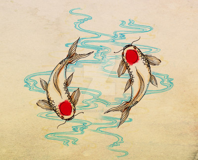
 Andoledius — Lotus Fish Ver.2

Published: 2009-11-21 03:57:58 +0000 UTC; Views: 19238; Favourites: 831; Downloads: 744
Redirect to original
Description
Kinda wanted to upload both versions, so here's the second one.Version one:
[link]
Related content


Comments: 25

👍: 0 ⏩: 1

👍: 1 ⏩: 1
👍: 0 ⏩: 0

Hi, I really like the colors you used in this piece. It has inspired one of my pieces. I will try to tag you in it as soon as its done.
👍: 0 ⏩: 0

Hey Andoledius! Is this the version where the print is "lighter"? (I'm sorta confused because the original looks 'lighter' than this version.) D :
👍: 0 ⏩: 1
Nope! That would be the original version.
👍: 0 ⏩: 1
I think you need to fix your version 2's Print Description --> www.deviantart.com/print/97415… It says Version 2 is "lighter" than the Original!
👍: 0 ⏩: 1
Ah, I think i just need clarity. That description is accurate, the original dark version ( on my DA page) is darker than the PRINT version of that same image, because the printer naturally prints it darker. So i'm still talking about the same image, just different variations of the same one! Does that make sense?
Thank you for pointing it out, I hope i havent confused anyone else!
👍: 0 ⏩: 0


THIS
This remind me the cover of the Nabari no Ou's Artbook "Liricamente" by Yuhki Kamatani (*; 艸 ; ) ♥♥♥
👍: 0 ⏩: 0

Very nice work.
the detail on the fish is really good.
Keep up the good work.
👍: 0 ⏩: 0


Beautiful. Congratulations! The carp really does seem to swimming. Love the different depths.

👍: 0 ⏩: 0


this is really really beautiful. I love all of the different textures and how delicate your lines are.
👍: 0 ⏩: 0

Ooh, I like this version a lot. The fish is more subtle, and the flowers pop out more. n_n
👍: 0 ⏩: 0

nice, too  (Smile)")
👍: 0 ⏩: 1
i hate double posts =____=" gomen nasai.
👍: 0 ⏩: 0
nice, too
👍: 0 ⏩: 0
