HOME | DD
 andrewk — Baby Badger- Step 1 and 2
Published: 2007-04-24 03:00:13 +0000 UTC; Views: 2200; Favourites: 22; Downloads: 36
Redirect to original
Description
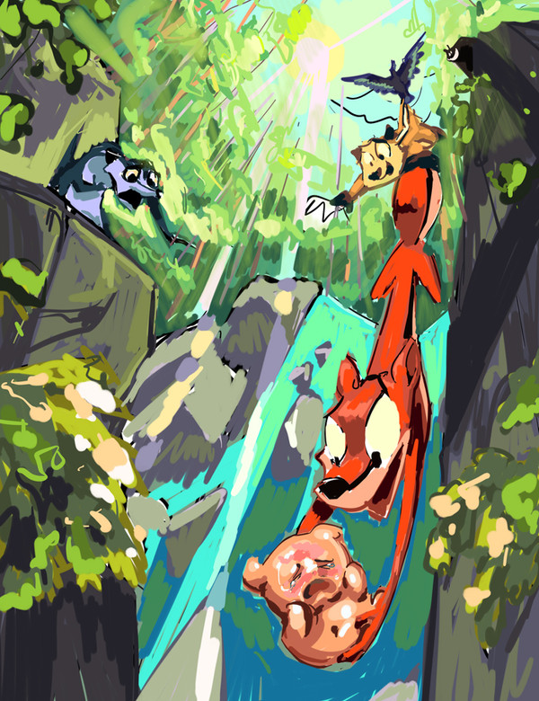
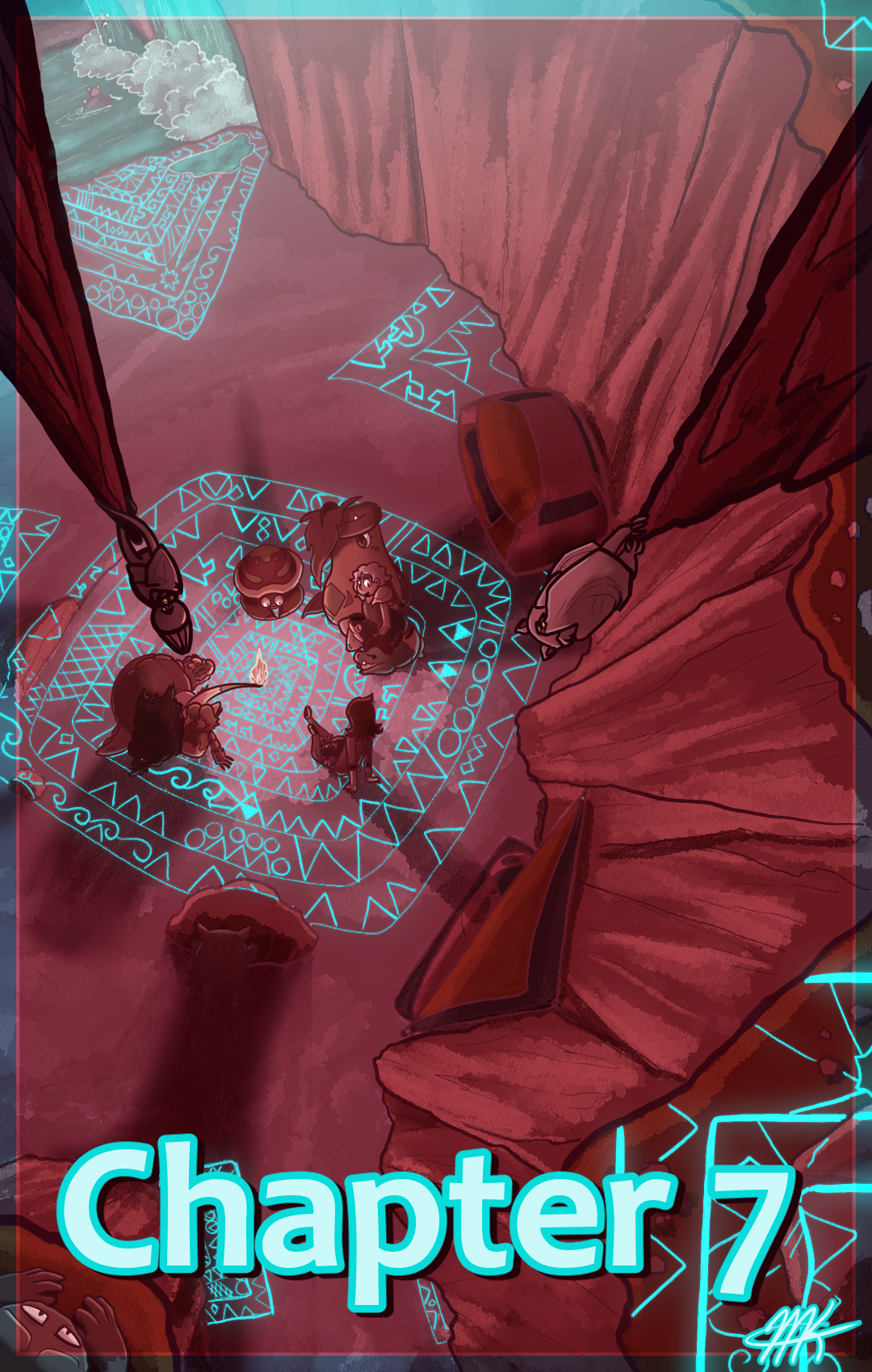
It's been a while since i did a painting on the same caliber as my Featured Deviation. This time, I'm going to submit it in steps to show you how i go about doing a painting like this, for those wondering. My process is not really any different than anyone else's- but I find that painting comes down to ONE thing- PUSH AND PULL.Step 1- I sketch the drawing out just like I do for a strip. At this point, it looks like a comic page, only with one panel taking up the entire frame. I think about composition, and where I want the eye to go. I knew what I wanted the narrative to be about first, so I wanted the eye to be drawn to Cory with the baby badger at the bottom to emphasize the story's climax. Its mom is the second thing you notice, as well as the sunlight as the brightest point of the piece. The eye goes from the sunlight, to the characters, following the trail downward until you notice the baby. The mother is the second thing you notice as you go back up. I'm pushing the contracts of the baby by putting it inside a clear shape, and Cory's red coat of fur is a nice contract wit the background, pulling it back to add to the depth. Of course, I push and pull the characters literally, to enhance their cartoony feel.
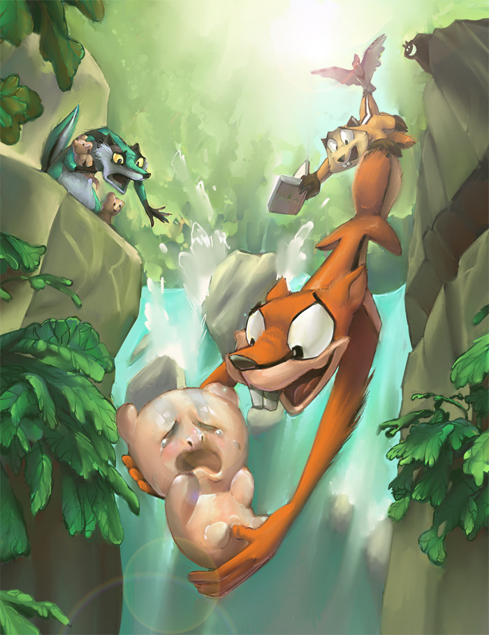
Step 2- I block out the lines with color. Color comes to me in a composition through trial-and-error- the baby and Cory turned out with warm colors, so I naturally wanted the background to have cool colors.
The mother is neutral, standing on the sidelines, so she's a medium-valued turquiose badger- the same color scheme as the background- she's pushed back. This may give me the idea to give the baby some turquiose baby fur as well, though, we'll see how well that looks later.
The other characters behind Cory are also secondary, so they're also warm, but they are PULLED back, since their colors are less saturated, and neutral. You can spot Lark as that bluish shape at the top. For fun, I added Philbert at the top of the cliff, smiling, using black and white, the most desaturated colors.
All this took an hour to do, from the conception. I didn't worry about details. My goal is to make what LOOKS like a completed painting if you only squint at it. Looking back, the colors may be TOO saturated, especially in the rocks and leaves- I may tone down the colors to have an even stronger contrast, pulling the characters to the focus even MORE.
Related content


Comments: 9

cool! the colours have always been tricky for me to figure out!
👍: 0 ⏩: 0


Very helpful advice on colors and composition - can't wait to see the finished product!
👍: 0 ⏩: 0

Wow, this is awesome! You give some very helpful advice. Hopefully this will now improve my own work...
👍: 0 ⏩: 0

Thanks for doing this, becasue i always wondered how you paint and maybe i learn from it.
👍: 0 ⏩: 0

Too cute.
You did one hel of a job with the perspective too.

👍: 0 ⏩: 0

I really love the baby badger. The expression speaks an odd amount of volumes to me, so I like it.
")
👍: 0 ⏩: 0

There is a method to the madness, I see. Cool.
👍: 0 ⏩: 0

wow, i saw this on the newest chart, and it's pretty damn good!

👍: 0 ⏩: 0