HOME | DD
 anesthetix — _diffusion

Published: 2006-02-15 00:32:30 +0000 UTC; Views: 1137; Favourites: 32; Downloads: 185
Redirect to original
Description
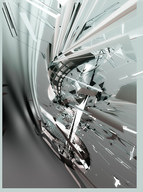
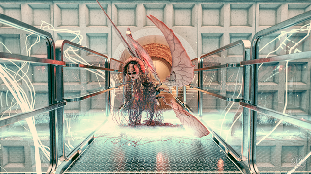
Newest piece i have made so far, i really like this style, if you dont, may i link you to my friends page. =MachaiMatsuda and read his newest deviation's Description


Thanks to Matsuda and a few others for the help on this.
im going to have this on dA for a short time just to get some views on it and see how people like my work, then it is going to be moved to this page...
[link]
Thanks for the comments if you leave any.
Related content
Comments: 32

loving the piece overall in composition, but i think the lower render has a problem with over contrasting and not necessarily giving a complimentary weight to the picture
good work man...keep this shit up
Hels
👍: 0 ⏩: 0

Okay, if not color, what about contrast? You dont have to go with the most realistic lighting a render has to give you, Photoshop has a purpose. Adjust that contrast, map a gradient on a layer and screw with it. All of your stuff has the same exact listless color scheme, you might try spicing it up!
👍: 0 ⏩: 0

Well, I think the shapes and rendering, brushes, etc are very good, but when I stared at it, the very first thing tha came to my mind was "colour!!" Maybe some small strokes of colour in the middle, or somewhere else, could make the piece unique, and remove the small monotony...
👍: 0 ⏩: 0

... It's nice, but why don't you add some color to it?
TeraLink Was Here!
👍: 0 ⏩: 1

color ruins this piece..why does everyone think color is key to making a good piece? its not, color seriously ruins this peice....trust me i tried color...it didnt look pretty..
👍: 0 ⏩: 0

Nice render here. You need more detail overall, much more details at your brushings. I neither can find some kind of "depth" in it.
But a talent is found here ,)
👍: 0 ⏩: 1

Thank you sir 
👍: 0 ⏩: 0

Thank you very much sir! 
man, you seriously made my day, this is like the first time someone of your status, in my terms awesome, has commented on my piece 
👍: 0 ⏩: 1

The colors are the reflection of the lighting onto the piece, and the lighting happens to be that color so it is actually very realistic.
👍: 0 ⏩: 1

cool, very nice render anyway. I just thought it may look more interesting with some more colours.
👍: 0 ⏩: 1

i tried to add colors it just looked weird...i seriously tryed so many different combonations but this was the best i could get it to look.
👍: 0 ⏩: 1

ok thats cool, was just suggesting, good job!!!
👍: 0 ⏩: 1

yeah i know and i thank you greatly for the comment
but color isnt always everything
👍: 0 ⏩: 0

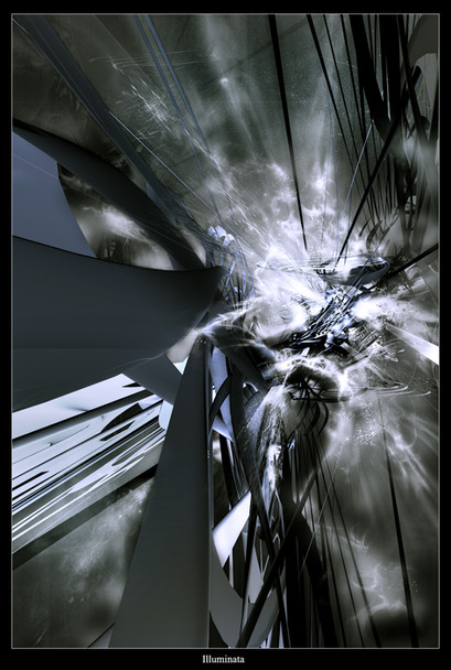
wow bro, i love the style in that peice, it just has an amazing feel to it, it looks like some kinda crazy future technology or something
but now to critique, there are a few areas that kinda look choppy or just unsmoth, like those strands in the top middle of the piece kinda look rough
but the light sources and reflections are very well drawn, but for some reason (possible the shitty quality of my monitor) they look kinda dulish, like they're not as bright as they should be, you might wanna put alittle more light near the bottom of the peice, its pretty dark and jumbeled, and im not too sure about those strandy things coming out of the center light soarce
the particles look amazing, awsome job on those, and the render itself, especially the top half of it, look superb, they kind of give a distorted nightmareish feel
over all i give it a 8.5/10 only reason its not 10 outa 10 is the kinda scetchy ness in some spots and the lighting isnt brilliant enough (again both those things could be just the quality of my moniter)
👍: 0 ⏩: 0

There are a lot of rough areas on this picture, I like how you have a new style of Grey going
always cool to see !
👍: 0 ⏩: 0

this is sekseh..a bit sharp in part but sekseh indeed.
👍: 0 ⏩: 0
