HOME | DD
 angelaacevedo — Revolution Mag 'Prototype'
Published: 2007-09-18 21:32:50 +0000 UTC; Views: 25955; Favourites: 171; Downloads: 1217
Redirect to original
Description
::::::::::::::::::::::::::::::::::::::::::::[EDIT: 06/08] Full view recommended. Changed original to my actual portfolio piece. You can see more at www.swavdesignstudio.com
::::::::::::::::::::::::::::::::::::::::::::
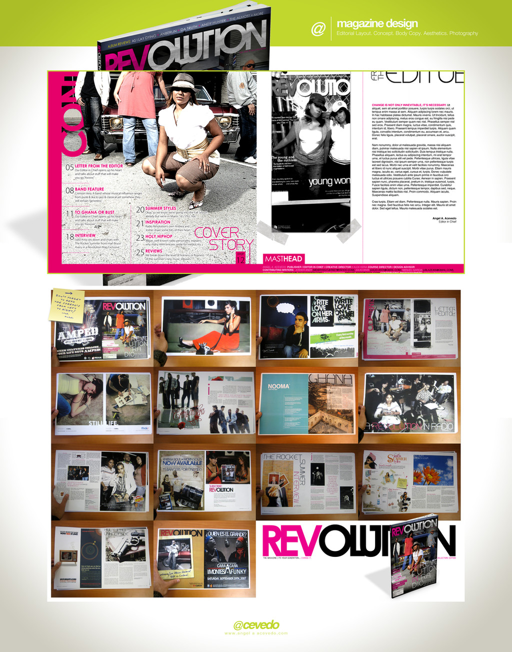
This started out as a School Project from [link] for my Digital Layout class. It was a final project for the course. I decided that instead of creating a "fake" mag, I would create an actual magazine with articles, interviews, ads and so on.
This is the result of 19 hrs of nonstop work (since, like good student I created most of the design last minute), and I turned it in the next day (yesterday Sept 18).
After I printed two copies and made a "dummy", I turned it in but the professor was a no-show... figures. Non-the-less, it was complete, but it still needs work on some things I didnt quite like and some artciles I didnt get from some of my buddies.
I'll upload the FINAL once its complete. DOWNLOAD FULL VIEW! for maximum richness. Don't mind the blurriness of some of frames.
Below are the credits and relevant info:
• Program - Adobe InDesign, Illustrator & Photoshop
• Photo by - see below
• Mag Font - Century Gothic [manipulated]
• Body Copy - Switzerland
• Texture/Vectors - several
Credits:
• Design - yours truly except some of the Ads
• Photography - Dajo Photography [cover, ad, subscription and main story, Jennie Fernandez, Mairenis Rielo, Swav | Design Studio, Jess Baumung, [gun and Bible, Im still looking for owner]
• Ads - Zeal, FreshAesthetics, Amped [these were not designed by me]
Presentation inspired by: [link]
Related content


Comments: 36


the masthead are really cool.. a bit more space between the letter L and U would look better...
well, it's only my opinion..

👍: 0 ⏩: 0


Man, I would so buy a magazine like that, it's right up my alley.
Fabulous work, makes me wish I had been in charge of layouts in my digital publishing class last year :<
👍: 0 ⏩: 1

wow thanks! Yea, the mag is def now in the works. We're looking on actually the possibility of publishing the music mag. I'll def keep posting on it. thanks again!
👍: 0 ⏩: 0

If only magazines were designed like that...
👍: 0 ⏩: 1
much of US mags are bleh. You should checkout some of the UK mags at Barnes & Noble, exquisite (spelled wrong, I know) design.
I got inspired by Relevant Mag [link] Thanks for the love on this!
👍: 0 ⏩: 1
hehe, no problem!
Barnes & Noble ey....? Might go check em out
👍: 0 ⏩: 1
def do. they would be in the international sections, I think. The designs push the envelope! Let me know if you pick one up.
oh and btw, your avatar is sweet!
👍: 0 ⏩: 0

this is pretty sick. i love that one in the middle with the turquoise page that says 'nooma' on it. no idea what that means, but the negative space is calling to me..
👍: 0 ⏩: 1
wow, Nooma, they are amazing. Here is their [link]
I made that ad using their colors, I think its my fave ad on the whol mag. Thanks for the comment!
👍: 0 ⏩: 0

thank you, and thanks for the

👍: 0 ⏩: 0

Loving the play on the amazing typography!
Great work!
👍: 0 ⏩: 1
hey thanks! I appreciate that.
👍: 0 ⏩: 0

 (Smile)")


This is hot, it definitely deserves a fav. from me")
👍: 0 ⏩: 1
I appreciate that, thanks!

👍: 0 ⏩: 0

I appreciate the love mate!
👍: 0 ⏩: 0


Looks good... You should let me submit an article + layout when you go worldwide!
👍: 0 ⏩: 1

👍: 0 ⏩: 0
jajaja! gracias! y cuando me vaz a mandar la foto esa de la cara tuya eh?
👍: 0 ⏩: 1

hahahaha tu me dices despues pak la necesitas ")
👍: 0 ⏩: 0

it's wonderful- really : >! it looks very professional!
👍: 0 ⏩: 1
