HOME | DD
 arpad — LT01 - rough sketching
by-nc-nd
arpad — LT01 - rough sketching
by-nc-nd
Published: 2008-03-03 06:09:27 +0000 UTC; Views: 36639; Favourites: 329; Downloads: 838
Redirect to original
Description
***WARNING***I'm not a native english speaker but I do alright. If you find any typos.. I'm sorry. Also if you feel this is lame, you'd better not read this, logo designing has everything to do with passion and emotional awareness.
Hello my friends,
I've been wanting to do this for a very very long time now, a logo tutorial. I'll divide the tutorial in 5 stages:
------
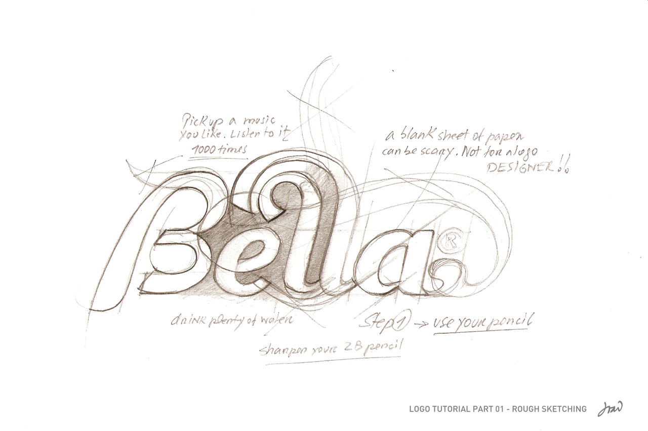
LT01 - rough sketching
Introduction:
Grabbing a piece of paper and fill it with pencil strokes is very challenging and frightening at the same time. Sharpen your 2B pencil and promise you will never use the eraser (not on this stage anyway). Kick off your shoes, pick some tune you like and leave it there, turn your winamp's repeat, you won't listen to anything else for at least one hour.
For this exercise, lets do a logo for a Café called Bella. As soon as you drink the word, make sure you repeat it over and over to yourself. (no need to do it verbally, just focus on the word.)
Never draw with your hands cold, make sure the body temperature is warm and cozy, environment is essential.
Turn off your goddamn workstation, go somewhere else, drawing doesn't require a fucking screen.
Pick a few blank sheets of 80/100 g/s white paper and make some room, lets rock and roll, we are on a mission now: deliver "Bella Café's identity.
The first lines aren't really taken into consideration but most of the time (depending on the experience), it should represent the frame of the final artwork design. Please, don't think about softwares and shit, you, your pencil and that sheet of paper are truly one, just like the Holy Trinity.
Imagine an uppercase 'B', elegant, curvy and smooth. Lets do a vintage style, something revivalist and memorable, based on those images you saw on some 30's printed posters on the walls of some pub.
At this time, you are going to draw basic shapes, circles, parallel lines, and strokes. Find a connection between every single line in that sketch. [When you are more experienced, you don't need to make all letters from the first, you make them from a little thing called the 'typographic matrix', a shape like the Bee Queen, she only gives birth.]
When you finish the B, you are going to look for ways to make the next character fit. This is a very important step, blending together the shapes. Be intuitive, make a lot of lines and strokes, use your imagination. Look up, make a pause, get up and stand back just a tad, you need to see it from as many angles as you can. Never mind what your Mom says, you may look like a Cirque du Soleil clown, but she's very proud of you. It's important to let yourself go with the flow, be the pencil... be the pencil and be confident.
When you find yourself looking at something you do not like, remember you can't use that lovely Rötring eraser.. not now, don't break your promise. Be persistent, forget about the hours, the girlfriend, that stupid soccer game you lost.. focus on the paper, you need to get obsessed.
Flip your sheet, look at it upside down. You'll see something new. A new possibility, something to think about. Fuck with your mind, question every pencil stroke. Move back and forth with your head, make your eyes see what comes ahead. You are not creating something new, imagine you are just remembering it.
Be patient, steer your hand firmly. You got to love your hand, its God's gift to you and it defines your existence.
Use the space between letters to find new shapes and directions for your pencil, your line of thought is quicker than your hand, scout that piece of paper for its path, be the guide and lead the way to your hand.
Go emotional, sing along with Moloko. Forget about that depressive music you like to hear so much, dance to the beat, whatever.. acknowledge that refreshing and being positive is important when you're being so obsessed in a healthy way, so to speak.
Look at your drawing with blurry eyes, see the layout spots, it also shows you other possibilities.
You should have a 'Bello' drawn, more or less incomplete. Never mind about that, this is supposed to be this way.
Be proud of what you did but first, be true to yourself by asking these questions: Is this what I wanted? Can this stand out from the other logos out there? Am I being stubborn enough and going back the necessary steps to get what I need? Be humble and persistent but be objective.
End of LT01 - rough sketching.
------
Next will be LT02 - selective sketching, LT03 - tracing, LT04 - Details, LT05 - colors, and as kntz suggested, LT06 - Presentation.
I will try to be brief, thank you for your attention.
Best,
João
Related content


Comments: 78


good, im happy that another person makes a tutorial like this, the funny thing is that almost noone uses the god damned pencil! you must have a special bond with it, also a logo designer must see further than the drawing itself, he should think of the future of the sketch, he must see it finalized and detailed, thats what i like to graphic desig, forseeing and adjusting before finalizing.
👍: 0 ⏩: 0

brov your the best!!! lool this is wicked.
ive actually already started doing my logo sketches and stuff - rather than just making them straight away...but not as pretty as yours!
looking forward to lesson 2
")
👍: 0 ⏩: 0

this is one of the best tutorials I've ever read... I can see your passion in it! 
👍: 0 ⏩: 0


Thanks a bunch for the tutorial, it's really clear you have a passion for this. And your English is fine, too!
👍: 0 ⏩: 0

Nice. But where does the substance abuse come into the process? ie: whiskey
 (Wink)")
👍: 0 ⏩: 0


you're totally in it. You have so much passion for corporate identity, very loyal designer. true to the game, practicing and fighting for honesty, like a comics hero, hehe. I like that you're so serious about everything that comes near graphic design. You see, the only profiles on DevART I put as friends are you and my girlfriend, so I can be informed when you put something new. I noticed your commitment from the very start. Studious approach and all. I think you should also teach in art/design school, and practice your communication skills. I respect what you do the way you do it. My suggestion, don't get stressed that much about ripoff artists, your loosing on beauty. keep your PMA - positive mental attitude.
👍: 0 ⏩: 0

What an awesome read. Made me want to leave work and find a park somewhere with my MP3 player. Way cool.
👍: 0 ⏩: 0

Very useful tips here...I'm looking forward to see the other tutorials!! very good work, thank you for share!
👍: 0 ⏩: 0


Cheers for the tutorial, logo design is definitely my weak point. Hopefully you can help me to overcome it ")
👍: 0 ⏩: 0


Interesting start, I'll wait for me.
I completely agree on pencil + paper, that's always what I do for logos too
👍: 0 ⏩: 0

really nice, I love logos and your first part is really good to read. can't wait for the next steps.
👍: 0 ⏩: 0

arpad ur the best dude! one of the most greatest brandesigners on DA!!
👍: 0 ⏩: 0


Thanks a lot man. My heart was beating when I read your words lol. I always wanted to know the detailed way of making logos specially from someone like you.
You mentioned "Please, don't think about softwares and shit, you, your pencil and that sheet of paper are truly one, just like the Holy Trinity."
Is that really true because I suck at Illustrator?
👍: 0 ⏩: 0

Awesome tutorial mate  (Smile)")
👍: 0 ⏩: 0

You are wonderful.
👍: 0 ⏩: 0

hey mate, how are you doing? This stuff is great!
Also, I have a suggestion. There could be a LT06 - presentation. Hehe. Thanks for your effort !

👍: 0 ⏩: 1

Man, you're absolutely right. LT06 - presentation! I will update the description.
👍: 0 ⏩: 3
")
<= Prev |