HOME | DD
 arpad — LT01 - rough sketching
by-nc-nd
arpad — LT01 - rough sketching
by-nc-nd
Published: 2008-03-03 06:09:27 +0000 UTC; Views: 36639; Favourites: 329; Downloads: 838
Redirect to original
Description
***WARNING***I'm not a native english speaker but I do alright. If you find any typos.. I'm sorry. Also if you feel this is lame, you'd better not read this, logo designing has everything to do with passion and emotional awareness.
Hello my friends,
I've been wanting to do this for a very very long time now, a logo tutorial. I'll divide the tutorial in 5 stages:
------
LT01 - rough sketching
Introduction:
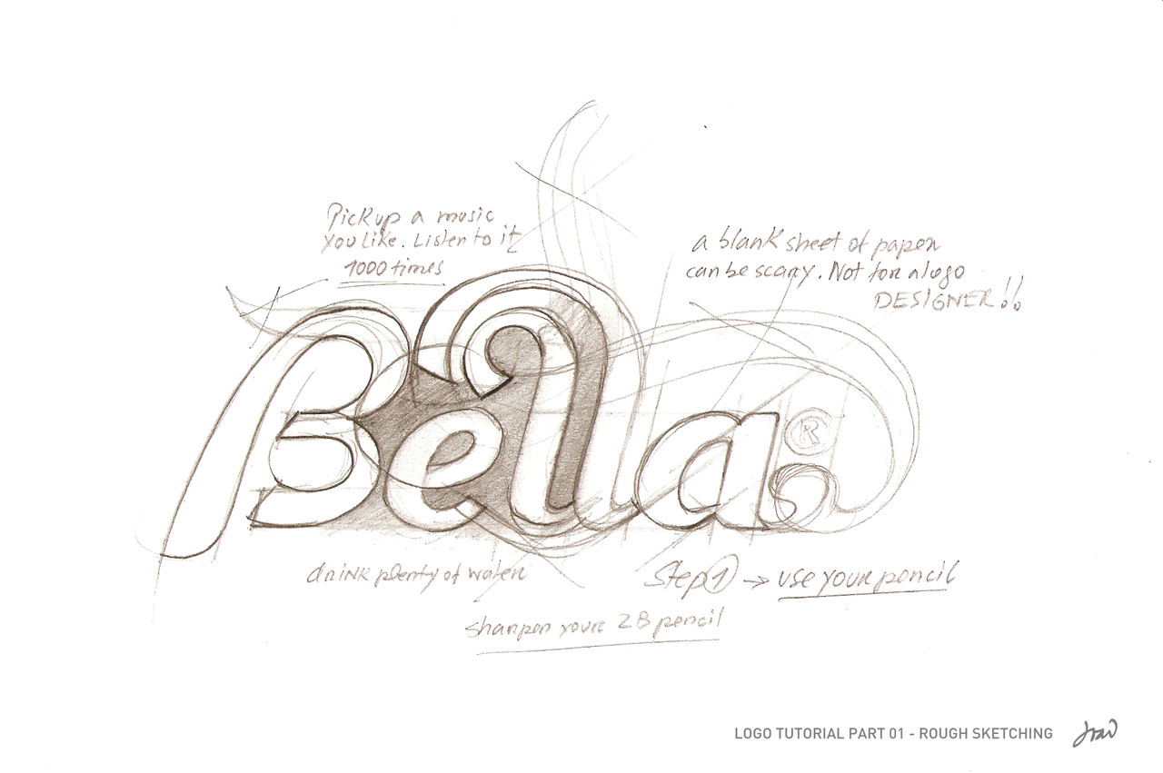
Grabbing a piece of paper and fill it with pencil strokes is very challenging and frightening at the same time. Sharpen your 2B pencil and promise you will never use the eraser (not on this stage anyway). Kick off your shoes, pick some tune you like and leave it there, turn your winamp's repeat, you won't listen to anything else for at least one hour.
For this exercise, lets do a logo for a Café called Bella. As soon as you drink the word, make sure you repeat it over and over to yourself. (no need to do it verbally, just focus on the word.)
Never draw with your hands cold, make sure the body temperature is warm and cozy, environment is essential.
Turn off your goddamn workstation, go somewhere else, drawing doesn't require a fucking screen.
Pick a few blank sheets of 80/100 g/s white paper and make some room, lets rock and roll, we are on a mission now: deliver "Bella Café's identity.
The first lines aren't really taken into consideration but most of the time (depending on the experience), it should represent the frame of the final artwork design. Please, don't think about softwares and shit, you, your pencil and that sheet of paper are truly one, just like the Holy Trinity.
Imagine an uppercase 'B', elegant, curvy and smooth. Lets do a vintage style, something revivalist and memorable, based on those images you saw on some 30's printed posters on the walls of some pub.
At this time, you are going to draw basic shapes, circles, parallel lines, and strokes. Find a connection between every single line in that sketch. [When you are more experienced, you don't need to make all letters from the first, you make them from a little thing called the 'typographic matrix', a shape like the Bee Queen, she only gives birth.]
When you finish the B, you are going to look for ways to make the next character fit. This is a very important step, blending together the shapes. Be intuitive, make a lot of lines and strokes, use your imagination. Look up, make a pause, get up and stand back just a tad, you need to see it from as many angles as you can. Never mind what your Mom says, you may look like a Cirque du Soleil clown, but she's very proud of you. It's important to let yourself go with the flow, be the pencil... be the pencil and be confident.
When you find yourself looking at something you do not like, remember you can't use that lovely Rötring eraser.. not now, don't break your promise. Be persistent, forget about the hours, the girlfriend, that stupid soccer game you lost.. focus on the paper, you need to get obsessed.
Flip your sheet, look at it upside down. You'll see something new. A new possibility, something to think about. Fuck with your mind, question every pencil stroke. Move back and forth with your head, make your eyes see what comes ahead. You are not creating something new, imagine you are just remembering it.
Be patient, steer your hand firmly. You got to love your hand, its God's gift to you and it defines your existence.
Use the space between letters to find new shapes and directions for your pencil, your line of thought is quicker than your hand, scout that piece of paper for its path, be the guide and lead the way to your hand.
Go emotional, sing along with Moloko. Forget about that depressive music you like to hear so much, dance to the beat, whatever.. acknowledge that refreshing and being positive is important when you're being so obsessed in a healthy way, so to speak.
Look at your drawing with blurry eyes, see the layout spots, it also shows you other possibilities.
You should have a 'Bello' drawn, more or less incomplete. Never mind about that, this is supposed to be this way.
Be proud of what you did but first, be true to yourself by asking these questions: Is this what I wanted? Can this stand out from the other logos out there? Am I being stubborn enough and going back the necessary steps to get what I need? Be humble and persistent but be objective.
End of LT01 - rough sketching.
------
Next will be LT02 - selective sketching, LT03 - tracing, LT04 - Details, LT05 - colors, and as kntz suggested, LT06 - Presentation.
I will try to be brief, thank you for your attention.
Best,
João
Related content


Comments: 78


Awesome really enjoyed this. Great gallery btw, you are truly an inspiration for logo designs/typography.
👍: 0 ⏩: 0

Wow, this is pretty gross!!! Thanks a lot for all the tips given, I'm putting into practice right now
Hope you can make the other LT02, LT03, etc tutorials for us to learn a bit more
Thanks again!
")
👍: 0 ⏩: 0


When do you go on with that tutorial, I'm very curious about the next steps.
👍: 0 ⏩: 0

irmao: this would be the step 2.
the step 1 of your tutorial would be "listen your client's ideas, check the places and how and where will be used the logo" .. because you will start your design: based in your ideas or based in your client's targets (or based in what your client's need)
valeu cara- tudo fica bem so isso


👍: 0 ⏩: 0

Whats with the part of having one track repeat all over? Wouldnt it be a good idea to pick out a mix (a set of songs specially put together to keep an overall vibe) or a playlist or a genre?
Other than that, cool writing
👍: 0 ⏩: 0


Man... I'm just reading this for the first time. Sometimes I've watched your works and faved some of them, but never saw this before.
Let me tell you, one of the most inspiring and honest things I've ever read about logo designing... Thanks so much for doing this, I will try to follow along the next time I'am sketching a logo. It is true that you need to get away from the computer for a while. Sometimes I do it, sometimes I don't... the result is allways better when I've hand-sketched the piece before getting into illustrator.
So thanks again and try to post some stuff whenever you can, love your logos
👍: 0 ⏩: 0
Thanks for this interesting tutorial.
When will we see LT02 and the rest?
I'm looking forward to it!
👍: 0 ⏩: 0

I love hearing how other people formulate their ideas and make them in to actual designs, yours is interesting and amazing!
👍: 0 ⏩: 0

estão ai umas formas interessantes para começar um novo tipo de letra.
👍: 0 ⏩: 0
 (Wink)")

And this is awesome way to get some inspiration
Congratz, and keep doin' it
")
👍: 0 ⏩: 0

this was fucking great!!!!
"a shape like the Bee Queen, she only gives birth"
hahahaha thats fucking awsomee bro!!!!!!
👍: 0 ⏩: 0

I've been doing logos for almost a year now.. and I still can't draw out a logo like that, takes genius...
👍: 0 ⏩: 0

Truly awesome of you to do this! I'm looking forward to the next part. Thank you so much!!!
👍: 0 ⏩: 1

Thank you!! I'll try and do it as soon as I can!
👍: 0 ⏩: 0

This is really great! Are we going to see LT02 soon?
👍: 0 ⏩: 1
Hello skutterfly, Yes. Soon, I hope.  (Smile)")
👍: 0 ⏩: 0

This is what i looking for long time , in an attempt to tracing of making logo .
Finally, i found it in reading your kind article,
Thank you for your effort .

👍: 0 ⏩: 0


Thank you
I will soon launch LT02, can't miss it! hehe
👍: 0 ⏩: 0

thank you, nice to hear a bit more of your process, though I think it always shows through visually through your sketches/scraps
👍: 0 ⏩: 0

i see you as a real artiest
sketch you work and scan it .. the colorize it and finish it digitally
not just see and try directly
real artiest
👍: 0 ⏩: 0


oui , mais après vous allé le reproduire sous photoshop , vous allez donc utilisé une police ? et vous allez modifié les 2 " L " et le " B " .
👍: 0 ⏩: 0
Arpad ! je vais essayé de pas faire de fautes ! Je voulais dire que même , vous allez trouvé un police de ce genre ! Pourriez vous me la donnez des que vous l'aurez trouvé ! Merci
👍: 0 ⏩: 1
Je l'ai fait tout à partir d'un dessin au crayon .. Donc Il n'ya pas de police. Si vous voulez vous pouvez attendre la deuxième partie de ce tutoriel, Je serai bref.
👍: 0 ⏩: 0

WOOOOOOOWWWWWWWWWWWWWWW
FINALLY a logo tutorial!!!
thankyou so so so much!
i love ur work!
👍: 0 ⏩: 0
Arpad, sorry but I am not English I uses a translator. Therefore I am not read your description of the logo. But otherwise you gone to use a police of this type?
👍: 0 ⏩: 1
Allo Nicolas. Tu peux écrire en francais que je comprendre.
👍: 0 ⏩: 0

inspiring for us graphic designer wannabes. you've shown me some aspects i haven't thought of.
👍: 0 ⏩: 0


Parabéns João, muito bom tutorial! Espero ver os outros
👍: 0 ⏩: 0
Good night. I fell in love with your logo! If you can definitely give me the used name of the font
👍: 0 ⏩: 1
Hello. I'm not sure you read the description.. this is a logo tutorial. The 'font' is still a pencil sketch.. I will develop further very soon.
👍: 0 ⏩: 0

I'll follow these tuts for sure. the logo was lright but your words had me hooked. The passion seemed real and that is great!
👍: 0 ⏩: 0


| Next =>