HOME | DD
 arrghman — Morning

Published: 2004-08-09 01:58:16 +0000 UTC; Views: 3545; Favourites: 37; Downloads: 356
Redirect to original
Description
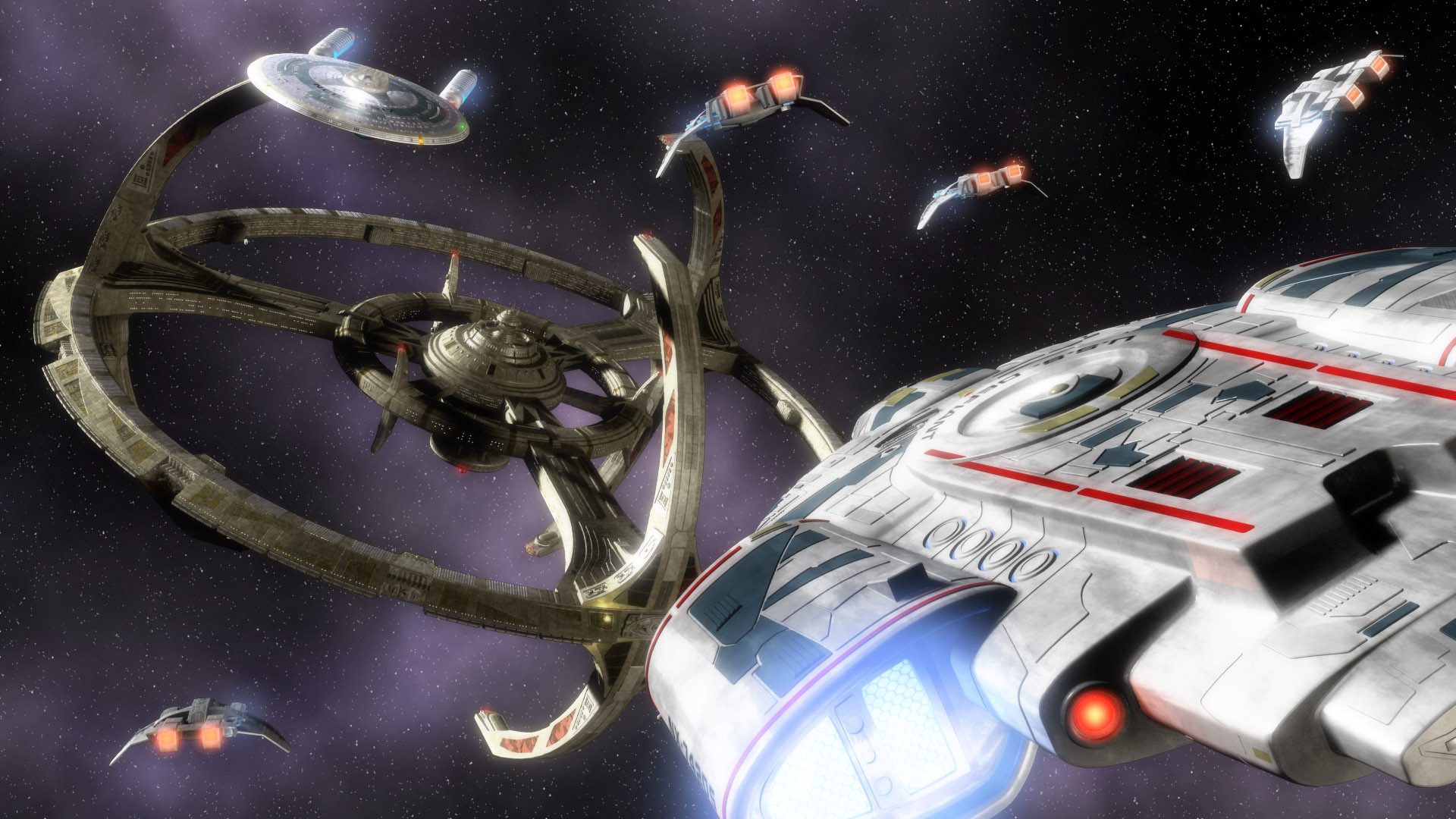
Still some tweaking to do on the station, but I wanted to put this whole scene together.The difference between this and the previous deviation are the additional ships, updated DS9 model, repainted backdrop and blooms. The entire scene was about 1.7 million polygons and used up every last meg of RAM I have!
Related content


Comments: 15

YAAAAY!! this is awesome!! I love it 
👍: 0 ⏩: 0

I love the sort of "overexposed" thing you do with the lighting... gives it a very ethereal feel.
Excellent render.
👍: 0 ⏩: 0


Simply another stunner, your work deserves far more credit IMO. I can see what you mean in regards to the DS9 texturing but I don't think I would have noticed it without prompting, or long careful examination.
👍: 0 ⏩: 0

I'm making a nebula in XSI 4.2 and I can't get my particles to look quite realistic enough. How did you do your nebula? Is it just a texture?
👍: 0 ⏩: 0

Picard has a point on the Ambassador, however, it could also be the angle. Ambient light is a wee bit bright, i.e. on the show I always remember the station being dark.
F-ing A.
👍: 0 ⏩: 0

Very nice modeling work. All the work you've put into DS9 has really paid off. The model of the station looks seamless, and creates a very convincing sense of realism. The texturing is also excellent, however, not perfect. Perhaps it's just me, but I think the texturing on the thingies running between the inner habitat ring and the outer docking ring are a little elongated. I think they might be improved if there was more vertical tiling. Aside from that, it looks excellent. As for the lighting, I really like the light being cast by light source off the screen to the left (a sun, I'm assuming). However, I think there should be a little less ambient light. With less ambient light, the light coming from the various windows and other light sources would be a little more pronounced, and I think that would create a slightly more realistic feel. The only other qualms I have with the lighting are on the Ambassador class ship. For one, I think the deflector dish would look better if it were a slightly darker blue (and perhaps the nacelles as well). Secondly, and this is very minor, there seems to be a stray shadow on the bottom of the saucer section, almost as though the round blue thing at the direct bottom of the saucer is floating slightly below the ship. Maybe my brain is just playing tricks on me. The background seems to really fit the scene, especially with the hazy purple nebula or whatever it is in the background. However, I think if the stars were in sharper focus, they would give the scene an entirely new sense of vastness, as though this place really is deep in space, far from other space things. Oh, and I just have to comment on how frigging awesome this scene is with the Defiant docked there.
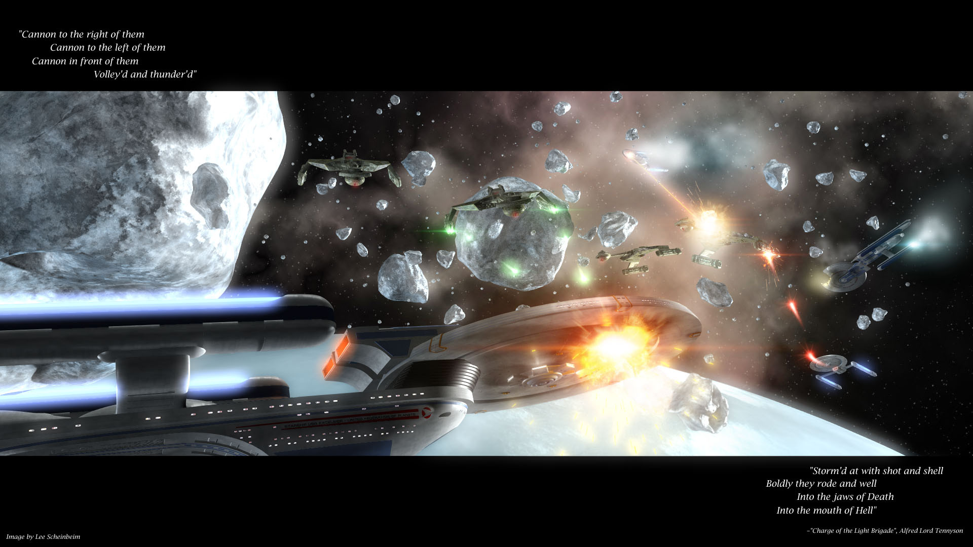
I don't suppose you have a battle scene planned for the station... Perhaps with the Defiant chasing a Bird of Prey through the docking pylons or something. And with the station firing several of its plentiful phaser banks and torpedo lauchers. But short of that, might you be able to make a view of the top of the station?
👍: 0 ⏩: 1

The texturing in the areas you mentioned has been bothering me a bit but I couldn't really put my finger on why. I'll try playing with it like you said! And you're definetely spot on with the lighting comment, the more I look at it the more I agree that ambient should be lower than it was. Thank you very much for your honest comments!!
I'll definetely be doing some kind of battle scene later, though I still have to do a bit of modeling work first to add in some of the retractable phaser banks.
👍: 0 ⏩: 0


Arrghrocksmysocksandthisisajobveryverywe lldone.thatisall.
👍: 0 ⏩: 0

Ambasador seems a but large for the station.. from what I've seen of the Galaxy and Nebula being docked on that uper arm.
👍: 0 ⏩: 1
Do you have any comments on the lighting? On the composition? Do you have anything to say about any of the texturing or modeling choices? How do you feel about the color balance, or the contrast?
Personally, after looking at the image more and getting some comments from elsewhere, I've decided that the ambient light is a big high and that the secondary shadow cast is too sharp and should be a lot softer. The nebula could be a little more complex as well.
This is an example of the kind of constructive critisim I would expect on an art website. The Ambassador may be a bit too large for the station. However, this is not a 100% accurate historical account of a fictional universe. It is instead a piece of art. I would think that approching the image from that angle would do you a lot of good and enable you to participate more fully in an art focused site.
👍: 0 ⏩: 1
Their are many diffrent levels to "participateing" on this perticular "art focused site". Assumeing you know which is the best way to participate for all members and all 8 Million peices of work on your part is an error. I don't feel the need to change the way i participate nor do I feel like explaining how exactly I participate ,most of which people will never see, in great detail.
Thanks for the suggestion though.
👍: 0 ⏩: 1
I'm not telling you that I know the best way to participate in this site. I'm instead explaining to you what my work is and why I make it so that you might attempt to appreciate it on that level.
If you can't... then it's your loss!
👍: 0 ⏩: 0