HOME | DD
 arvalis — The Guide-Color Exploration
by-nc-nd
arvalis — The Guide-Color Exploration
by-nc-nd
Published: 2011-05-08 05:38:21 +0000 UTC; Views: 9943; Favourites: 178; Downloads: 292
Redirect to original
Description
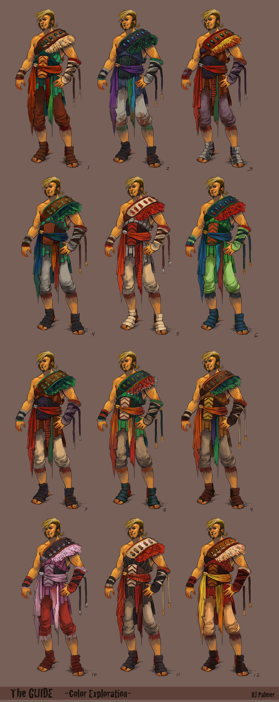
After the design exploration, i created a final design to explore color variations. Im still not pleased with any of these completely, i will still play around with these a bit more.Design Exploration
Original Design
Related content


Comments: 47

I like 3, 5 and 11 best.
But they're all awesome!
👍: 0 ⏩: 0

1 
👍: 0 ⏩: 0

1, 4, 11, 12 the best to me. 1 feels kinda Aztec-reminiscent, while 12 feels Roman for some reason. Overall, nice!
👍: 0 ⏩: 0

You have some really awesome concept designs! *insta-watch*
👍: 0 ⏩: 0


lol! First thing that came to mind= Adoptables!!~!
👍: 0 ⏩: 1

Oh I know! It was just the first thing that came to mind. *Plam face* I'm actually trying to start an adoptable of my own. Haven't posted any art of it on DA yet. But the Adoptables are taking over my mind. @.@
👍: 0 ⏩: 0

Did you put thought into each colour scheme or was it simply a matter of fiddling with Hue\Saturation?
👍: 0 ⏩: 0

I like 1, 2,3 and 10...I think 10 might be girly for this guy but I think it still goes!
awesomeness!
How was the semester?
👍: 0 ⏩: 0


must have been a bitch picking out one exactly: I like 1, 2 and 4 out of these
👍: 0 ⏩: 0


This is coolio man! I'm really liking 1,3,9, and 12
👍: 0 ⏩: 0


I like 3, 5, 11, and 12! Damn! You just keep putting out amazing work!
👍: 0 ⏩: 0


11's working the best as a whole, I think whats throwing you off is his hair color matching with he cream white on the pads. I'd try tweaking there you might get a a more desired and harmonious flow of colors. Good work over man.
👍: 0 ⏩: 0

1, 9, 12: I like the deep rich brown tones in each of these designs they feel more earthy I guess. It's kind of how I see someone called "The Guide" if they are traveling kind of blending into the trail someone who is very down to the ground. Very rich earthy tones. I do like the change in the design though pretty awesome.
👍: 0 ⏩: 0


5, 11, 12 <3 Something about the golden belt thingy is what I like with 12 It catches attention x]
👍: 0 ⏩: 0

I really like one because the clothes have a unique color combination that harmonizes with characters over all appearance. Plus no other character has those iconic colors. I've been reading alot of people want 5 and 11, I feel like those colors have been over used on characters. If you want to it to keep it unique and memorable, do number 1.
👍: 0 ⏩: 0


I like 4 simply because it reminds me of those animals...dragons? that you drew along with the client and the guide.
11 is a fantastic color combination for a hero type. vibrant reds and blonde hair screams hero. the black grounds him as well which allows for a more realistic character as opposed to the number 5 color scheme.
10 made me laugh
👍: 0 ⏩: 0


1 3 4 5 7 11, I think.
I... really like most of these. It's hard to choose.
👍: 0 ⏩: 0

I like 9, 11, and 12. 9 for the green accent, 12 for the value scheme & yellow, and 11 for the color saturation placements & value scheme. If I had to pick a fave from those, it would be 11, but it could use a little more punch in terms of hue/color contrast. in my opinion.
👍: 0 ⏩: 0

no. 1,2,5 and 7 are nice ")
👍: 0 ⏩: 0


12. 7 and 9 as well - if you don't mind, try swapping the green on those with warmer colors.
👍: 0 ⏩: 0

11 looks like pineapples <3 hehe. This was helpful~ But it looks like a lot of work for a character costume design.  (Smile)")
👍: 0 ⏩: 0


twelve is my favorite it reminds me of traditional warrior colors
👍: 0 ⏩: 0

I like 1, 4 and 11.
Pink one needs more ruffles, I think.
 (Wink)")
👍: 0 ⏩: 0


I think 4 is my fav but i also like the red n yellow one, hes a pretty cool guy
👍: 0 ⏩: 0

4, 9 and 11 are my favourites.
The pink one is the sexiest thing I've ever seen.
👍: 0 ⏩: 0

I'm really liking that pink one in the bottom left corner. Really sums up his character, I think. LOL
👍: 0 ⏩: 0

4, 9 and 12 are my favs! You really did a lot of them... not quite 20 though!
👍: 0 ⏩: 0